The IBM Executive typewriter allowed typed documents to somewhat resemble typeset text by varying the amount of space allocated to different letters. For example, with the Documentary font, a character could be from 2 to 5 units in width, where each unit was 1/32 of an inch. Other fonts, even when still typed at 6 lines to the inch, had a different basic unit; the Mid-Century font, for example, used a unit of 1/36 of an inch.
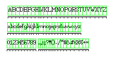
Using a crude dot-matrix font, the diagram below illustrates a unit system of this type:
and this keyboard chart includes typical character widths for such a unit system:
 -----------------------------------------------
| ! | @ | # | $ | % | ¢ | & | * | ( | ) | _ | + |
|  2|  5|  3|  3|  5|  3|  4|  3|  2|  2|  5|  3|
| 1 | 2 | 3 | 4 | 5 | 6 | 7 | 8 | 9 | 0 | - | = |
|  3|  3|  3|  3|  3|  3|  3|  3|  3|  3|  3|  3|
 -----------------------------------------------
  | Q | W | E | R | T | Y | U | I | O | P | ¼ |
  |  4|  5|  4|  4|  4|  4|  4|  2|  4|  4|  5|
  | q | w | e | r | t | y | u | i | o | p | ½ |
  |  3|  4|  3|  3|  2|  3|  3|  2|  3|  3|  5|
   --------------------------------------------
   | A | S | D | F | G | H | J | K | L | : | " |
   |  4|  3|  4|  4|  4|  4|  3|  4|  4|  2|  3|
   | a | s | d | f | g | h | j | k | l | ; | ' |
   |  3|  3|  3|  2|  3|  3|  2|  3|  2|  2|  2|
    -------------------------------------------
     | Z | X | C | V | B | N | M |   |   | ? |
     |  4|  4|  4|  4|  4|  4|  5|   |   |  3|
     | z | x | c | v | b | n | m | , | . | / |
     |  3|  3|  3|  3|  3|  3|  5|  2|  2|  3|
      ---------------------------------------

space = 2

2 fijlt I .,:;'!()
3 abcdeghknopqrsuvxyz JS 0123456789 "?#+-*/=
4 w ABCDEFGHKLNOPQRTUVXYZ &
5 m WM @%_½¼
This is based on the unit system for Documentary at a unit size of 1/32", but may deviate from it for some of the special characters, my actual primary source being a font with the same spacing as Documentary for the letters which was used on a Friden Justowriter.
There were typewriters that offered proportional spacing long before the IBM Executive, but they were not successful; the IBM Executive could type as rapidly as a normal electric typewriter, but those early attempts apparently were encumbered by the added complexity of proportional spacing.
The Olivetti Graphika typewriter, which came out after the IBM Executive, and offered proportional spacing of a similar kind, with charcters from two to five units in width, spaced with a unit of 0.8 or 0.785 mm, and was manual instead of electric.
It came out in the 1950s, after the IBM Executive, which was the first commercially successful typewriter with proportional spacing. Uniform spacing, however, was recognized as a deficiency of the typewriter from the outset, and thus earlier attempts at a proportionally-spaced typewriter were made.
One web site gives the first such typewriter as the Crandall 1, from 1883, and also notes the Columbia 1 as another early typewriter with proportional spacing. One that was particularly well known was the Maskelyne, from 1889, which continued to be sold into the 1920s, from a firm which was indeed founded by the famous stage magician of that name. There was even a typewriter called the Automatic that went to the trouble of offering proportional spacing despite only typing capital letters.
While we are on the topic of IBM trivia, and if we have wandered from punched card codes to line printers, another important input-output device, the IBM 2741 printing terminal, may also deserve some attention.
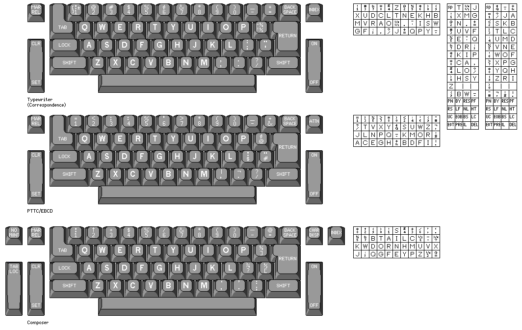
In the top two rows of this diagram, the two major families of 2741 arrangements are illustrated, first the arrangement of characters on the keyboard, and then the arrangement of characters on the typing element.
The arrangement at the top, the Correspondence arrangement, uses exactly the same elements as a standard office Selectric typewriter. The one in the middle is the PTTC/EBCD arrangement, which is designed so that the position of characters on the element leads to a code for the letters which has some relation to punched card codes and the EBCDIC internal code.
On the bottom is the keyboard arrangement, and arrangement of characters on the element, for another major family of devices using the IBM Selectric "golfball" element, but which was not made into a form of the 2741 terminal.
The charts of 2741 codes on the right shows the codes for the printing characters applicable to the Correspondence arrangement and then for the PTTC/EBCD arrangement; the relation between these is determined by matching characters in corresponding positions on the elements. The space and control characters always have the same codes.
Of course, Selectric typewriters were sold in many other countries in addition to the United States. This diagram compares the keyboard, and the arrangement of characters on the element, for the United States and the United Kingdom. A number of characters are in different positions on the element.
Incidentally, the paper-clip storage container in the shape of a Selectric element, once commonly seen in offices, is designed after a UK element rather than an American one.
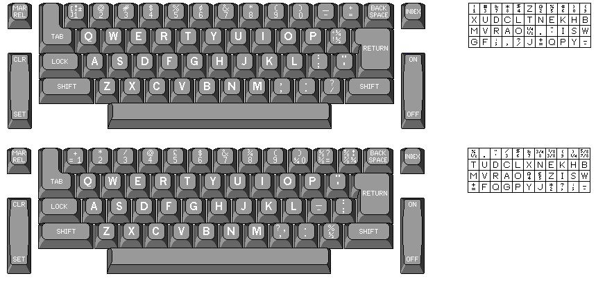
Now that we have discussed the IBM Selectric Composer, here is a chart of its keyboard, including the widths of each of its characters in units, a unit being 1/72", 1/84", or 1/96" depending on the size of type being set, these sizes being indicated by red, yellow, and blue triangles upon the element respectively:
 -----------------------------------------------
| ! | † | + | $ | % | / | & | * | ( | ) | _ | @ |
|  4|  6|  6|  6|  8|  4|  8|  6|  4|  4|  8|  8|
| 1 | 2 | 3 | 4 | 5 | 6 | 7 | 8 | 9 | 0 | - | = |
|  6|  6|  6|  6|  6|  6|  6|  6|  6|  6|  3|  6|
 -----------------------------------------------
  | Q | W | E | R | T | Y | U | I | O | P | ¼ |
  |  8|  9|  7|  8|  7|  8|  8|  4|  8|  6|  8|
  | q | w | e | r | t | y | u | i | o | p | ] |
  |  6|  8|  5|  4|  4|  6|  6|  3|  6|  6|  6|
   --------------------------------------------
   | A | S | D | F | G | H | J | K | L | ¾ | ½ |
   |  8|  6|  8|  7|  8|  8|  5|  8|  7|  8|  8|
   | a | s | d | f | g | h | j | k | l | ? | [ |
   |  5|  4|  6|  4|  5|  6|  3|  6|  3|  5|  5|
    -------------------------------------------
     | Z | X | C | V | B | N | M | ` | ' | : |
     |  7|  8|  7|  8|  7|  8|  9|  3|  3|  4|
     | z | x | c | v | b | n | m | , | . | ; |
     |  5|  6|  5|  5|  6|  6|  9|  3|  3|  3|
      ---------------------------------------

space = 3

3 ijl  .,;`'-
4 ftrs  I  :!()/
5 acegvz  J  [?
6 bdhknopquxy  PS  0123456789  ]+*=$†
7 BCEFLTZ
8 w  ADGHKNOQRUVXY  &@%½¼¾  <em dash>
9 m  WM
where the underscore is filling the space that should contain a dash (I've seen pages that try to use &emdash; but that doesn't work), and I have cheated somewhat by using † or † to represent a dagger, which assumes you are viewing the page from within Microsoft Windows. The difference in width between colon and semicolon, and open and close square bracket, is intentional, and has to do with the desired amount of space after each character.
Incidentally, while I couldn't originally account for the fact that the :; key is moved from its normal position on a typewriter, I was able to easily see the reason why ¼ and ½ are on separate keys, rather than on the same key as on a typewriter. This is so that the keys containing ¼, ½, and ¾ can be used with a German-language element for Ä, Ö and Ü, as was explained in the January, 1968 issue of the IBM Journal of Research and Development which featured multiple papers about the original Selectric Composer. The U.S. English keyboard for the Composer and the German keyboard for the Composer are illustrated below for comparison:
On further reflection, this explained the changed position of the :; key as well: so that not only could the keys for Ä, Ö and Ü retain their usual positions on the keyboard of a German-language Selectric Composer, but that, as well, the keys would remain in the same position as on the U. S. version of the Selectric Composer. That concern did not initially occur to me, given that a German keyboard would have the QWERTZ arrangement, just as a French keyboard would have the AZERTY arrangement, so not all the keys would be in the same position in any case. None the less, keeping those keys in the same position might still have reduced confusion in the use of type elements from other languages or common to all languages, such as the ones with special symbols.
Later on, on the next of this series of pages, we will be looking at ATF Self-Spacing Type and ATF Quick-Set Roman. The latter had a 7-unit system, and the former used a set of widths for characters which was comparable, but not identical, to a 5-unit system. Both achieved a quality of printing that was hard to distinguish from that achieved with conventional type. Quick-Set Roman achieved an improved quality of printing, compared to that of a 5-unit IBM Executive typewriter, by limiting the width of the widest characters, so that more variations of width remained available for the other characters (that is, the characters were still larger compared to the size of a unit, even though the maximum number of units remained five). Self-Spacing Type, on the other hand, although it only used 7 units for the widest letters like capital M, did not restrict the width of the wider characters to further improve the quality obtainable from a 7-unit system.
Given that, why did the IBM Selectric Composer make the widest letters, like M and W, somewhat narrower than they should have been, if a 9-unit system could have provided adequate quality without doing this?
Here, there is an obvious answer. The issue wasn't primarily one of providing a higher quality of printing from the IBM Selectric Composer, even if that may have been one of the results. The IBM Selectric Composer was based on the mechanism of the IBM Selectric typewriter, and used printing elements that were physically the same as those of the typewriter, even if they were incompatible because of a different arrangement of letters, and because the letters were different in width. This meant that the physical size of the element was defined, and so the maximum width of a character on the element was determined.
Consequently, if the letters m, M, and W were given 10 units instead of only 9, it would no longer have been possible to offer a 1/72" escapement on the Composer, and so it wouldn't have been able to set type in 12 points or 11 points, only 10 points or smaller, which would have limited its utility.
And because it was the physical size that was the constraint, this problem would have remained if it had been decided that allowing characters to have 10 units involved too much mechanical complexity, and instead m, M, and W were to be given 9 units, but to still have their full proportional width by reducing the number of units allocated to the other letters, with the resulting quality still being adequate. Having an escapement larger than 1/72" and 9-unit characters at the same time was again not an option.
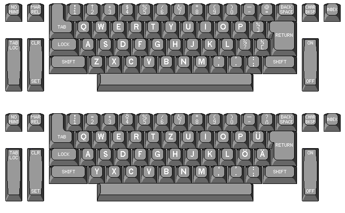
And here is the unit system of the IBM Electronic Typewriter Model 50, for the proportional typestyles which it uses:
 ---------------------------------------------------
| ° | ! | @ | # | $ | % | ¢ | & | * | ( | ) | _ | + |
|  5|  5|  5|  5|  5|  5|  5|  6|  5|  5|  5|  5|  5|
| ± | 1 | 2 | 3 | 4 | 5 | 6 | 7 | 8 | 9 | 0 | - | = |
|  5|  5|  5|  5|  5|  5|  5|  5|  5|  5|  5|  5|  5|
 -----------------------------------------------------
      | Q | W | E | R | T | Y | U | I | O | P | ¼ | [ |
      |  7|  7|  6|  7|  7|  7|  7|  4|  7|  6|  5|  5|
      | q | w | e | r | t | y | u | i | o | p | ½ | ] |
      |  6|  7|  5|  5|  4|  6|  6|  3|  5|  6|  5|  5|
       ------------------------------------------------
       | A | S | D | F | G | H | J | K | L | : | " | ³ |
       |  7|  6|  7|  6|  7|  7|  5|  7|  6|  5|  5|  5|
       | a | s | d | f | g | h | j | k | l | ; | ' | ² |
       |  5|  5|  6|  4|  6|  6|  3|  6|  3|  5|  3|  5|
      -------------------------------------------------
     | ¶ | Z | X | C | V | B | N | M |   |   | ? |
     |  5|  6|  7|  7|  7|  7|  7|  7|   |   |  5|
     | § | z | x | c | v | b | n | m | , | . | / |
     |  5|  5|  6|  5|  6|  6|  6|  7|  5|  5|  5|
      -------------------------------------------

space = 4

3 ijl  '
4 ft  I
5 aceorsz J 0123456789 .,:;!?"@#$¢()+-*/=_½¼°±³²[]¶§
6 bdghknpquvxy EFLPSZ &
7 mw ABCDGHKMNOQRTUVWXY
There is also a PSN setting for the Pitch Control Lever that makes the space 5 units, so that a space is the same width as a digit. This performs a function similar to the 3-unit space key next to the normal 2-unit spacebar on a typebar Executive.
A paper published in the IBM Journal of Research and Development claims a 1/72" unit for the Mag Card Executive. As that paper, however, was a retrospective on IBM typewriter development, published many years after the Mag Card Executive was an actual IBM product, I had assumed that the Mag Card Executive was very similar to the IBM Electronic Typewriter Model 50, except that it used 88-character elements.
However, a book illustrating type elements available from IBM, and illustrating those for both machines, showed that on the Mag Card Executive, the upper-case alphabet was longer than the lower-case alphabet by a greater amount than was the case for the Electronic Typewriter Model 50 for its proportional typestyles, even though they looked similar and had the same names.
This sowed the first seed of doubt; I wasn't able from those illustrations alone to determine the exact unit system of the Mag Card Executive with confidence.
My doubts grew when I saw, from a picture of a Mag Card Executive in an old advertisement, that it only had a single scale for the typing position, and there was apparently no pitch selection lever. If it could only use proportionally-spaced elements, and did not also have to use Pica and Elite elements (despite the fact that the arrangement of characters on an element for the Mag Card Executive was the same as for a conventional 88-character typewriter element) then it would not have had to have had a 1/60" escapement, but could instead have used existing parts designed for the IBM Selectric Composer which had preceded it.
Finally, I stumbled on a product brief in an old issue of the ABA Journal online, which described the proportional printing capabilities of the Mag Card Executive in a way that was only compatible with a 1/72" escapement. So, while I was able to learn more about the Electronic Typewriter 50, I have to admit I do not know the details of the unit system of the Mag Card Executive.
The forwards-pointing triangle on a Selectric Composer element indicated its spacing with its color; on a typewriter, a solid white triangle indicated pica, and a hollow triangle elite; proportional spacing was indicated by a circle, both on Model 50 elements and on those for the Mag Card Executive.
The 1/60" unit for proportional spacing of typed copy was, of course, also used on virtually all daisywheel printers that provided proportional spacing. A few even provided the option of printing small monospaced typing with letters 1/15" in width. Rather than being similar to the Mag Card Executive font, however, the proportionally-spaced fonts for some daisywheel printers tended to have small x-heights, a clear distinction between small and capital letters emphasizing that the font in use is proportionally-spaced.
However, the relative widths of the upper-case and lower-case alphabets do differ between the Mag Card Executive and the Electronic Typewriter Model 50, and I have not yet been able to pin down a specific cause for that. Furthermore, a photograph of a Mag Card Executive in an advertisement shows that it does not have a pitch selection lever, nor does it have a dual scale for carriage position. So the possibility that the Mag Card Executive used a 1/72" escapement, however unlikely I may think it is, cannot be completely excluded: the typewriter did not support Pica and Elite typewriter typestyles, so nothing was compelling the use of a 1/60" escapement, and using a 1/72" escapement would have allowed the use of some parts carried over from the Selectric Composer.
Recently, my best guess from the limited samples I have to view for the Mag Card Executive, at this time, had still been that both machines used a 1/60" escapement, and that the discrepancy between the length of the alphabets in the two machines is: the lower-case alphabets have the same length on the two machines, but the upper-case alphabet is four units shorter on the Mag Card Executive, because the following four letters have been allocated one unit less space on that machine: B, G, Q and R. Also, & is 5 units instead of 6. The shapes of the letters did not appear to have been noticeably redesigned for the Electronic Typewriter Model 50, simply the space allowed between letters was changed. Should I get more information, though, this is subject to change.
|
It now appears that I was mistaken in my assumption that the Mag Card Executive must, almost of necessity, have had the same 1/60" escapement as the Electronic Typewriter 50. A contemporary source, a brief product description with the reader advised to circle a number on the reader service card in the magazine for more information, appearing on page 1312 of the November 1973 issue of the Journal of the American Bar Association, states the following about the Mag Card Executive: "This new word processing machine utilizes a nine-unit spacing system which produces six different letter widths." For proportional spacing on the Electronic Typewriter 50, a seven-unit spacing system which produced five different letter widths was used, so this statement is not consistent with a 1/60" escapement, but it would be consistent with using a 1/72" escapement in a manner similar to that in which it was used with the Selectric Composer. Since it would have been based on advertising material supplied by IBM, it would have had to have been accurate. |
In the case of the Mag Card Executive having a 1/72" escapement, a position towards which I am now gravitating more and more, and in which case some of the characters of the typestyles were likely redrawn slightly, its unit system would appear, as best I can determine, to be the following:
4 ijlt I '
5 f
6 abcegorsvz FJ 0123456789 .,:;!?"@#$&¢()+-*/=_½¼
7 dhknpquxy EFGLPSUZ
8 ABCDHKNOQRTVXY
9 mw MW
In addition to the Mag Card Executive, and machines intended for typesetting, such as the Selectric Composer and the VariTyper, another modern single-element typewriter before daisywheels offered proportional spacing.
From the 1970s, many of you might remember the Olivetti Lexikon 82 and 83 portable typewriters, and the Brother Correct-O-Ball, which used plastic elements which resembled the Selectric typewriter "golfball" element.
Olivetti also made a series of office typewriters, the Lexikon 90, 92, 93, and 94, of which the 92 had proportional spacing; there were also the later 90C, 92C, 93C and 94C models, which had a correction ribbon added. These also used a single element. However, that element was sometimes called a "pineapple", as it looked very different from a Selectric element.
A Selectric element had 88 raised characters in four circles of 22 characters which stood side-by-side next to each other, the circle in the middle of the element being the largest one, with those above and below spaced more closely together. Teeth on the bottom of the element were used to align the element exactly as it struck the page. A lever at the top was used to mount and dismount the element.
The elements for the Olivetti Lexikon 90 and related typewriters had 96 raised characters in six circles of 16 characters, in which the characters stood vertically one on top of another.
Most of the single-element typewriters that came out after the Selectric patents expired had 96-character elements. The element for the Olivetti Lexicon 82 and 83, however, had nine columns of characters on each side, in five rows around the element. It was also unusual in that between each column of characters, there was an indented column in the element which served as a detent, similar to the space between the circles of characters in the Lexicon 90 series elements, which were filled with V-shaped detents.
The element for the Brother Correct-O-Ball (as it was sold in North America; elsewhere, the typewriter was known as the Brother Super 7200 as well as there being other models) although like that for the Olivetti Lexikon 82 and 83, using a slider mechanism instead of a lever to attach to the typewriter, was otherwise very similar to that of the Selectric, with four rows of characters and eleven columns of characters on each side.
I was able to find enough images of the element on the Web to work out the arrangement of characters on it without having to buy one of these typewriters at a local thrift shop:
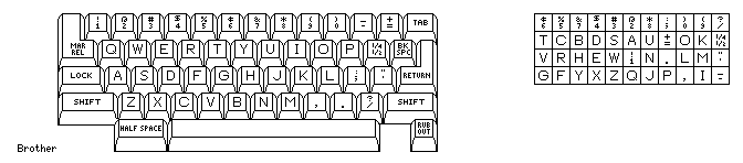
The arrangement of characters on the element also resembles that on the Selectric: letters with descenders in their lower-case forms are on the bottom row, the two wide letters M and W are on the second row from the bottom, and most of the digits are in the top row.
And now I think that I've been able to work out, at least for the Swedish version of the element and keyboard,
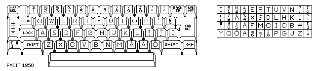
the arrangement of characters on the element for the FACIT 1850 as well.
Note the key to the lower left on the keyboard diagram. On the IBM Selectric, there were multiple characters on the key for the digit 1, representing the characters provided by alternative styles of element. Here, both pairs of element on that key are found on the element, and so I presume one of the switches adjacent to the keyboard controls which pair of characters on the element is assigned to that key, thus making the keyboard more compact.
The two circles in the middle of the pineapple element for the Olivetti Lexicon 90 family of typewriters had the characters most widely spaced, but the spacing was vertical, and so there would be a preference for putting characters with descenders in the middle instead of wider ones there.
Between each circle of characters were columns of V-shaped indentations so that a pair was immediately beside each character; these were what was used to align the element as it struck the paper. A rod through the center of the element was pulled out to dismount the element and pushed in to mount it.
One model in the series, the Lexikon 92 (and the Lexikon 92C as well) could be switched between Pica, Elite, and proportional; the proportional spacing was comparable to that of a normal Executive typewriter, not a Mag Card Executive.
One had to lift the cover on the top of the typewriter to change this setting, which was controlled by a pair of levers covered by sliders, but that was reasonable as normally it would only be changed when changing the element.
It may also be noted, though, that the Crandall 1 typewriter also used a single element (like many other early typewriters) as well as having proportional spacing (unlike all but a very few).
The book Century of the Typewriter notes that many typewriters were invented before the one by Sholes and Glidden, who are often regarded as the inventors of the typewriter.
That is true, but it is also true that their typewriter succeeded, and became the ancestor of the manual typewriters that continued to be made and sold by many companies for many years, because its design permitted relatively fast and efficient typing.
Similarly, there were several typewriters that permitted the typist to see what was typed on the paper as soon as it was typed before Underwood came up with the "visible" typewriter that became such a success as to drive the older kind of typewriter off the market.
So, while it definitely is mistaken to refer to the IBM Executive as the first typewriter with proportional spacing, as it dates from 1944, and other typewriters with that feature date back to 1883, typing on an IBM Executive was as fast and efficient as typing on any other ordinary electric typewriter. Of course, there was still the additional difficulty involved in backspacing; IBM did have a memory backspace achieved by mechanical means for the original Selectric Composer some years later.
Having typed on a VariTyper, I know that one had to press quite forcefully on the keys to type with it, and thus typing on a VariTyper or a Hammond would be slower than typing on a conventional manual typewriter.
The IBM Selectric could not keep up with a few of the very fastest typists, but for almost everyone else, it was at least the equal of a typebar electric typewriter.
Thus, as with the Sholes and Glidden typewriter, while IBM didn't invent proportional spacing for the Executive, and it didn't invent single element typewriters with the Selectric, in both cases they were indeed the first to achieve a level of speed and ease in typing that made these innovations, at long last, acceptable for use in the normal office environment.
The Blickensderfer, as well as the Hammond, had elements resembling those used in some toy typewriters, in that all the symbols associated with one shift state of the keyboard were in a single circle; thus, those elements had to move further to print a letter than the typeball of the Selectric, which moved in two directions. However, some of the older single-element typewriters, such as the Crandall, did not have that limitation. Although the Crandall had an unusual keyboard, and had a figures shift, the fact that depressing a key would have had to have moved the element in two directions means that the most critical element of an efficient single-element typewriter design would have been available without infringing on IBM's newer patents. It should be noted, however, that the Crandall only implemented this feature in its most basic form: each shift state of the keyboard corresponded to two horizontal bands of charcters around the element, so the additional vertical direction of motion only covered the minimum possible number of characters greater than one.
In any case, the Selectric didn't inspire any competitors of IBM to revive any of the older single-element typewriter designs. Some of the designs would have required a three-bank keyboard, which could be argued was only a problem due to fashion, but the absence of any attempt to produce a competing single-element typewriter based on the earlier designs would seem to indicate that IBM had, genuinely, through innovative technology to which it held patents, made single-element typing fast and efficient enough to be acceptable in the contemporary office environment, and the earlier designs had not reached that target.
Of course, it's possible that this alternative was only rejected because typewriters based on it would "look" old-fashioned, and thus not be saleable, and they would have worked as well, but at this point I doubt it.
Instead, Olivetti came out with the Lexikon 90 series, which used an element that, although it looked very different from an IBM Selectric "golfball" element, still moved in two directions, and flipped over to the other side when shifted.
Then, as IBM's patents expired, the Olivetti Lexikon 82 and 83 portable typewriters, and the Brother Correct-O-Ball came out, along with the Facit 1850 and the Triumph-Adler SE1000, in addition to typewriters from Remington and Silver-Reed that used actual IBM Selectric elements.
Later on, Smith-Corona appears to have made their own version of the Olivetti Lexikon 82/83 as the Vantage under license, rather than putting their name on units made by Olivetti; at least, while the elements are compatible, the outer case looks different.
I've since learned that Olympia also made a single-element typewriter of their own, the SGE 75, also available as the SGE 75 C with the built-in ability to use a lift-off tape. I first learned of it from the Writelephant web site, which has since moved to the Electric Typewriter Zone web site. The elements resembled those of the IBM Selectric closely in one way - they had teeth on the bottom for a rotate detent. But the plastic top was very different; it completed the spherical shape of the element, and did not include a lever or slider. Only the one model used these elements, and it had a limited sale, despite having won a design award in 1975.
The Triumph-Adler elements, although they were about the same size as a Selectric typeball, were actually cylindrical in shape in one sense: the inner portion of the element from which the characters protruded was cylindrical. However, in terms of the way the characters faced, and thus the way the element had to move to print, the rotate motion was not replaced by the up-and-down motion a cylindrical element would require. Instead, the effective shape was like that of a football (that is, in football as played in the U.S. and Canada, not soccer), so in addition to the horizontal rotate motion around the central axis of the element, there was a "tilt" motion, but instead of being around the center of the element, as on a Selectric, it was around a pivot point further away from the paper, in front of the element from the typist's viewpoint. As well, the element didn't include any mechanism for locking it to the typewriter; instead, a lever for this purpose was part of the post on which the element was placed.
The elements for the Facit 1850 were much more similar to those of the Selectric. But there were important differences. There was a plastic cap on the top with a lever, but the cap was flat with flanges on the side of the lever, instead of being a shallow dome. Also, while the element had the shape of part of a sphere, like the IBM element, it looked a bit more "boxy", because instead of tilting downwards twice as far as it tilted up, like the Selectric element, it appears to have moved symmetrically, and, thus, the printing part of the element was wider at the top. As well, it didn't have teeth on the bottom, with the grooves between them used for the rotate detent.
The Hermes 808 used elements that even more closely resembled those of the IBM, having both a lever on the top and teeth on the bottom. I only recently learned, though, that unlike the Remington and Silver-Reed typewriters, this machine didn't use Selectric elements; a close-up image of the element in a typewriter being offered for sale showed that the arrangement of letters on the element was very different, several of the letters being in the topmost row. Also, the Olympia SGE 77 (and 77C) and the Japy 808 were apparently rebranded versions of this typewriter.
None the less, while IBM does deserve credit, therefore, for making the single-element typewriter with interchangeable elements, thus providing the potential of typing in many different languages, and using a wide repertoire of symbols for special purposes, practical, the Blickensderfer and the Hammond typewriter do, of course, show that the basic idea of such a typewriter itself was around long before the IBM Selectric, and to the extent that IBM advertising created a contrary impression, it would be subject to criticism.
A Vari-Typer could both type proportionally in multiple spacings, like a Selectric Composer, and it could also use monospaced typewriter fonts as well. Only the Mag Card Executive and the IBM Electronic Typewriter models 50, 65, and 85 could mix proportional spacing and normal typewriter monospaced type, and those typewriters could only produce proportionally spaced type in one size.
But the unit system of the Vari-Typer was much coarser than that of the Selectric Composer, which limited its usefulness as a device for cold type composition; it was a genuine piece of typesetting equipment, and was used as such, quite commonly, in fact, for purposes such as designing forms and producing the text on the central label portion of phonograph records. But in general, its limited unit system meant that the type it produced was unattractive in appearance compared to more conventional typography.