At this point, we've seen how a modification of the IBM Electronic Composer could be extended so as to allow use of typestyles for IBM Executive typebar typewriters, normal typewriter typestyles, and the proportional typestyles for the Mag Card Executive and 96-character electronic typewriters.
Modifying horizontal movement with suitable gears to allow printing with metric spacing was noted in the section above to accompany a discussion of metric linespacing.
Other modifications to horizontal movement could provide this device with access to extended repertoires of characters.
One possibility is merely a historical curiosity, and not really worth doing; if the typestyles are of interest, they could be resized to be placed on elements compatible with the spacing features already described up to this point. But as it illustrates the principle involved more simply than the more complicated case that is (at least potentially) worth doing, it shall be examined first.
Before there was the IBM Selectric Composer, there was the Vari-Typer. It too could use interchangeable typestyles with proportional spacing, and, on a second typing, justify. As it used a four-unit system, similar to the five-unit system of the IBM Executive, except with the widest characters limited to four units, however, unlike the Selectric Composer, it did not approach the level of quality associated with normal typography. But it did have one feature the Selectric Composer did not: two elements could be mounted on it at a time, and switching between them was relatively easy.
The possible sizes of a unit were labelled A, B, C and D.
These unit sizes, upon some investigation on my part, appear to be 23/900", 21/900" (or, of course, 7/300"), 19/900" and 17/900" respectively.
The Electronic Composer used a disk with holes placed at regular angles around its center, in three tracks, to permit advancing the printhead in units of 1/72", 1/84", and 1/96". Here, I have proposed extending this to seven tracks, to give a wider selection of unit sizes: 1/60", 1/66", 1/72", 1/78", 1/84", 1/90", and 1/96".
If one had a second such disk, made to spin ten times as fast by suitable gearing, one could, by selecting the 1/90" escapement, but using the signal at 10x the frequency from the faster disk, position the carriage in units of 1/900", and thus use 23, 21, 19, or 17 of them as the basic unit so as to use Varityper typefaces in their original proportions.
As noted, this would be of limited utility. But making a third disk move not ten times faster, but eighteen times faster (actually, 72 times faster, I'm afraid) would open up the ability to use typefaces of significantly better quality than Composer typefaces.
One of the horizontal spacing options is 1/72", or a unit being the same size as a point.
Now if a point were divided into eighteen parts... then one could apply an eighteen-unit system to type of any point size!
So one could use genuine Monotype typefaces without any adjustment in their proportions!
It isn't quite as simple as that, which is why the wheel has to go 72 times faster, not 18 times faster. Instead of the actual point size of the type being divided into 18 equal parts, what is so divided is the "set width" of the particular size and style of type. And that might be 10 1/2 points, or 9 3/4 points. Well, four times 18 is 72, so it is still achievable.
I envisage a knob being provided to choose the set width in points, and a lever for adding 1/4, 1/2, or 3/4 point to that if required, as the way to provide an appropriate control for this purpose.
The reason why I decided that this flexibility was best provided by using spinning disks moving at a rate which was a multiple of that of the disks used for normal character positioning was that, then, there would be micro-units of movement available that kept the tab stops at 1/6" intervals available. If, instead, some sort of gearing were used to adjust the unit size, then the tab stops would move too.
The Selectric Composer provided different unit sizes by dividing the pica into various aliquot parts, one-twelfth, one-fourteenth, and one-sixteenth. Both the Varityper and the Monotype caster worked in the opposite way - starting with one tiny unit, 1/900" for the Varityper, and one eighteenth of 1/4 of a point for the Monotype, unit sizes were multiples of this smallest unit.
Instead of explicitly using the smallest unit, though, another option might be to use gearing to generate displacements in units of adjustable size, with another type of gearing to add both motions.
This was the principle used with the ATF Typesetter Model B-8, which divided the unit produced by a mechanical design into three parts so as to allow the device to use 18-unit typefaces.
However, in the case considered here, where the unit is not just divided into three parts, but a much larger number, either ten parts or 72 parts, that technique would have the obvious potential problem that if the displacements aren't exactly their nominal size, then when at the limit of the range of the displacement, where a distance in the geared displacement is replaced by a conventional motion, the accumulated error would become visible all at once at the switch-over points.
A cute system where a scaled backwards displacement from the next conventional unit and a scaled forwards displacement are both generated, and the carriage is positioned at a weighted average between the two is possible, but that is getting quite complex.
Therefore, while this final step is attractive - allowing a desktop typewriter to do just about everything a Monotype caster could do - there are also good reasons for considering this to be taking a step too far.
In the case of the Varityper typefaces, since provision is already made for the typestyles of the IBM Executive typewriter - and Varityper typefaces, being limited to four units, don't present the issue of too many wide characters - the obvious thing to do is to avoid reproducing the width of characters on the Varityper exactly, but instead simply to use unit sizes of which the machine is already capable.
Thus, the unit sizes of the Varityper are:
A  23/900"   0.02556
B  21/900"   0.02333
C  19/900"   0.02111
D  17/900"   0.01889
and the possible unit sizes in this range available by using two or three of the basic units of this typewriter are:
3/96"   0.03125"

2/66"   0.03030"
2/72"   0.02777"
2/78"   0.02564"
2/84"   0.02381"
2/90"   0.02222"
2/96"   0.02083"
Not perhaps as good a match as one might like, at least for part of the range.
What about Monotype faces? Clearly, the units available on the machine, suitable for typefaces with 11 units to the em, are not small enough for typefaces with 18 units to the em.
However, if, instead of cutting the units into 10 parts, 18 parts, or 72 parts, we just cut the units in half, they're already more than small enough. The fact that, to handle typewriter faces, we extended the range of units upward to units of 1/60" will help to avoid their being too small.
Here, the new unit sizes would correspond to set width values, so we can see if, by having intermediate unit sizes between those of the Selectric Composer, we have an adequate selection:
Unit Size     Set Width
1/120"         10.8
1/132"          9.818
1/144"          9 points
1/156"          8.308
1/168"          7.714
1/180"          7.2
1/192"          6 3/4 points
The difference between different set widths varies from about one point to about half a point. Also, it would be desirable to have available set widths of up to 12 points, since the Composer originally handled typefaces up to 12 points in size; of course, the new kinds of typeball proposed would allow even larger typefaces, but for those whole units instead of half units could be used.
The fact that the units have been cut in half, however, opens up a possible solution. 72, 84, and 96 were all multiples of 12, so intermediate unit sizes of 1/78" and 1/90" were possible while still allowing tab stops and margin settings at every pica.
Now that the units have been cut in half, their denominators are again multiples of 12, not just six. So in addition to widening the basic unit to 1/54", with the divided unit being 1/108", again intermediate units are possible.
This still would not be just as good as a Monotype caster, but it would be reasonably close.
              Half-Unit  Equivalent       Full Unit   Equivalent
Color         Size       Set Width        Size        Set Width
                         (18 half-units               (10.276 full units
                          to the em)                   to the em)

Medium gray   1/108"     12 points         1/54"      13.701
Light gray    1/114"     11.368            1/57"      12.98
White         1/120"     10.8              1/60"      12.331
Royal Purple  1/126"     10.286            1/63"      11.744
Mauve         1/132"      9.818            1/66"      11.21
Magenta       1/138"      9.391            1/69"      10.723
Red           1/144"      9 points         1/72"      10.276
Red-Orange    1/150"      8.64             1/75"       9.865
Orange        1/156"      8.308            1/78"       9.486
Yellow-Orange 1/162"      8 points         1/81"       9.134
Yellow        1/168"      7.714            1/84"       8.808
Yellow-Green  1/174"      7.448            1/87"       8.504
Green         1/180"      7.2              1/90"       8.221
Blue-Green    1/186"      6.968            1/93"       7.956
Blue          1/192"      6 3/4 points     1/96"       7.707
The third column shows, where the diamond symbol is used, indicating a typeface designed according to the Monotype 18-unit system is on the element, the set width corresponding to the color of the symbol.
The fifth column shows the effective set width in the case of Composer typefaces, based on comparing the unit widths of the upper and lower case letters except for m, M, and W on the Composer to the unit widths on the Monotype of the corresponding characters in Times Roman 327.
It should be noted that this would not necessarily apply to other typefaces. Why not?
In another typeface, different widths might be chosen for the lower-case characters. More specifically, if the typeface has a smaller x-height, to keep the widest letters at 18 units, it would mean that all the lower-case characters would be smaller than in Times Roman. Which is all right in a fine-grained 18-unit system - therefore, the set widths in the third column apply to all typefaces. But for the coarser Composer system, it would likely work better if the widths of the lower-case letters were kept about the same as those in Times Roman, except for differences affecting individual letters due to the design of the typeface. That the widest letters might be 11 or 12 units instead of 10 would not be prevented by any ironclad mechanical limitation of this typewriter design as envisaged.
That would mean that the number of units in the Monotype version of that typeface that are equivalent in width to a unit in the Composer version of that typeface would be different from the value that applied to Times Roman versus Press Roman. So each escapement would correspond to a different set width than for Press Roman, with a constant scale factor applied for the particular typeface.
Of course, choosing how to set the Escapement Lever by the color of the triangle or other indicating mark on the element now requires very good hue discrimination. Perhaps instead of using intermediate hues, the intermediate widths might be indicated by using the two adjacent colors on the indicating mark; i.e. instead of yellow-orange, the triangle would be yellow on one side and orange on the other. That would make it much easier to see which is the right setting.
Another option would be to use a dot - black on triangles or circles with a solid color, of the color in hollow shapes - to distinguish a shape in an intermediate color from a shape in a principal color. The idea in that case is that the intermediate colors are as far from one another as the original colors were. This avoids the need for printing in an extra color on elements.
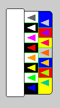
Even simpler would be to use black plastic for the cap for shapes in the principal colors - the primary colors, red, yellow, blue and white, and the secondary colors, mauve, orange, green and medium gray - and white plastic for the cap for shapes in the intermediate or tertiary colors. So the Escapement Lever and the Pitch Selection Lever now might look like this:
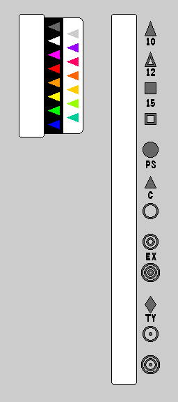
Thus, on the left, for the Escapement Lever, on the black background the colors of the triangles and the full unit sizes they indicate are:
Medium Gray, 1/54"; White, 1/60"; Mauve, 1/66; Red, 1/72; Orange, 1/78; Yellow, 1/84; Green, 1/90; Blue, 1/96.
To the left of those triangles, the colors of the triangles on the white backgrounds and the full unit sizes they indicate are:
Light Gray, 1/57; Royal Purple, 1/63; Magenta, 1/69; Red-Orange, 1/75; Yellow-Orange, 1/81; Yellow-Green, 1/87; and Blue-Green, 1/93. Again, as the denominators are all odd multiples of three, to allow margins to be set, and tab stops to be placed, at any pica of 1/6", the half units are required to be available.
On the right, for the Pitch Selection Lever, the shapes and their meanings are:
Solid Triangle: Six full units per character. A white solid triangle, therefore, indicates 10 pitch. And a mauve solid triangle (1/66" full unit) indicates 11 pitch.
Open Triangle: Five full units per character. A white open triangle indicates 12 pitch. Also, with the metric spacing lever engaged, and thus the letter M next to the triangle on the element, as gearing is then engaged which expands 1/60" to 0.5 mm, a white open triangle then indicates characters that are 2.5 mm in width - note that these correspond to pica rather than elite.
Solid Square: Four full units per character. A white square therefore indicates 15 pitch. A white square with M next to it indicates characters 2 mm in width, corresponding to elite.
Open Square: Three full units per character. This is normally used only with the metric lever engaged, indicating characters 1.5 mm in width.
Solid Circle: This is used for proportional spacing typewriter characters, of the type used with the Mag Card Executive and the Electronic Typewriter Models 50, 65, 85, and 95, with their seven-unit system.
Solid Equilateral Triangle: This solid triangle is used instead of the one for 10 pitch typing to indicate the use of a Selectric Composer element with its nine-unit system. The Typestyle lever, located on the right-hand side of the keyboard, under the typewriter, with a numerical indicator of its setting above, beside the keyboard, is used when required for elements with modified spacing, particularly the new ones with wide characters that are 11 units, and with different spacings for different typefaces, although some modified spacings are indicated using the Code key, as on the Electronic Composer, instead, such as those for different languages or different character sets.
Open Circle: This indicates characters based on the five-unit system of the Executive typewriter. As the units used for the Selectric Composer are much smaller than those used on an Executive typewriter, this setting is used only for elements containing superscript or subscript characters.
Double Open Circle: This indicates characters based on the five-unit system of the Executive typewriter where two full units are used as one unit. A red double open circle indicates the use of a 1/36" unit, for typestyles such as Mid-Century.
Triple Open Circle: This indicates characters based on the five-unit system of the Executive typewriter where three full units are used as one unit. A blue triple open circle indicates the use of a 1/32" unit, for typestyles such as Documentary.
Diamond: This indicates characters with widths based on an 18-unit system, where the half-units are used as the fundamental units. See above for the chart of equivalent set widths.
Open Circle with Dot: This indicates characters based on the five-unit system of the Executive typewriter - or, with a suitable setting of the Typestyle lever, below the right of the keyboard, with its numerical indicator to the right of the keyboard (where the power switch is on an IBM typebar typewriter), the four-unit system of the Varityper - where each unit is built from one full unit and one half unit, or three half units of those native to this typewriter. And, indeed, the smaller spacings this indicates are intended to facilitate approximations to the size of the units used for some Varityper typestyles.
Double Open Circle with Dot: This provides for additional intermediate unit sizes, should they prove to be of use.
However, while it's easy enough to tell mauve from blue, or green from yellow, some people may find green-yellow and orange-yellow hard to tell apart. This could be solved by using yet another background color for the cap, but if one is going to use two backgrounds for tertiary colors, it might seem appropriate to go whole hog and use one background for primary colors and a different one for secondary colors as well. Thus, the escapement lever might look like this:
if white plastic caps were used for secondary colors. For the tertiary colors, I ended up rotating four different colors to ensure that the cap color would always provide a good contrast to the color of the symbol.
But another problem is solved; since now instead of just three units and two units to make a larger unit for Executive typestyles, we could also use three half-units, it should be possible to more adequately approximate the four Varityper sizes as well.
Once again, the four Varityper unit sizes are:
A  23/900"   0.02556
B  21/900"   0.02333
C  19/900"   0.02111
D  17/900"   0.01889
and now the units we have available are:
2/54"   0.03704"       3/108"   0.02777" *
2/57"   0.03509"       3/114"   0.02632"
2/60"   0.03333"       3/120"   0.025"   (A)
2/63"   0.03175"       3/126"   0.02381" *
2/66"   0.03030"       3/132"   0.02273"
2/69"   0.02899"       3/138"   0.02174"
2/72"   0.02777"       3/144"   0.02083" *
2/75"   0.02667"       3/150"   0.02"
2/81"   0.02469"       3/156"   0.01923" (D)
2/84"   0.02381"       3/168"   0.01786"
2/87"   0.02299" (B)   3/174"   0.01724"
2/90"   0.02222"       3/180"   0.01667" *
2/93"   0.02151"       3/186"   0.01613"
2/96"   0.02083" (C)   3/192"   0.01562"
Asterisks note redundant widths (3/180" is redundant with 1/60" rather than a double unit shown in the table); letters in parentheses note close approximations to the Varityper widths. Many fractions are not in lowest terms.
As 5/192" is about 0.02604", it might be a slightly closer approximation to the A unit size than 3/120", but generally smaller approximations are preferred to larger ones in order that characters will fit into the intended point size.
Adding half units adds more possibilities for the escapement lever, and that is now more complicated than reasonable. Instead of using doubled circles and tripled circles to indicate that three units are used to make one unit, perhaps a better route is to use a letter or number to indicate a multiplier, and place a multiplier lever after the pitch control lever, like this:
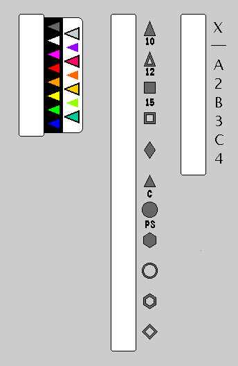
where X means 1/2, A means 1 1/2, B means 2 1/2, and C means 3 1/2, representing each multiplier by one short character.
I had thought to place that letter or number on the symbol, as a number below the symbol indicates pitch; one to the right would indicate the typestyle code - and the position to the left would have been used either for a Varityper width letter, A, B, C, or D, or a Monotype set width, if the alternate design, where the units, instead of being cut into two parts, were cut into either 10 parts or 72 parts as described above, were used, but since the position to the left will not now be used, it is less cluttered and easier to see to use it for the multiplier.
Also, to add distinguishability to the colors of the symbols, in addition to using two cap colors, black for the primary and secondary colors, and white for the tertiary colors, every second tertiary color has a black border around the symbol. That seems to be adequate to make each possible escapement value readily distinguishable, without excessive complication.
Now, after the hollow square, which means 4 units per character, the other pitch symbols are in order by width, and some are added so that nearly every possibility is covered.
The diamond, for the Monotype 18-unit system. The triangle, for the Selectric Composer 9-unit system. The circle, for the Mag Card Executive 7-unit system.
Then, the hexagon, for the 7-unit system of Self-Spacing Type and perhaps some daisywheel typewriters, in which 7 units is the full natural width of letters like M and W, instead of a truncated width.
In the case of Self-Spacing Type, we have the number of units per pica em for various point sizes of type documented:
Units per    Color of      Multiplier      Point
Pica em      Hexagon                       Size(s)

    6         Red           2               12
    7         Yellow        2               11,12
    8         Blue          2               8,9,10,11,12
    9         Medium Grey   1               8,9,10
   10         White         1               6,7,8,9
   11         Mauve         1               6,7
   12         Red           1               5 1/2, 6, 7
   13         Orange        1               5 1/2, 6
and so we can see what settings these various sizes of typeface would require.
The open circle, for the 5-unit system of the Executive typewriter.
Then, the open hexagon, for the 4-unit system of the Vari-Typer, and the open diamond, for the minimal 3-unit system where m, w, M, and W are 3 units, f, i, j, l, and t as well as I are 1 unit, and everything else is 2 units, as found on the Underwood Raphael.
There are additional complications not touched on yet. The typestyle lever on the right is adequate for selecting different spacings for the various IBM Executive typewriter typestyles, and different spacings for the IBM Selectric Composer typefaces. With the solid diamond intended to provide access to every typeface for the Monotype system, however, one would need a means of selecting a three-digit number for this purpose. Of course, that could be done using the CODE key.
Perhaps on the left there would be a schema lever; since there would be larger 5-alphabet elements and 7-alphabet elements, that lever would indicate if the element contains the default of roman, italic, bold, and small capitals, or if superscripts replace bold, and so on. However, the new larger elements, like daisywheels, could just somehow automatically indicate this information to the typewriter.
The first of these seven steps involved adding the ability to use typewriter elements to a version of the IBM Selectric Composer.
Thus, instead of being limited to the proportional-spacing typewriter typestyles of the IBM Electronic Typewriter Model 50, one could use the Selectric Composer typefaces, intended for typesetting, to prepare a programming textbook - with example program listings printed in a monospaced typewriter typestyle.
Without having to do paste-up, without having to take the paper out of one typewriter and align it carefully in another.
That goal would indeed have been achieved even at the first step. However, in a book about computer programming with example programs, it might be desirable to put program keywords or other short snippets of code in the body of the text as well.
Text within the body of a paragraph to undergo justification must all be in the same escapement.
Generally speaking, monospaced typestyles associated with computer programming tend to be 10 pitch, not 12 pitch.
The escapement valued of the Selectric Composer were all aliquot parts of 1/12 of an inch. So, changing the number of units per character, one could use an Elite element with any of those escapement values, but a Pica element could only be used with a 1/60" typewriter escapement.
Now that half-units are added, to accomodate 18-unit typefaces, the situation is a little different.
Elite elements can be used with not only all the primary colors, but also the secondary colors. But they can't be used with the tertiary colors, since those escapements are odd multiples of 1/3 of an inch, and they only fit in with the Selectric Composer system of tab stops every 1/6 of an inch thanks to half units.
Pica elements, at 10 characters to the inch, not only work with the white escapement at 1/60", but also the green (a secondary color) escapement at 1/90", and, as well, thanks to half units, with the red-orange (a tertiary color) escapement at 1/75".
Or at least potentially work, as there would also be a need to somehow specify monospaced typing with the correct number of units per character. Especially in the case of Elite elements, perhaps it might be useful to have an additional "Elite Universal" setting of the Pitch Selection Lever that selects the appropriate number, if possible, for 1/12" characters rather than specifying five of the current unit.
And so, for putting keywords in the same monospaced typestyle as the program examples, it would probably be the simplest course to make 12-pitch versions of the elements in those typestyles.
Another option would be to increase the available options for typesetting in the escapements compatible with Pica elements. The ATF Typesetter was able, using only a 7-unit system, to produce typeset material in an especially-designed version of Baskerville, and, although the result was not quite as good as regular typesetting, the difference was very slight, not immediately apparent. So a 7-unit typeface of that kind with 1/60" units might perhaps be accepted where the Electronic Typewriter Model 50 proportionally-spaced typestyles would not.
And if higher quality is desired, a set of typefaces of different point sizes, all using the same escapement, but different unit allocations, perhaps the 1/90" escapement, or using half-units in any of the three possible choices, could be produced for this application.
Since there are three Pica-compatible escapements, and the original Selectric Composer made do with just three escapements, there might even be a temptation to use just one allocation of units, but all three escapements. The three escapements for the original Selectric Composer divided 1/12" into 6, 7, and 8 parts; these three escapements divide 1/10" into 12, 15, and 18 parts, or 1/30" into 4, 5, and 6 parts, so they are more widely spaced. But using two (or perhaps three) unit systems (for each typeface), instead of a different one for each point size, and all three escapements, could produce good results.
A third way of dealing with this issue is to provide both an "Elite Universal" and a "Pica Universal" setting on the Pitch Selection Lever, with the behavior that, if an incompatible escapement is selected, the width of each character is then adjusted to whatever number of half-units is the smallest which is greater than the desired character width. Letterspacing of less than a half unit should not be too obtrusive.
Of course, these three options are not in conflict, so taking all three measures is desirable as it would provide the greatest flexibility in dealing with the situation.
A fourth option is also possible, but this one I believe would not be advisable to implement.
For allowing the use of metric typestyles such as were used on some Hermes typewriters, the option of switching in gearing that changed a horizontal displacement of 1/60" to one of 0.5 mm was proposed. Why not switch in gearing so that a horizontal displacement of 1/60" was instead changed to 1/50" exactly?
The ATF Typesetter used user-replaceable gears that scaled carriage displacements in this way to achieve a wide selection of set widths. But margins and tab stops weren't affected, because they were implemented in a mechanical fashion tied to the actual position of the carriage.
In the design proposed here, based on the Electronic Composer, margins and tab stops would be moved. So a whole set of pica-compatible typefaces would have to be developed that would not be interoperable with the usual Composer typefaces, as for them margins and tab stops could be set at positions of 1/5 of an inch. This does not seem reasonable, even if displaced tab stops and margins are acceptable for the isolated special purpose of metric typing.
Dealing with this issue in some fashion is particularly relevant if the computer language being described is APL, because there it is more desirable to use the actual APL font for items in the body of the text; ALGOL keywords could be in the bold weight of the normal text typeface, and, in fact, with languages like ALGOL and Pascal, using proportionally-spaced type for programming examples in the publication language is the conventional practice. Even with FORTRAN, it isn't mandatory to use a typewriter typeface for keywords and equations, even if it is highly desirable to do so for longer program examples.
As noted, the ATF Typesetter used gears for changing the set width, rather than dividing the pica into aliquot parts. So it didn't achieve interoperability of type sizes in the simple manner that the IBM Selectric Composer did.
One workaround that would allow this to be integrated would be to have two photoelectric disks and two motors for advancing the element across the page, with one of them having the gears between the photoelectric disk and the spiral gear that moves the carriage, and also a clutch, so that the clutch could be disengaged, and the ungeared mechanism used for advancing to a tab stop, or returning to the left margin. That way, even if the current escapement units were incompatible with the pica, the left margin and tab stops would not need to be used, and those units could start from those positions.
Only the right margin would present potential complications. In the absence of tab stops, treating the nearest approximation to the right margin in the unit system in use as the margin to use would produce an even right margin. But if a tab stop had reset the origin of the unit system, then lines in which a given tab stop was the last one used would not end evenly with lines that did not.
The simplest solution would be to disengage the clutch only for returning to the left margin, and use the nearest approximation for the tab stops as well.
So using gears to achieve a greater choice of escapements is not strictly incompatible with an extended version of the Selectric Composer.
From the patent for the ATF Typesetter, the gear ratios it used for different set widths were:
 Set Width in Points                            Gear Ratio    Actual Set Width

                   (x1)      (x2)      (x4)

          (14)                                  14 : 82                         4.10
          (16)                                  24 : 72                         8
                                      14        35 : 61                        13.77
                                      16        38 : 58                        15.72
 (5    )                                        40 : 56        4.29
 (5 1/4)                                        42 : 54        4.67
 (5 1/2)           5                            44 : 52        5.08
                   5 1/4    10 1/2              45 : 51        5.29    10.59
 (5 3/4)           5 1/2    11                  46 : 50        5.52    11.04
                   5 3/4    11 1/2              47 : 49        5.76    11.51
                   6        12        24        48 : 48        6       12      24
                   7        14                  52 : 44        7.09    14.18
                   7 1/2                        53 : 43        7.39
 (7    )                                        56 : 40        8.4
                   9                  36        58 : 38        9.16            36.63
 (7 1/2)          10                            60 : 36       10
                                      42        61 : 35                        41.82
          (36)                                  64 : 32                        48
          (42)                        60        69 : 27                        61.33
 (9    )                                        72 : 24       18
          (60)                                  77 : 19                        97.26
(10    )                                        80 : 16       30
The set widths in parentheses are ones appearing in the original patent which are replaced in the following columns with closer approximations.
The apparent errors in the patent, however, could be due to my misunderstanding of the mechanism being used. If a driving gear of 48 teeth were used which then directly meshed with one of the two gears involved, then the actual gear ratio would be the number of teeth on the other gear to 48 teeth, instead of to the number on the other gear of the pair. In this case, the gear ratio would change less rapidly: also, it would vary linearly in proportion to the number of teeth on the one gear, possibly allowing all the set widths to be exact.
In this case, the set widths become:
 Set Width in Points                            Gear Ratio

                   (x1)      (x2)      (x4)

                                      14         28 : 48
                                      16         32 : 48
                   5                             40 : 48
                   5 1/4    10 1/2               42 : 48
                   5 1/2    11                   44 : 48
                   5 3/4    11 1/2               46 : 48
                   6        12        24         48 : 48
                   7 1/2                         60 : 48
                   8                             64 : 48
                   9                  36         72 : 48
                  10                             80 : 48
                                      42         84 : 48
                                      60        120 : 48
But in that case, all the set widths are exact, rather than some still being approximations, as depicted in the patent.
That is due to the linearity resulting from having the ratio determined by the number of teeth on the driving gear. If, instead, it were the driven gear determining the ratio, so that the ratio is proportional to the reciprocal, perhaps a result closer to that seen in the patent could be obtained, with some approximations, but the effective gear ratio varying more slowly than I had imagined.
 Set Width in Points         Gear Ratio    Actual Set Width

                   14        48 : 82       14.05
                   16        48 : 72       16
                   24        48 : 48       24
                   36        48 : 32       36
                   42        48 : 27       42.67
                   60        48 : 19       60.63
which indeed does match the patent for the enlarging ratios - which are noted as using an arrangement the reverse of that for the normal ones, so the normal escapement sizes are indeed achieved by the previous scheme which always produces an exact escapement.
The gear ratios were given in the patent as applicable to 12 point type being produced by a default escapement of 1/32" using a five-unit system.
Presumably, the same gear ratios could then be used with a seven-unit system by going to a 1/36" escapement. And as a 1/6" pica is six units of 1/36", the nominal set widths would be correct for a six-unit system... and, as the model B-8 divided six units into thirds for an 18-increment system, the nominal set widths would be exact for that system, the one producing the highest quality type.
Based on the discussion above, let's assume that the selectable escapement can be directed through gears, and has a clutch between it and the actual advance mechanism for the element, while there is also a directly connected photoelectric disk with only two tracks of openings, both always sensed, one for units of 1/60" and the other for units of 1/72".
Since even with half-units and tertiary colors, the available approximations for the Vari-Typer unit sizes aren't good, rather than dividing units into ten parts and counting those, gearing could be used as a practical means of attaining those unit sizes.
So there would now be a geared motion lever, with the settings
T M - A B C D
placed at - by default for normal operation.
The M setting would be used with the white escapement, and engage gears that change a carriage advance of 1/60" to one of 0.5 mm. One inch = 2.54 cm, so 30/60 of an inch = 1.27 cm, and 300/60 of an inch = 127 mm, so 150/60 of an inch = 127 * 0.5 mm. Thus, multiply carriage motion by 150, with a driving gear of 150 teeth, and divide carriage motion by 127, with a driven gear of 127 teeth, and a motion of 1/60" is changed to the larger motion of 0.5 mm.
The A, B, C, and D settings are the ones for the Varityper, and are used with the green escapement. A motion of two units is 1/45", and equals 20/900 of an inch.
To change that motion to 23, 21, 19, and 17 900ths of an inch, for A, B, C, and D respectively, one would simply use a driving gear with 23, 21, 19, and 17 teeth respectively, and a driven gear of 20 teeth in all cases.
Note that a third gear between the driving gear and the driven gear would allow gears with the same size of teeth to be used in all cases without having to vary the distance between the axles.
The T setting would be for simulation of the ATF Typesetter. Presumably, it would be used with the red escapement, to modify a carriage advance of 1/36", or the blue escapement, to modify a carriage advance of 1/32", depending on whether the 7 unit (or 18-increment) version or the 5-unit version was being simulated.
As in the real ATF Typesetter, there would be a little door, presumably on the top of the machine, towards the operator from the Escapement Lever, which would reveal the ends of two axles on which a pair of gears could be placed. (As a useful convenience feature, the clutch should be disengaged by opening the door, as presumably the axles would be keyed, unlike the case on that machine.)
If the patent is accurate in this respect, the two gears would have numbers of teeth that add up to 96. A tray in the bottom of the typewriter that is pulled out on the left side of the typewriter could contain the sets of gears.
In order for the typewriter to be able to determine, unambiguously, accurately, and consistently the closest approximation in the geared units to a given pica position for tabs and the right margin, a means for electronically determining which set, from the available sets of gears, was in use would be required.
Based on the main gear rotating for a set width of 6 or 12 points, the desired possible gear ratios would be 5:6 to get 5 points from 6 points, 11:12 to get 11 points from 12 points, 1:1 to get 6 points and 12 points, 3:4 to get 8 points from 6 points, 2:3 to get 9 points from 6 points, 3:5 to get 10 points from 6 points.
With 7, 5, and 8 as factors, this would mean using two gears that have a total of 280 teeth.
In that case, set widths would be attained like this:
 Set Width in Points                            Gear Ratio    Actual Set Width

                   (x1)      (x2)      (x4)

                                      14        103 : 177                      13.97
                                      16        112 : 168                      16
                   5                            127 : 153      4.98
                   5 1/4    10 1/2              131 : 149      5.28    10.55
                   5 1/2    11                  134 : 146      5.51    11.01
                   5 3/4    11 1/2              137 : 143      5.75    11.50
                   6        12        24        140 : 140      6       12      24
                   7 1/2                        156 : 124      7.55
                   8                            160 : 120      8
                   9                  36        168 : 112      9               36
                  10                            175 : 105     10
                                      42        178 : 102                      41.88
                                      60        200 :  80                      60
Since the number of teeth is more than doubled, it is not surprising that the approximate set widths are closer than in the previous case.
137 : 143 is fortuitously close to 23 : 24 since 137 = 23 * 5 + 22, and 143 = 24 * 5 + 23.