This page has no pretensions to be a complete history of the typewriter, but it simply aims to put in order some of the dates in its history that are the most significant to issues I have discussed at various places in these pages. Thus, it is primarily focused on techical advances in the development of the typewriter, but only those that came after the typewriter was "invented" in its modern form and was already a commercial success.
This information came from a number of pages on typewriter collecting scattered around the Web.
I will try and provide links to a few of the most outstanding pages on this topic:
ozTypewriter, the blog of Robert Messenger
"To Type, Shoot Straight, and Speak The Truth...", the blog of Theodore Munk
As is well known, a Pica is a unit of measure used by printers, corresponding to 12 points, or about one-sixth of an inch. In general, printers apply this unit to vertical measure; if they wish to refer to the same unit of distance running along a line of text, to avoid confusion they will call it a pica em, as an em space is square in shape, and so an em space belonging to pica type will take up that same amount of space in a horizontal direction.
The most common sizes of letter printed by typewriters are termed "Pica" and "Elite", the former being 10 characters per inch horizontally, or 10 pitch, and the latter being 12 characters per inch horizontally. Both of these sizes are printed at six lines per inch.
From this, one might indeed complain that the name "Pica" for 10 pitch typewriter type is something of a misnomer. It did not seem to me to be particularly remarkable how that might have come about; presumably the original size of type for a typewriter was 10 pitch, but the type was named after its height rather than its width - and then, when narrower type of the same height came along, it was given a new, distinctive, name, and the old name for the original size of type now distinguished the larger size, even though in its original meaning the name referred to its height and not its width.
But I did not know where the name "Elite" came from, although such a name would be a natural one to apply to a smaller size of type, and no obvious answers came up initially in my search.
Gradually, however, I found further information that allowed me to piece together the story.
A catalogue dating from around 1886 by Wyckoff, Seamans & Benedict, the company that owned the rights to the Remington typewriter at that time, illustrated the styles of type available for the Remington Standard 2 typewriter: Italic, Pica, Medium, and Great Primer. Medium and Great Primer appeared to be at a wider pitch than Pica. So at that time, the printer's term "Pica" had become the name of a typeface for typewriters. (Note, of course, that Great Primer was also one of the old names for a size of printer's type.)
No smaller-sized type was illustrated there for that typewriter, although one of the styles for their other model with capital letters only may have been smaller in size than 10 pitch.
In the December 1891 issue of American Printer and Lithographer, also titled "The American Bookmaker", illustrations of printers' type that looked like typewriter type appeared, including one from the Keystone Type Foundry called "Ten Point Elite Typewriter". This is the earliest reference I had been able to find to the use of the term "Elite" in connection with the print from a typewriter.
I also remember running across a mention in 1893, I believe in a magazine for stenographers, of a Remington typewriter fitted with elite type.
But finally I came across another catalog from Remington. It dealt with the Remington Standard 6 typewriter and its accessories, and so it must have dated from 1896 or later. While it used the term "elite", though, it did not do so in its modern sense.
This catalog, "The Remington Typewriter and its Accessories", listed the following styles of type with which the Remington Standard 6 could be provided:
 1) Pica                         10-068
 2) Medium Roman                 10-080
 3) Large Pica                   10-078
 4) Great Primer                  9 1/4 - 088
 5) Large Great Primer            8 1/2 - 098
 6) Elite                        12 1/3 - 059
 7) Elite                        10-059
 8) Elite Italic                 12 1/3 - 062
 9) Large Italic                  9 1/4 - 079
10) Small Italic                 10-068
33) Gothic                       12 1/3 - 063
34) Medium Large Gothic           9 1/4 - 074
11) Double Gothic                12 1/3 - 070
14) Extra Large Double Gothic     8 1/2 - 103
12) Vertical Script              10-080
13) Small Vertical Script        12 1/3 - 065
82) Ronde Script                  9 1/4 - 090
The longer numbers associated with each typestyle are not always distinctive: 10-068 applied to both Pica and Small Italic, and 10-080 to both Medium Roman and Vertical Script.
It seemed to me that the first part of this number was likely to be the pitch of the typestyle, and, indeed, when I looked again, I saw that this was explitly stated after the specimens of the type styles in a table of "letter spaces".
And so it seemed to me that, very likely, the mystery was solved. Sometime after 1886, but before 1891, Remington introduced a style of type which it called Elite, which was the most popular one that printed at a smaller spacing, twelve and one-third characters to the inch (or thirty-seven characters every three inches), and that name came to be applied to the spacing rather than the typestyle.
That other manufacturers would choose a simpler figure of 12 characters per inch, which would eventually become the standard of the industry, would not have been surprising either, just as it was not surprising that the names of styles of printing became applied to their sizes.
As the catalog giving this information dates from 1896, this conclusion does involve a degree of surmise, but it seems to me to be much the likeliest sequence of events.
1870: The Hansen Writing Ball. This typewriter was produced before the Remington, and the beautiful golden color of its brass construction gives it a place of honor in many typewriter collections.
1873: The original Remington typewriter. This one only typed in capital letters. Famously, Mark Twain had one of them. This is the one that inflicted QWERTY on the world.
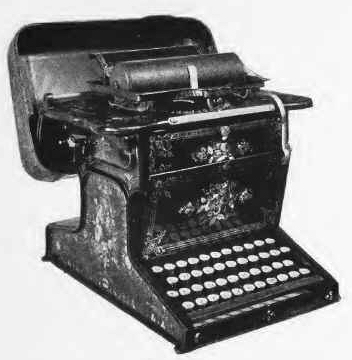
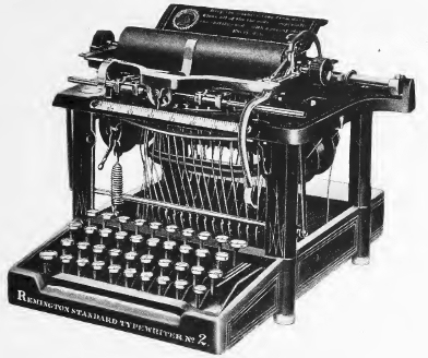
1878: The Remington Standard 2. This typewriter had both upper and lower case, and thus in some senses could be termed the first "modern" typewriter, although as we will see, some later models might have a claim to that title.
It had a lever, rather than a key, for the shift lock function. When that lever was not engaged, capital letters and other shifted characters were obtained with a shift key, the "upper case" key, in the modern position of the left shift key; when it was engaged, the "lower case" key, in the modern position of the backspace key was available to obtain individual unshifted characters.
Although it affected all the keys, not just the letters, and it involved two different shift keys, I still found it somewhat reminiscent of the action of the Caps Lock key on the modern IBM PC and its successors.
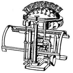
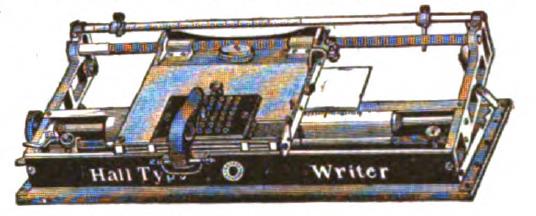
1881: The Hall typewriter, an index typewriter, appears on the market. According to the 1909 book "The History of the Typewriter" by George Mares, a very wide variety of type elements were available for it, thus putting it up there with the Hammond and the Blickensderfer. Its inventor, Thomas Hall, had previously invented a conventional typewriter with keys in 1865.
1883: The Horton typewriter is patented. This typewriter was a Canadian invention, and is recognized as the first typebar typewriter with visible writing. It was of the double keyboard type.
1884: The interchangeable element Crandall typewriter becomes available, slightly preceding the Hammond. The element on this typewriter both rotates and moves vertically to select an individual letter, thus resembling the Selectric more than the Hammond or the Blickensderfer, which moved in one direction to shift, and in the other direction for the specific letter. The first model of the Crandall, but not any subsequent models, also featured proportional spacing, on a four-unit system similar to that later used with the Vari-Typer.
Later versions of this typewriter used a three-bank keyboard. Thus, there were two shifts. Although the type cylinder moved in two directions for typing a letter, this principle was only used in its most elementary form: there were six rings of characters around the element, and two of them were assigned to each shift state.
1884: The interchangeable element Hammond typewriter becomes available (patented in 1881). A later model with a more conventional three-bank keyboard is shown.
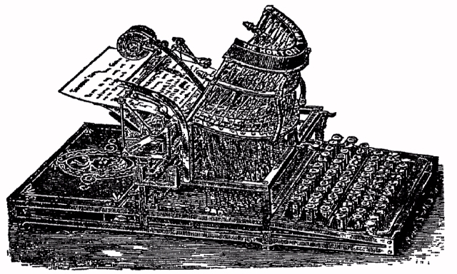
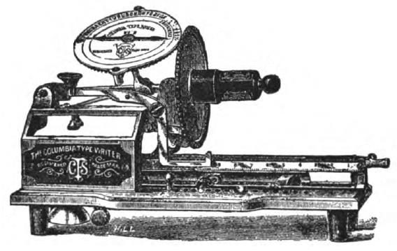
1885: This was the year the Columbia typewriter was introduced. This index machine offered proportional spacing for both upper-case and lower-case. The illustration, however, shows the version with only upper-case; on the dual-case machine, there were two discs next to one another with type in each shift state for printing.
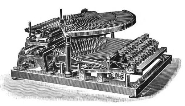
1889: The Maskelyne typewriter, an early model offering proportional spacing, first becomes available; it was produced for several years. The company was named for the typewriter's designer who was also the famous stage magician of that name.
I had not been able to find, anywhere on the Web, an image of text typed by this machine to compare the quality of its work with that of an IBM Executive typewriter or a Varityper.
However, a photograph of a late-model Maskelyne typewriter hosted by the Science Museum Group is at a sufficiently large scale that the characters on the type bars are visible. Also, the original patent for the Maskelyne typewriter provides additional information.
The differential spacing system on the Maskelyne typewriter allowed up to four units per character. It had a three-bank keyboard, with lower-case, upper-case, and figures shift.
Differential spacing only applied to the lower-case shift; all figures and all capital letters were the full four units in width.
From the photograph, the lower-case letters i, j, and l appear to have been two units in width, with f and t being three units wide, and all others being four units wide. Possibly s was three units wide as well, but r was definitely a full-width character.
As for the style of the type, it somewhat resembled Oliver's Printype, or Bookface Academic, or Modern Bold for the Varityper, or Documentary.
However, in the photograph, M, m, W and w all appear to be wider than ordinary characters, so it is possible that the Victoria typewriter in the photograph incorporated improvements over the original design which the patent described.
One other unusual thing about this typewriter's typestyle visible in that photograph is that the letter y shows that the typeface used had very short descenders; no technical reason why this might have been necessary comes immediately to mind.
As I had not been able to find any images anywhere of the actual printing produced by this typewriter, since I now have an idea of what its typing looked like, I feel it worthwhile to share the following image
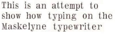
which I have created, based on the information I have, which shows what I think its typing looked like.
This is also the year in which the first Odell typewriter was introduced. This is one of the early index typewriters, although not the earliest.
Pictured at right is one of the double-case models with a shift mechanism that were made later on in the life of the machine, the first ones being only single-case.
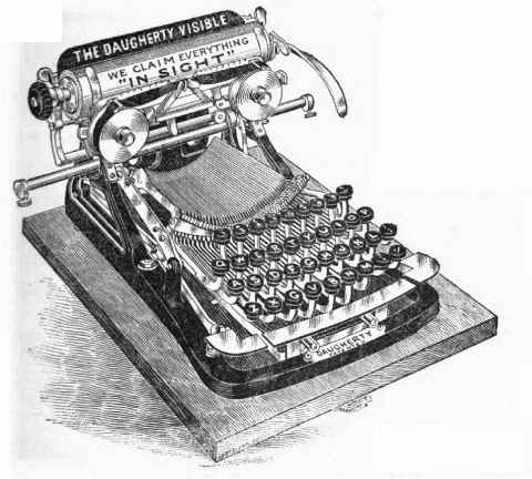
1891: The Daugherty typewriter became available. This was the first typewriter that combined the four-bank QWERTY keyboard arrangement with visible typing. However, the typebars were quite long, leading to poor character alignment.
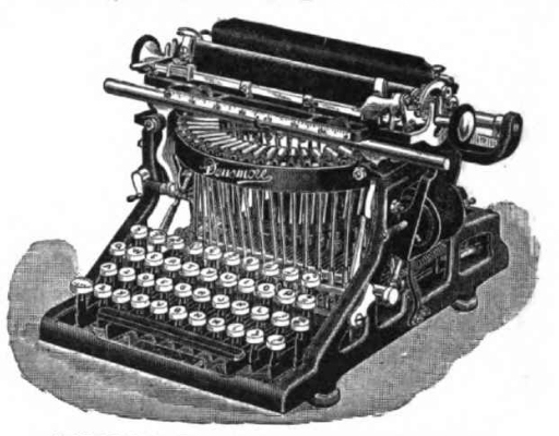
1891: The first Densmore typewriter was introduced; initially, its main special feature was a ligher touch due to the use of ball-bearings. Also, the shift key moved the type basket instead of moving the platen, as became the case generally for modern manual typewriters.
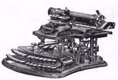
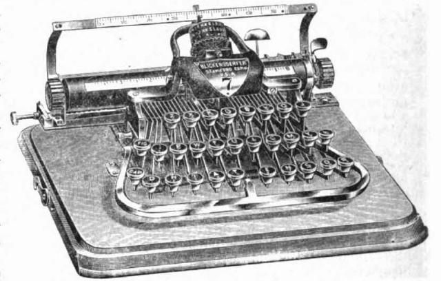
1893: The Blickensderfer typewriter becomes available. This interchangeable element typewriter was quite popular for a while, and many different elements were provided for it, including elements for a large number of different languages. Illustrated below is one of their later models.
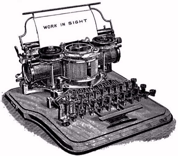
1895: The first Oliver typewriters were sold. These typewriters provided visible typing, and the quality of the text produced was fully satisfactory. Thus, the Oliver typewriter made visible typing a reasonable alternative. One of the later models is shown below:
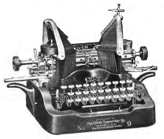
However, the Oliver typewriter did have some limitations. The typebars struck the paper from above. In order to allow the typing point to be visible, they were divided into two groups, to the right and the left of it, but this meant that the typist's view of the line being typed was blocked except for the last few letters that were typed.
The design also meant that the keyboard had to be a three-bank three-shift one instead of a four-bank two-shift one, because the latter would have led to excessively long typebars. On the other hand, there was the benefit that the typebars could strike the paper forcefully, making the Oliver particularly suited to typing mimeograph stencils.
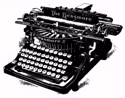
1897: The Densmore 4 typewriter was introduced, which apparently was the first to incorporate the following two modern features: the backspace key, and a shift key on each side of the typewriter so there was one for each hand. I have an image of its immediate successor, the Densmore 5, handy, although the particular specimen shown incorporates a decimal tabulator, the invention of which is the subject of the next entry:
1898: The decimal tabulator is introduced by Remington, originally called the Gorin tabulator, after its inventor.
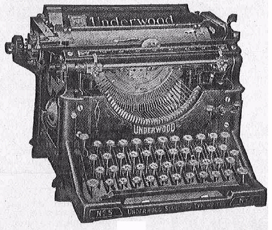
1900: The Underwood Model 5 (preceded by other Underwood front-stroke typewriters from 1895 or so) was a reliable front-stroke typewriter with a light touch. From this point onwards, most manual typewriters subsequently designed and sold would tend to follow the same general design as this highly successful model.
1902: Blickensderfer introduces the Blickensderfer electric typewriter. Despite having (so I have read) a light touch comparable to modern electric typewriters, it was not successful.
1905: Yost introduces the Imperial type style as an option for its typewriters, producing a style of typed text which, although still monospaced, was styled so as to look more like printers' type. Later, Remington would introduce a type style of this kind named Clarendon, and in 1910 Oliver would come out with Printype.
This image shows what the characters of Oliver's Printype looked like; however, it is not made from copy actually typed with an Oliver typewriter, but is instead from the page in an American Type Founders specimen book describing type made in imitation of that typewriter face:
IBM, much later, made similar typestyles available for the Selectric: Bookface Academic, Adjutant/Delegate, and (in some markets) Diplomat. These were previously available for their typebar electric typewriters. European typewriter manufacturers achieved more popularity for their typestyles in this category, both Congress from Olympia and Imperial from Adler.
Of course, while one could get elements for the IBM Selectric that had the appearance of conventional typewriter type, the most popular typestyles for the Selectric were Prestige Elite and Courier. Courier, as well as Scribe, was a typewriter typestyle that was also similar to an "Egyptian" printing type, just as conventional typewriter type was, but in a number of subtle ways was made more stylish and elegant. Prestige Elite, also available in a larger version as Prestige Pica, on the other hand was something that moved from typewriter type in the direction of a print-like character, but instead of going all the way to something that fully imitated printing except for still being monospaced, it went only part way, which could have accounted for its huge success.
Since the classic form of typewriter type had wide serifs in order to achieve a reasonable appearance in monospaced printing, it stands to reason that an improved typeface that still retained such features of typewriter type that helped to improve the appearance of monospaced text, rather than one that fully imitated printer's type which did not have that issue, and thus which incorporated no features to deal with it, might be preferable.
And, incidentally, in addition to making monospaced type that imitated a conventional typewriter, typefounders also made "mailing list type" which was monospaced for faster setting but made to look more like ordinary type.
This is also the year in which the Mignon typewriter was introduced:
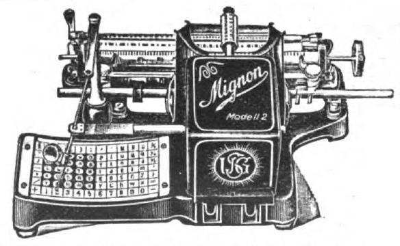
This is a typewriter of the index type, a kind of typewriter which I have basically ignored on this page and elsewhere on this site. It is unusual in that it was introduced at this relatively late date, and yet was quite popular, but its popularity can be accounted for by its extreme portability.
As can be seen from the image, the Model 2 version of this typewriter, rather than the original one introduced in 1905, is pictured. However, the image comes from a magazine published in 1906, and so it does not represent a much later version of the typewriter than the original. (Unless, of course, the reluctance of people to buy version 1.0 of any software product had its counterpart in those days, leading to the Model 2 being the original version released... but it's more likely that some important feature was added shortly after it was first sold.)
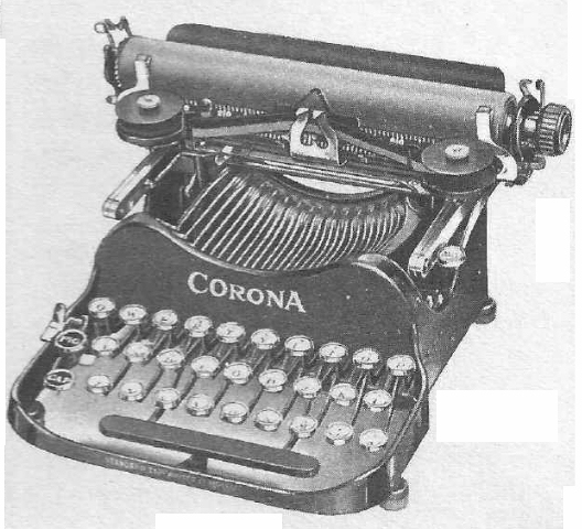
1906: The Corona folding typewriter, a three-bank typewriter that was the first portable typewriter (well, at least if one does not count index typewriters, such as the one noted just above).
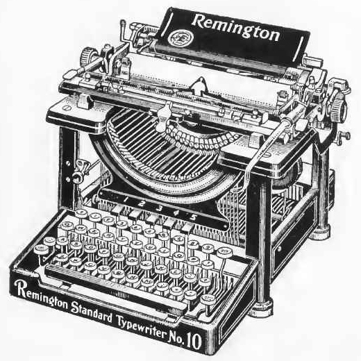
1908: Remington finally introduces the Model 10, accepting the victory of the visible front-stroke typewriter.
1925: The Remington Electric typewriter is introduced. This typewriter was not successful, but it worked on the same principle as later typebar electric typewriters, using a roller to catch the typebar mechanism when a key was depressed.
The 1925 Remington electric typewriter already used the modern electric typewriter arrangement of symbols on the keys, so that characters that were small, like quote marks or the underscore, were grouped together on the same key, so that those keys could be made to strike with less force, regardless of whether or not the shift key was pressed, and that would suffice to ensure all characters were typed with the right amount of force.
Despite this, some later electric typewriters from manufacturers other than Remington and IBM used the manual typewriter arrangement of characters.
1929: North East Electric, the supplier of the electric motor for the Remington Electric, makes its own electric typewriter, the Electromatic. This model was a success.
1933: IBM purchases North East Electric. However, the purchase did not include the rights to a version of the Electromatic that worked automatically from paper tape; these first went to Commercial Controls Inc., and were later purchased by Friden, and that machine was known as the Flexowriter.
1944: IBM brings out the proportional-spacing Executive typewriter. Commercial Controls Inc. offered the Justowriter, which employed the same proportional-spacing system as the Executive typewriter, from at least 1946, which implies that an amicable licensing relationship between IBM and the Flexowriter existed.
1947: The Coxhead DSJ, derived from the Hammond typewriter, adds the ability to type with proportional spacing. It could also produce justified columns on a second typing, which feature had also been available for monospaced typestyles since 1937. The machine would later be known as the Vari-Typer. However, variable line spacing would be added later; some sources give 1953 as the year for that, and others give 1951.
1961: IBM introduces the Selectric on July 31, 1961 (or, according to some sources, July 23, 1961), which appears to have been the first single-element typewriter that could hold its own in competition with the descendants of the Underwood Model 5, which accounted for its huge success where other single element typewriters had been forgotten.
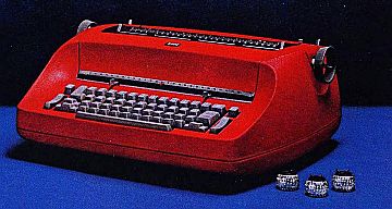
Here is a photograph of the original IBM Selectric typewriter, along with some elements, from an early advertisement.
However, as it is claimed the Blickensderfer Electric also had a light touch, if that truly was the case (having used even the most advanced electric Vari-Typer, I can attest they were not comparable to either a Selectric or a conventional office manual for typing), either having a three-bank keyboard instead of a four-bank keyboard was a major issue, or offices simply weren't ready for electrical equipment back in 1902 - which is entirely possible.
Also, at least one Selectric typewriter may have been delivered to a customer prior to that date: the STRETCH computer was delivered to the Los Alamos Scientific Laboratory in April 1961, and LASL completed its acceptance testing of it in May 1961; the console printer of the IBM 7030 had a Selectric mechanism, and this was true of the initial STRETCH as well, at least for most of its life.
1964: IBM produces the Magnetic Tape Selectric Typewriter, sometimes abbreviated MT/ST. This records the text of documents on small reels of perforated magnetic tape. Although Flexowriters had previously been used for allowing typed documents to be edited, from punched paper tape, this machine is often considered to be the first word processor.
1966: IBM introduces the Selectric Composer, a machine based on the Selectric mechanism, but which is designed to produce typeset copy. Its feature set was similar to that of the Coxhead DSJ, except that the Selectric Composer could have only one element installed at a time, while two type shoes could be placed in a Vari-Typer (as the Coxhead DSJ was later known). However, the proportional spacing of a Vari-Typer was based on a four-unit system, while that of the Selectric Composer was based on a nine-unit system: thus, the Vari-Typer produced copy which, like that from an IBM Executive typewriter, although being proportionally-spaced, could not be mistaken for conventional typeset copy, while the copy produced by a Selectric Composer was very close to regular typesetting in appearance.
1967: IBM produces the Mag Tape Selectric Composer, applying the technology of the MT/ST to typesetting.
1969: IBM introduces the Mag Card Selectric, which edits documents on magnetic cards the same size as an 80-column punched card.
1971: IBM brings out the IBM Selectric II typewriter, for which dual-pitch operation, switching between pica and elite operation with a lever, is an available option.
1972: IBM produces the Mag Card Executive typewriter, which offers proportionally-spaced typestyles on a Selectric ball element. The proportional typestyles had the same names, and the same general appearance, as those that would later be offered on the Electronic Typewriter 50, 65, 85, and 95.
As a result, I had originally assumed that its spacing was based on a unit of 1/60", to allow it to also use conventional Pica and Elite elements. But in fact, the spacing of text typed with the Mag Card Executive differs from that of text typed with the later Electronic Typewriter models using 96-character elements (the Mag Card Executive used an 88-character element). Apparently, it took the 1/72" unit size from the previous Selectric Composer, and it could only type with proportionally-spaced elements.
1972: The first daisywheel printer, the Diablo HyType, is commercially available.
1973: IBM introduces the IBM Correcting Selectric II, which adds the built-in capabilty to use a correction tape.
1974: IBM introduces the IBM Memory Typewriter, which edits documents in an internal memory instead of using magnetic media.
1974: Olivetti introduces the Olivetti Lexikon 82 typewriter. This portable typewriter has a moving carriage, but uses a typeball element similar in appearance to, but not compatible with, the typeball of the IBM Selectric.
1975: IBM applies the technology of the IBM Memory Typewriter to the similar in appearance IBM Electronic Selectric Composer.
1976: The Diablo 630 daisywheel printer, which was very successful and popular, was introduced.
1976: Olivetti introduces the Lexikon 90 office typewriter, which is a single-element typewriter like the Selectric, but which uses an element different in appearance (nicknamed a "pineapple" instead of a "golfball") and which has a moving carriage: this typewriter actually came out after, and not before, the Lexikon 82, and thus apparently the difference in the appearance of the element was not due to the need to avoid any IBM patents.
1977: The Xerox 9700 laser printer is offered for sale. This is a large and expensive device, for use with mainframe computers. It printed at 300 dpi, providing letter-quality output.
1978: Vari-Typer direct impression machines based on the Hammond typewriter cease to be produced. The company continues to make phototypesetting equipment.
1978: IBM produces the Mag Card Selectric Composer.
1978: IBM introduces the IBM Electronic Typewriter, the first device to use a modified Selectric element with 96 instead of 88 characters. Of the two initial models, the Model 50 offers proportional spacing, using many of the typestyles previously offered on the Mag Card Executive.
Incidentally, although the IBM Electronic Typewriter Model 50 used a seven-unit system of proportional spacing, instead of a nine-unit system as did the Selectric Composer, the gradations of spacing between letters in its typestyles were not all that much coarser than those of Composer fonts. Instead, its primary compromise was further limiting the maximum width available for a character than the Selectric Composer already did: if one compares the widths of letters in Selectric Composer fonts to those of fonts used in normal typesetting, for example Monotype Times Roman, the letters M, m, and W should have been eleven units, rather than nine units, in width on the Selectric Composer to be in proper proportion.
1980: IBM introduces the Displaywriter, an 8086-based word processing system for smaller offices.
1980: Brother Industries produces its first electronic office typewriter using a daisywheel.
1984: IBM introduces the Wheelwriter and Quietwriter, daisywheel and thermal transfer ribbon typewriters. The Quietwriter had 40 electrodes on its printhead, and it printed characters with a vertical resolution of 240 dpi, so the printhead covered the full typing line of 1/6 of an inch; its horizontal resolution was 360 dpi.
1984: Hewlett-Packard introduces the LaserJet, based on a laser printer mechanism from Canon. This was the first desktop laser printer for personal computers, and printers of this type, as they became even more affordable, would end up doing to the typewriter what the pocket calculator did to the slide rule.
This chronology outlines items which I find to be of importance, given my views on the subject of the typewriter.
On at least one typewriter collecting site, I found sentiments deploring the fact that after the Underwood Model 5 came out, most typewriters by other manufacturers eventually became very similar to it. It's not unreasonable to find the lack of diversity unfortunate, from that point of view. But it also needs to be remembered that typewriters weren't made to be antiques for people to collect; they were made to help people get work done in offices, and, later, at home as well.
Having typed on a Vari-Typer myself, I know that there simply is no comparison between one of those and a conventional manual typewriter in good repair; the latter allows easier and faster typing by far. And, thus, while one can regret the passing of the Hammond and the Blickensderfer and so on, one can't really blame anyone for the fact that it didn't happen differently.
And, while one could interpret some early IBM advertisements for the Selectric typewriter as suggesting they originated the single-element typing principle, one must take into account that they could not have used the names of competing firms in promoting their product. After all, in 1961, the Vari-Typer, a descendant of the Hammond, was still being made.
Numerous books as well as web sites on typewriter collecting have been somewhat critical of IBM in this matter, essentially denying that the IBM Selectric typewriter manifested much in the way of originality.
And I strongly disagree with this view.
Given what the Underwood No. 5 did to the typewriter landscape, it should be clear what the nature of the accomplishment for which IBM deserves credit is: they had both the technical competence and the courage to take what were undoubtedly improvements in the typewriter, both single-element typing (in the Selectric in 1961) and proportional spacing (in the Executive in 1944), that were tried in the past, but were discarded due to an inability to match the quality, reliability, and performance of the Underwood No. 5; and to make these improvements available again, but in an embodiment sufficiently practical to use that they would be acceptable to a marketplace that insisted that any typewriter, to be acceptable, would have to be as good as the Underwood No. 5 in the areas where it excelled.
That is what the Selectric had that the Blickensderfer didn't. That is why it succeeded when other single-element typewriters were long-forgotten antiques and curiosities. It faced an age that didn't value the ability to change type styles enough to give up speed and convenience, and it met the challenge offered by the demands and habits of the business world on its own terms, without excuses.
I do think that a Crandall or a Hammond or a Blickensderfer is deserving of an honored place on the shelves of a typewriter collector, but so is a Selectric, even if it is less of an antique and thus easier to find. It has its place in history, and it is also deserving of honor rather than dismissal.
One other note, an amusing one, on the IBM Selectric typewriter.
In this advertisement for the IBM Selectric,
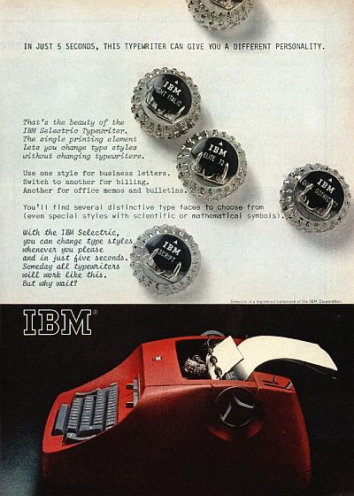
this immortal line was used:
Someday, all typewriters will work like this. But why wait?
When IBM's patents expired, there were a number of other typewriters that used interchangeable elements, from Facit (1850), Adler (SE1000), Olympia (SGE 75), Brother (Correct-O-Ball, XL-1, Super 7300), Olivetti and Hermes (808), among others. But those typewriters did not supercede their typebar models, and before they became particularly common, daisywheel typewriters did replace both them and typewriter models.
So, while a time did come when all typewriters being newly made had interchangeable elements, they were daisywheel elements, not golfballs similar to that of the Selectric.
Two companies made clones of the Selectric which could use Selectric elements: Remington made the Sperry Remington SR101, and Silver-Reed made the 225 and 225C; the Silver-Reed tyepwriter used 88-character elements, but was an electronic design, such as IBM introduced for 96-character elements.
The other makers of single-element typewriters inspired by the Selectric had their own styles of element. Most resembled the Selectric element, but with minor differences. Olivetti both made the Olivetti Lexikon 82 and 83 for the home which had an element resembling the Selectric element except with a slider instead of a lever, and office typewriters, the Olivetti Lexikon 90, 91, and 92 (or 90C, 91C and 92C for the ones with correction tapes) which used an element which was considerably different, as it rotated vertically and tilted horizontally, and with detents between columns of characters instead of teeth at the bottom (or, in this case, the side) of the element.
However, another IBM design did achieve universal success.
The IBM System/360 Model 195 computer added cache memory to a design including a floating-point functional unit that used the Tomasulo algorithm, equivalent to register rename, for out-of-order execution. Much later, the Intel Pentium II microprocessor combined cache and full out-of-order execution (again, only in the floating-point unit), and today, except for a few processors aimed at very low-power operation, nearly all microprocessors, even those in smartphones, combine cache and out-of-order execution.
So they could then have said "Someday, all computers will be made this way"... but, of course, the 360/195, costing several million dollars, was not a product aimed at the general consumer, so it would not have been advertised quite the same way.
Incidentally, while Seiko advertised its earliest quartz watches with "Someday, all watches will be made this way", long after 1961, I am sure this particular line was old even in 1961, but I haven't been able to track down the first advertiser to use it.
As we have seen, the ordinary typewriter type that printed at ten characters to the inch was termed "pica type", as it was printed at six lines to the inch.
Elite type prints at twelve characters to the inch... even if, as noted, originally it had a somewhat finer spacing of twelve and one-third characters to the inch. Although it, too, is printed at six lines per inch, given that its size is in a ratio of 10:12 to pica type, one could think of it as, therefore, being 10 point type, the old name for which was "long primer".
In addition to Pica, we've encountered a typewriter type style called "Great Primer". This was the old name for 18 point type. Originally, Remington produced type of this name at a pitch of 9 1/4 characters per inch; much more recently, type so named was provided by IBM for its electric typewriters at 9 pitch.
A 9 pitch typewriter typestyle puts three characters in the space of four characters of a 12 pitch typewriter typestyle, so instead of being 1 1/2 times as large as 12 point pica type, it's 1 1/3 times as large as 10 point elite type. The old name for 14 point type is English, which is obviously confusing; one could use, instead, Gross-text, Mittel, or Mediaan, I suppose. Or Augustijn, according to another source, although I see that more commonly given as a name for 12 point type. And there isn't an old name for 13 point type, let alone 13 1/3 point type. Ironically, Remington did have, in addition to Great Primer, another type style named Medium, but that was also 10 pitch rather than 9 1/4 pitch.
In doing a web search to find if anyone ever gave a name to smaller-sized type, such as 16 pitch type as was provided by a Royal manual typewriter I once owned, or the more common 15 pitch type that many daisywheel typewriters could produce, I found two names.
One was Mikron, which is actually the name of a specific typestyle produced by Olivetti.
The other was agate, found from several sources, and apparently all copied from the same place, perhaps a Wikipedia entry. Agate, though, is the old name for 5 1/2 point type. Since 15 pitch type is two-thirds the size of 10 pitch type, it is presumably 8 point type, for which the old name was Brevier. As a brevier or breviary is a type of religious book, thus creating an uncomfortable or sensitive association, while the use of the word "agate" in connection with printing is familiar from discussions of newspaper classified ads (although they are printed in a somewhat larger type size than 5 1/2 points these days), this misnomer is understandable.
If a lesser inaccuracy is acceptable, Minion is 7 points, and Bourgeois is 9 points. However, an alternate English-language designation for 8 point type is Small Text, which should be acceptable.
However, while my web search turned up examples of the claim that this size of type was named agate, it turned up no actual examples of such a usage, so, at the moment I tend to regard this not as a misnomer but as an Internet legend: somebody said something, and others quoted it without checking to see if it had a basis in fact.
Still, for some, "agate type" is simply synonymous with "small printing", without worrying about how small, so perhaps someone somewhere did apply the term "agate" to 15 pitch type. However, a search failed to turn up even so much as, say, a column for InfoWorld by John C. Dvorak about printers with such a usage, let alone a brochure from a daisywheel typewriter maker so doing.
And the old name for 11 points is Small Pica, with Philosophe as an alternate, which might approximate the size of 11 pitch type, which IBM and others offered for those who wanted something smaller than 10 pitch Pica, but found 12 pitch Elite to be a little too small.
The daisywheel typewriters with which we are most familiar in the English-speaking world were based on a unit of 1/60 of an inch, so as to be able to handle both Pica and Elite type.
An inch is 2.54 centimetres, so one-tenth of an inch is 2.54 millimetres. And one-twelfth of an inch is 2.116666...667 millimetres, which rounds to 2.12 millimetres.
As noted, some European companies used 2.5 mm for Pica, and 2 mm for Elite.
But quite a few other sizes for type have been used.
In inches, we have the following (and probably many others):
Pitch        mm
 6 1/4       4.06
 8 1/2       2.99
 9           2.82
 9 1/4       2.75
10           2.54
11           2.31
12           2.12
12 1/3       2.06
15           1.69
16           1.59
and I have provided their metric equivalents, rounded to 1/100 of a millimetre, so that these inch-based sizes can be separated out from metric sizes.
Some European typewriter makers simply used the inch-based sizes of 2.54 and 2.12 millimetres. Some used the strictly metric sizes of 2.5 and 2 millimetres.
A scholarly article on identifying the typewriter on which a document is typed for purposes of criminal investigation listed many other character widths that have been used.
A wide variety of other (presumably) metric sizes - 2.1, 2.2, 2.3, and 2.6 millimetres in addition to those listed above were noted.
Other sizes recorded are 2.17, 2.23, 2.25, 2.35, and 2.53 mm. Whether these are exact metric sizes, or approximations to a size based on the inch, I am hesitant to say, but at least I can try to divide them into an inch of 25.4 mm and see what comes out...
mm      pitch
2.53    10 1/25
2.35    10 4/5
2.25    11 13/45
2.23    11 2/5
2.17    11 7/10
None of them seem to be sufficiently close to any particularly obvious pitch expressed in characters per inch to suggest that any of them were based on the inch. Presumably, then, these were all sizes chosen for esthetic reasons - just as 11 pitch was offered by some typewriter makers because 10 pitch seemed too big, and 12 pitch too small, and so perhaps 11 pitch would be "just right", perhaps other typewriter makers would have picked 2.23, 2.25, or 2.35 mm as their Goldilocks size.
On the other hand, 2.53 - and 2.55 - are so close to 2.54 that perhaps some manufacturers, while not objecting to the size of pica type, saw no need to accurately define the width of their letters in terms of that exotic unit, the inch, and found tooling for 2.55 mm or for 2.53 mm simpler to achieve.
And presumably 2.17 mm was an attempt to improve Elite by moderating its size to something just a bit larger without going to something between Pica and Elite. It could have been 2 1/6 mm rounded off, even if inches are more commonly divided into fractions than metric units.
The metric small size of 1.5 mm is very close to one-seventeenth of an inch. Seventeen such characters occupy 25.5 mm instead of 25.4 mm. I suppose, then, one could imagine a typewriter maker deciding that instead of using 2.5 mm for pica, making pica equal to ten characters per a typewriter inch of 25.5 mm, although the fact that 2.55 mm is an even multiple of 0.05 mm is probably a far more likely reason for that to have been used for pica in a country using metric measure.