The addition of a 1/90" escapement suggests another possibility.
IBM made a line of typebar typewriters offering a relatively coarse and simple form of proportional spacing, the IBM Executive typewriters.
These typewriters had different escapement widths depending on the size of the typestyle provided; the escapements used were 1/32", 1/36", and 1/45".
1/32" is three times 1/96"; 1/36" is two times 1/72"... and 1/45" is two times the new width of 1/90".
So the thought comes to mind of putting these typestyles on Selectric elements, and adding them as possible options.
However, this runs into difficulties.
Characters on the IBM Executive typewriters could be from 2 to 5 units in width.
Five units at 1/45" per units is 1/9", or (6 2/3)/60", in width, which is no problem. However, 1/45" was the unit size for Text and Charter, which were small-sized typestyles.
Five units at 1/36" is ten units at 1/72".
This requires special elements that support wider characters, but this increase in maximum width was already made available by the strategies discussed in the previous step.
But what about five units at 1/32"? That is fifteen units at 1/96". Six units at 1/32" are one and one-half times 1/8", or 9 units at 1/72", so since half of the empty column which is the scheme used in the previous section is available, this should work as well.
But while there may be enough space for the required character width in the column next to the one left empty, there is another issue.
M, m, and W are 5 units wide in several IBM Executive typestyles; in some, m is only 4 units wide.
But some of the special characters are also 5 units wide in some of those typestyles. As one might expect, @ is 5 units wide in three typestyles; Mid-Century, Charter, and Text. In Mid-Century, % is 5 units wide as well.
As it happens, Mid-Century uses a 1/36" unit, and Charter and Text both use the smallest 1/45" unit.
Unfortunately, though, Arcadia, which uses a 1/32" unit, and which therefore must be accomodated with a provision for its widest characters, allocates 5 units of width to the & character.
Thus, five keys on the typewriter keyboard would seem to have to be allocated to the wide column on the element: M, W, @2, %5, and &7, since a 5-unit character in a typestyle with a 1/36" increment still requires a wide space.
A full omitted column gives a great deal of extra space; dividing that column into two pieces, so that eight characters in each shift would have an empty half-column next to it would provide more flexibility.
As well as requiring space on the element for several extra-width characters, the fact that the various Executive typestyles had a number of different spacing arrangements means that a more convenient way of accomodating this than using a two-digit font code with the CODE key, as was done on the Electronic Composer, would be helpful. At present, I'm thinking in terms of a typestyle lever, on the right side of the keyboard, with the typestyle number showing through a window to the right of the keyboard, and the lever being below the keyboard, somewhat in the location of the power switch on an IBM typebar electric typewriter.
The typestyle number would be printed on the element to the right of the symbol.
This would also allow different spacing arrangements for improved versions of the Selectric Composer typefaces.
In addition, this would allow use of the original elements for the Mag Card Executive; set the symbol to a circle, set the escapement to red (1/72"), but also set the typestyle lever so that a different unit system is used. (This, in fact, goes somewhat against the general philosophy of the use of the typestyle lever, as major changes in how many units wide the characters are normally result from selecting a different symbol shape, but it seems an economical way to allow for handling something rarely used.)
To avoid the need for radical modifications of the printing mechanism, such as the following sections would require, however, the fact that it is necessary to indicate the different spacing for some Executive typestyles such as Arcadia means that there is no real reason why this indication could not also be used to indicate a different arrangement of characters on the element. Thus, the simplest expedient for wide characters, a 96-character element with one unused column of characters on each side, would be an option.
There is another reason why additional extra-width characters are needed. The Electronic Composer permitted the use of elements with the Russian and Serbian scripts.
On the Russian element, wide characters were on the keyboard positions for em-dash/hyphen (on a Composer) or _/- (on a typewriter), I, O, H, 1/2/[ (on a Composer) or "/' (on a typewriter), and V. On the Serbian element, the wide characters are in the positions for W, H, and M, so it creates no additional issues.
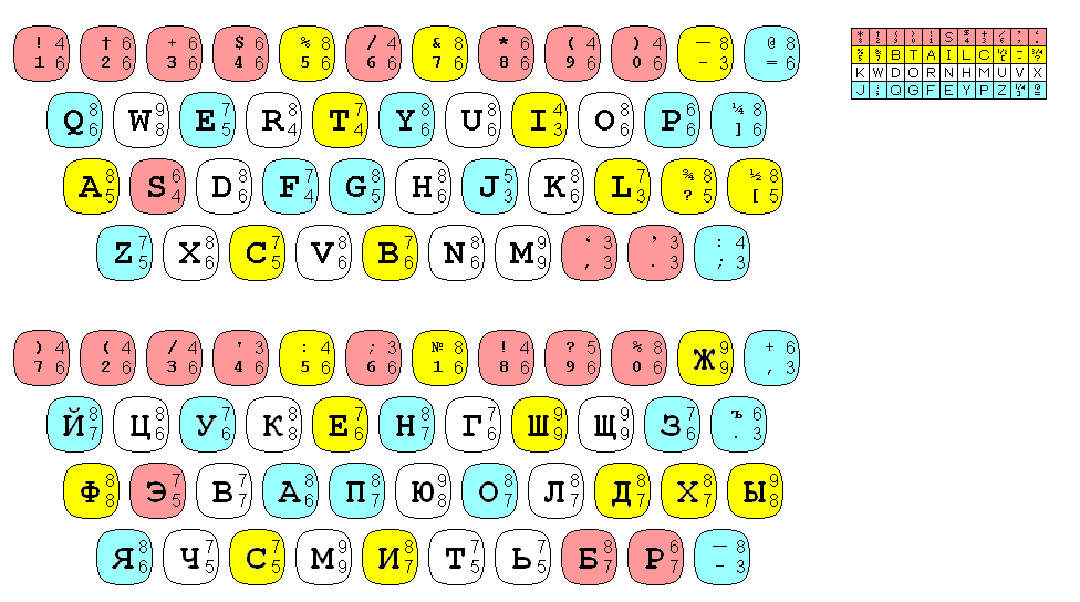
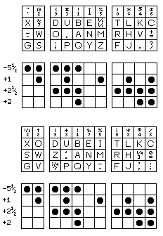
Having now located a source for information on the character widths for the Russian-language Composer elements, my reconstruction of them is as follows:
The corresponding keys, and widths, are shown for both United States English elements and Russian-language ones. In the case of the conventional elements, the characters in the narrowest band on the element, shown in pink, are never more than 6 units wide, and characters that are 9 units wide are only on the widest band, shown in white.
As far as I can determine from my reconstruction of the Russian element, however, three 9 unit characters are allowed on the band shown in yellow, and two characters as wide as 8 units is on the narrowest band, shown in red.
This is odd, as it appears that could have been avoided. It is, however, possible that there are errors in my reconstruction.
But while I had initially thought in those terms, such an element would have the notches between teeth in the middle of a character, instead of between characters, in some cases. However, given that the use of both 88-character and 96-character elements has led to the actual rotate detent being located on the rotate shaft, rather than using the notches between teeth for that purpose, it is not necessary for elements only usable on this new design to be fully notched.
Even with eight positions for wide characters, given the number of positions reserved, in the typewriter case, for the Executive, and in the Composer case, for languages with Cyrillic scripts, at least slightly different arrangements for the two kinds of typestyle are needed. One possible way to put characters on such elements is shown below:
But if the gap between some columns, in order to make room for extra wide characters, is reduced to one-third of a column in width, so that in addition to two gaps within each of the shifted and unshifted characters, there is also a gap between them, then there are twelve positions for wide characters, and this does allow a single arrangement by which the keys on the keyboard correspond to the positions on the element to suffice:
In addition, a 1/66" escapement could be added. IBM made some typebar typewriters with 11 pitch typestyles, on the basis that this represented a nice compromise between 10 pitch Pica and 12 pitch Elite.
Purple could be used as the color for the 1/66" escapement.
Since a unit of 1/66" is too large to be used for a typeface using the Selectric Composer nine-unit system to fit on an ordinary lever element with four bands of characters, such elements made for the 1/66" escapement should also have the typewriter arrangement of characters rather than the Composer arrangement.
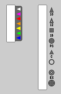
By this point, the Escapement Lever and the Pitch Selection Lever have grown to something like what is shown on the right.
In addition to 10 pitch and 12 pitch, which take 6 units and 5 units per character respectively, 15 pitch, at 4 units per character, indicated by a solid square, is added.
As well, in addition to the 7-unit system of some models of the Electronic Typewriter, and the 9-unit system of the Electronic Composer, an open circle indicates the 5-unit system of the IBM Executive. A double circle indicates two Composer units are used to make an Executive unit: 1/36" is made from two units of 1/72", and 1/45" is made from two units of 1/90". A triple circle instead indicates three units are used: 1/32" is made from three units of 1/96".
The single circle would normally only be useful for elements with superscripts and/or subscripts.
One typestyle available for IBM Executive typewriters was Directory, however. It used the 1/32" escapement, like Documentary and many other normal-sized typestyles. However, Directory was a condensed large-size typestyle, somewhat comparable to Orator. Unlike Orator Presentor, which had lower-case instead of small capitals, Directory had lower-case with normal descenders instead of very stubby ones.
This would appear to require something considerably more radical than a 96-character element with two half-columns of characters omitted. Possibly not, though, for two reasons: a conventional element can handle Orator, and, now, the bottom of the element no longer has a complete set of notches. The P and Q have been located on the element so that the one notch that would be kept, to lock the position of the element to the gears below performing the actual rotate detent function, is between them, with their descenders away from that notch.
At this point, however, it seems reasonable to omit that particularly difficult typestyle from the list of those that would be provided.