The IBM Selectric typewriter was introduced in 1961. The Diablo 630 daisywheel printer came much later, in 1980. Printers based on the Selectric mechanism could print at about 15 characters a second, while 30 characters a second was a typical daisywheel speed.
Because nothing like the Selectric Composer was ever built using a daisywheel, I had looked at a "perfect" typewriter as being able to use the existing print elements for various devices based on the Selectric. However, as we've seen, the size of the element strictly limits the number and size of characters that may be placed on it.
A "perfect typewriter" ought to be a convenient device for producing the desired type of text document. If typefaces like those of the Selectric Composer are going to be included, then it is likely that it will be desired to include occasional italics, and perhaps even boldface, in text.
Going to a daisywheel removes (or, at least, considerably relaxes) constraints on the number of characters that can be provided, and their size.
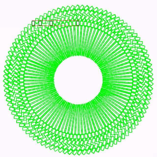
Here is a crudely drawn image of the kind of daisywheel I envisage adding:
Many daisywheel printers had larger character sets than the typical 96.
One achieved a set of 192 characters simply by going to 192 petals, and Qume had a daisywheel with 130 characters on 130 petals.
The Diablo 630 ECS printer placed one character above the other, requiring the daisywheel to move down to access the outer ring of characters, so keeping the number of petals at 96.
The same method was used in daisywheel printers made by Ricoh which were sold by Radio Shack, but here there were only 64 petals, for a set of 128 characters. And the thimbles in the NEC spinwriter also had 128 characters, again two to a petal.
One printer - the name of which I do not recall - had two rings of characters, but with the characters in the outer ring sloped, so that the daisywheel would be moved horizontally, in the same direction in which it moves during printing to advance along the paper, to access the characters in the outer ring.
The black rectangles in the diagram above show that I propose to extend this principle to allow four rings of characters. And, because the spiral pattern of printing faces on the daisywheel creates something of an optical illusion, there are red horizontal lines in the diagram to help make it clear that not only are the four rectangles all oriented vertically, but they are in a horizontal line.
In this way, a single daisywheel can contain a normal Roman character set of 96 - or just 88 - characters in the inner ring, italics on the next ring out, boldface (real boldface, not bolding created by displacing the printhead slightly and overstriking) in the one after that, and small characters plus an assortment of special characters in the outermost ring.
Being able to mix associated styles like that without constantly changing elements, while it might seem to be overkill for a mere typewriter, is a natural for something that intends to use the printing typefaces of the Selectric Composer.
A daisywheel such as that illustrated above is not the only option, however, for a printing element offering a larger selection of characters than a normal Selectric element.
In the event that an element with two empty half-width columns on each side did not solve the issues associated with the space required for wider characters, I had considered another approach.
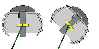
A Selectric element is inserted into a typewriter by being placed on a round post. This post extends slightly above the top of the main portion of the element, with a small part with a groove around it extending into the cap of the element, where a spring can grip the post by the groove to hold the element in place.
This arrangement means that it would not be workable to just make a larger element of the same kind, since then the groove by which the element is held to the post would be buried and unreachable; a complex mechanism in the element to reach it within the element, while possible, could hardly be seen as advisable. However, if the lever were replaced by a slider, such as used on the elements for the Olivetti Lexikon 82 and 83, or the Brother Correct-O-Ball/Super 7300, having the place where it grabs the post moved down would not need to add too much complexity. In fact, this might be simpler than the first idea I came up with, as described below, except that adding an extra row of characters at the top of the element now shrinks the area available at the top of the element, so that a button instead of a slider remains preferable.
If, however, another way of holding the element in place were used for a new kind of element, the problem that the top of the post wouldn't be accessible in the same way with a larger element would cease to be an issue.
The idea I came up with was to have a hole in the center of the post. A rod, with an area that could easily be gripped, which was hollow, with a plain rod within it would go into that hole.
A button on the top of the element would be used to push the plain rod down to release the catch holding the outer rod.
This would allow the construction of a larger element which still has the same diameter as a conventional Selectric element. It would be larger by having room for bands of characters at 32 degrees South latitude and 48 degrees North latitude in addition to the existing bands of characters on normal eacrlements. Since the room available for characters at 48 degrees North latitude would be smaller than for any of the pre-existing bands, I envisaged that half the character positions would be left unused on that band.
With the same diameter, no changes would be required to the force and velocity of the impact of the element on the paper. Of course, the mechanism would still need to change, as the element would now be more massive.
On a Selectric typewriter, the post holding the element normally has a collar around it located inside the element, and rods holding the collar at its edges push the element towards the paper. This would no longer be possible with the ability to use elements that have a greater angular extent in "latitude".
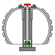
Here is how the existing elements work:
And here is a diagram of the new kind of element I'm thinking of:
Instead, the post holding the element would need to be held in a cradle at a point below the element, and the rods going to the collar would be replaced by rods connecting to the cradle beside the element, again located across from the center of the element.
|
However, such a cradle would either have to be so large as to make it difficult to position the element precisely, or it would have to fit within the limited space around the element allowed by the ribbon cartridge, which is a particularly serious concern if it is desired to continue using the existing standard form of ribbon cartridge. Perhaps it would be much simpler to allow the post on which the element is mounted to move vertically instead of tilting, as well as rotating. In this way, an element of cylindrical shape could be used as the alternative larger element, and far less difficulty in having it fit into the space available would be encountered. |
This change would be needed even for some apparently modest changes to the element. If the teeth on the bottom of the element are not used for the rotate detent, in order to improve safety in interchanging both 88-character and 96-character elements on the same machine, the idea of just adding a row of characters on the bottom of the element where the teeth were, inspired perhaps by the Olivetti Lexikon 92 and 93, might be considered. While the space occupied by the surface of the element on the sphere would only be increased slightly, however, the element still would have to tilt through a larger angle to allow the use of the characters on the bottom row, and this is what would most seriously interfere with the use of a collar situated inside the element.
With five and a half bands of characters, if there were 48 columns of characters as on a conventional 96-character element, one could place three sets of 44 characters on an element. Therefore, if it is instead desired to put only 88 characters on the element and not 132 characters, there would be ample room to provide as many extra-wide characters as might reasonably be desired.
Furthermore, since this design of an element, as opposed to the standard one with a spring holding the groove at the top of the post, pushed apart by a lever, decouples the top of the post and the permissible location of the top of the element, spherical elements of greater diameter become a possibility.
|
However, since the platen only curves away from the element in the vertical direction, since what limits how close characters can be placed together on an element is not their side by side distance, but their distance away from the paper, the number of columns of characters that could be placed on an element would not be proportional to its circumference. On the other hand, it wouldn't be constant, independent of diameter, either; if you have 22 columns of characters on one element, and then on another twice as large, now the adjacent characters are twice as far away from the paper. But if you tried doubling the number of columns, adjacent characters would only be half as far away from the paper, since for short displacements, distance from the paper is proportional to the square of the horizontal displacement (because the shape of a circle is similar to that of a parabola for small angles). Thus, instead of being proportional to the square of the diameter, the number of characters possible on a partly-spherical element of constant shape appears to be approximately proportional to the diameter times its square root. Thus, except for larger sizes of character, it looks like larger spherical elements are not a good idea, and a daisywheel is the best way to provide a larger assortment of characters on a single element. |
This diagram
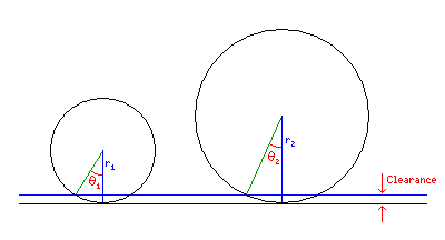
may make the issue clearer.
|
The circles represent two different sizes for a spherical element. The black line at the bottom of the diagram represents not the surface of the platen at rest, but the ultimate position where the element in printing comes to rest on impact. The blue line represents the area where, preceding this position, due to there being "give" in the rubber platen itself, and in the ribbon, and in the paper being typed upon (which may be several sheets with carbon paper interleaved, or, for that matter, it could be chemically-impregnated paper for "carbonless forms", a technology sometimes informally called "NCR paper" as it was the National Cash Register company that pioneered that technology), there is some danger that adjacent characters on that element that project this far forward could create a spurious mark on the paper. Thus, the circle represents where the characters reach, not the base surface of the ball out of which they rise. The required angle between characters, shown as theta in the diagram, is related to the radius of the element (r) and the required clearance X by the formula X = r * (1 - cos(theta)) as can be seen from the diagram. Of course, the diagram is simplified, as it doesn't take into account that the front of a character on the element is an extended flat area, leading to a slightly larger required angle than shown. |
Disregarding the issue that larger elements require more space between adjacent characters, at least horizontally, for the moment, if an alternative set of cams to govern the impact velocity and duration were provided for larger elements, an element with a diameter only one and one half times that of a conventional element would have room for as many as six sets of 48 characters (the enlarged element would have nine bands of characters instead of six, and the top two bands would have to have half the positions left empty, so in effect it would have eight bands; combine that with 36, rather than 24, rotational positions, and one would have room for six segments containing six times eight, or 48, characters). To allow wide charcters, perhaps only 30 rotational positions would be used, leading to a five-alphabet element, with room for regular characters, italics, and small capitals.
|
If we admit into consideration the fact that I just realized, that the number of rotational positions is only proportional to the square root of the diameter of the element, the fact that 30 is equal to 1 1/4 times 24 means that a five-alphabet element may still be just barely poossible, but the positions would have to be evenly spaced, and the prospects for wide characters may not be as good as hoped. |
It would take a seven-alphabet element, though, to have enough characters to do a proper job of typing mathematics. If one goes slightly larger still, let us say so that five columns are required for one shift state, meaning that the effective number of rows would need to be nine, for 45 characters in each, that might require a little space at the top to be left unused, so that it would still be the top two rows, not the top three rows, that had every second character used. However, there is now an odd number of columns per shift state.
One is starting from an element with the same diameter as the normal Selectric element, but with an extra row of characters at the top and bottom, so there are six values of tilt.
Increasing that to ten values of tilt still falls short of doubling the diameter, so only the top two rows would have to have every second character omitted. Five times eight is forty, and two times two is four, so if one accepts a loss arising from wanting to have each shift-state segment of the element identical to every other, so that only two characters out of five in the top two rows could be used, each segment would have the ideal 44 characters for the normal keyboard.
Now the diameter of the element, to keep the rows as high as on a normal element, would be 5/3 that of the normal element.
So 24 columns would become 40 columns, giving room for eight alphabets, but a wider spacing than on a 96-character element being desirable, a seven-alphabet element would be just right.
|
4/3 of 24 is 32, which is less than 35, so a seven-alphabet element would actually have to be larger. And 4/3 squared is 16/9, which is significantly greater than 5/3 in addition, so the distance from the paper of characters in additional columns on such an element would be too small. |
One could also, instead, use the same tilt and rotate motions as those of an element of normal diameter, and place characters one and one-half times as large, or five-thirds as large, on the element, another useful option.
Another option would be, instead of providing a flat daisywheel in front of the element, to use the existing tilt and rotate capabilities of the mechanism for a daisywheel-like element inserted in the same manner as a larger element.
The kind of element of this nature that I envisage would somewhat resemble a NEC Spinwriter thimble in its principle. However, instead of the printing characters being on vertical stems that extend up or down, to avoid radically changing the shape of the typewriter from the original shape providing enough room for a ball-shaped element, the stems would go horizontally to the center, with a V-shaped indentation to permit the stem to change shape as the printing characters are pushed to the paper.
The appearance of such a printing element, as I see it, might well lead to it being called a "print spider" instead of a print thimble, which, admittedly, may be an unattractive image to some. Perhaps "daisyglobe" might be a possible official name for it.
While an enlarged element would still travel some distance to fly up to the paper and then strike it with some force, this kind of element, like a daisywheel, would have its characters travel close to the paper, with a hammer creating enough force to print through motion along a short distance, so it could have considerably more characters on it than the enlarged element considered above. Note that this means that when such an element is used, the post would have to be moved to the halfway position between the normal at rest position and the impact position. Perhaps six to eight bands of 96 characters would be possible.
Although adding other kinds of typewriter element adds complexity to the design, in one area at least, things become simpler. The original Selectric element does not indicate if it is an 88-character typewriter element, a Selectric Composer element, also with 88 characters, or a 96-character typewriter element.
New types of elements would be designed to automatically indicate to the machine what tilt and rotate motions are to be used with them, thus avoiding the ambiguity 96-character elements encounter.
And the arrangement of characters for any new element type would be standardized in a sequence suitable for both typewriter and Composer use, so the issue posed by the difference in the arrangement of characters on a Selectric typewriter element and a Selectric Composer element would be avoided for them.
A fundamental problem I am facing here is this: it would be very desirable to allow two elements to be placed in the typewriter at once, so that at least two styles of type that are chosen by the user are available without constantly changing elements. If they are, or may be, both conventional Selectric elements, which don't automatically indicate pitch and escapement to the typewriter, then the many levers included to select those things would have to be duplicated.
Actually, the one escapement lever would not be, as for many practical reasons, the constraint would exist that any two elements used at once must work under the same escapement. (Note that an Elite typewriter element works as well as a red solid triangle as a white open triangle, giving some additional flexibility.) But multiple levers describe the pitch, as this would also include the typestyle selector, and thus duplicating them all is excessive.
Making the second element a flat daisywheel seems to make it possible that it could fit in without taking up too much extra space, although having two different kinds of element limits flexibility in what typestyles can be used together.
Instead of having the element carrier move from side to side to switch from one element to the other, as elements fly forward to the paper, one could have them fly forward along angled paths, like typebars in an ordinary typewriter, as another alternative.
To simplify the design, one could have a typewriter that only handles one element at a time, that element being a ball element, but because the elements can be up to seven-alphabet elements, make a special seven-alphabet element... that is a holder into which seven arbitrary alphabet segments can be placed. Or an eight-alphabet element into which four segments, each equivalent to a normal 88-character element, could be placed, as making the element, rather than the single shift state, the unit is conceptually more friendly.
One additional fact about the Selectric typewriter came to my attention that changes the situation slightly.
When the element is not tilted, it is characters on the top row of the element that will be printed, so the line going from the center of the platen to the center of the element makes an angle 32 degrees downwards from the horizontal.
That means that while adding an extra row of characters at the bottom of the element would require a change to using a cradle outside the element, going to the new element design proposed above, but with only an extra row of characters at the top of the element (which could only be half full) would not require a basic redesign of the tilt mechanism, since the tilt added would be a tilt of one position downwards, in addition to one, two, or three positions upwards, so there would be no interference with the supports of the post.
The usefulness of this is that it would allow addressing the fact that supporting the IBM Executive typestyles with only one arrangement of characters on the element, since there are five potentially extra-wide characters, is now convenient.
If one does not add rows of characters below where the lowest one on the existing Selectric typeball is located, but larger type elements are allowed, and the 32 degree rest position is used as the starting point, the following options may be considered to exist:
 Degrees Vertical  Rows Down     Degrees Down    Diameter of   Number of      Number of    Number of          Characters per
 per Character     from Rest     from Rest       Element       Columns        Rows         Alphabets/Shifts   Alphabet

       16            3 1/2              56          1 3/8       22 or 24       4 or 4 1/2        2             11*4     = 44
       12            4 1/2              54          1 7/8       24 (up to 28)  5 1/2             3              8*5 1/2 = 44
       10            5 1/2              55          2 1/4       28 (up to 31)  6 1/2 or 7        4            6+6*6 1/2 = 45
        8.5          6 1/2              55.25       2 5/8       30 (up to 33)  7 1/2 or 8        5              6*7 1/2 = 45
        7.375        7 1/2              55.3125     3           35             9 or 9 1/2        7            8+4*9     = 44
In the case of the element with 10 degrees per character, allowing two rows with only half of the character positions occupied above the row in the rest position means that the characters extend 25 degrees above the rest position instead of 24 degrees, as would be the case for allowing one extra row above for the ordinary-size element. That shouldn't make the area available at the top too small, as the element is larger.
I envisage that doubling the diameter of the element represents the maximum practical size, and so the one allowing 8.5 degrees per character, with a 2 5/8" diameter, is the largest possible one, but since seven alphabets instead of five is highly desirable, the table has been extended to larger sizes to examine those possibilities.
With two rows above the rest position, and five columns of characters per alphabet, the 3" golfball can already accomodate seven alphabets, so avoiding the need for an even larger size.
As well, if three rows above the rest position would be included, then characters would extend less than 26 degrees above the rest position - 25.8125 degrees exactly - which should not pose an issue given the large size of the element. This would allow 46 characters through the use of two columns out of five in all three rows, and 47 if different arrangements were used to allow three characters to be used in one of the three rows, with no two adjacent alphabets using the same row for this. Just short of 48, unfortunately, but at least 44 is easily attained.
If it is decided not to closely copy the original IBM Selectric mechanism with tilt and rotate tapes, but instead use an electronic mechanism with small motors that move along with the element across the carriage, it might also be felt that a cradle mechanism would allow more accurate rotate movements of the element.
In that case, another row of characters is possible at the bottom of the normal sized element, as shown previously. If we always start from the rest position at 32 degrees above the horizontal on each size of the element, we can make another table of the possibilities:
 Degrees Vertical  Rows Down     Degrees Down    Diameter of   Number of      Number of    Number of          Characters per
 per Character     from Rest     from Rest       Element       Columns        Rows         Alphabets/Shifts   Alphabet

       16            4 1/2              72          1 3/8       24             5 1/2             3              8*5 1/2 = 44
       12            5 1/2              66          1 7/8       28             6 1/2             4            6+6*6 1/2 = 45
       10            6 1/2              65          2 1/4       30 (up to 31)  7 1/2 or 8        5              6*7 1/2 = 45
        8.4          8 1/2              71.4        2 5/8       32 (up to 33)  9 1/2 or 10       7            4+4*10    = 44
For the first three sizes of element, we can use the same angular size for each band of characters, and each element now may have as many characters as the next larger size of element in the chart above.
For a seven-alphabet element, though, while a larger angular size for the rows, and hence a smaller element, than the seven-alphabet element in the earlier table is possible, the angular size has to be smaller than that of the element in the fourth row.
It turns out, though, that it only has to be very slightly smaller to allow two extra rows of characters on the element, so rounding the size of the element up doesn't lead to it having a larger diameter. That doesn't allow enough columns of characters to allow seven alphabets in a straightforward fashion, with five columns per alphabet. Instead, in order to have seven alphabets with characters of that size, one has to have two possible character arrangements, so that pairs of alphabets can share one character column. Thus, six alphabets get 4 1/2 columns each, with the seventh taking up five columns, for a total of 27+5 or thirty-two.
Alternatively, if no increase in the angular range of tilt motions is possible, then the only means of increasing the number of characters on the element is size, and this table shows the possibilities:
 Degrees Vertical  Rows Down     Degrees Down    Diameter of   Number of      Number of    Number of          Characters per
 per Character     from Rest     from Rest       Element       Columns        Rows         Alphabets/Shifts   Alphabet

       16            3 1/2              56          1 3/8       22 (up to 24)  4                 2             11*4     = 44
       12            4 1/2              54          1 7/8       27 (up to 28)  5                 3              9*5     = 45
        9.6          5 1/2              52.8        2 3/8       30 (up to 31)  6                 4            3+7*6     = 45
        8            6 1/2              52          2 3/4       33 (up to 34)  7                 5            3+6*7     = 45
        6.8          7 1/2              51          3 1/4       36 (up to 37)  8                 6              6*8     = 48
        6            8 1/2              51          4 1/8       40 (up to 41)  9                 8              5*9     = 45
In this case, we need to use the trick of having two alphabets share one character column for two different sizes of element. However, in this situation, probably only the enlarged three-alphabet element would be used, rather than attempting even to provide a five-alphabet element. With the three-alphabet element available, it would at least be possible to make two-alphabet elements either for extreme cases of typestyles with many wide letters, such as supporting IBM Executive typestyles, or two-alphabet elements for enlarged printing at up to 18 points.
One could also examine possibilities in the other direction. If one is using a cradle assembly, what if one tries to extend the possible tilt motions to their maximum?
In addition to five bands with the full complement of symbols, and the band occupying the space from 40 to 56 degrees with only half the spaces used, a band from 56 to 72 degrees is possible with characters in only one-quarter of the positions. Probably only one of those two bands could be used, though, because the mechanism that conveys rotate motion to the element must have at least one small part at the base of the element which must not hit the platen.
This would mean an average of 6 1/4 characters per column, so with 24 rotate positions, as on a 96 character element, the maximum number of characters on an element with the standard radius from this perspective would be 150 characters, instead of 96 or 88. This wouldn't be enough to go from a three-alphabet element at 132 characters to a four-alphabet one, but it would allow a three-alphabet element with many unused positions to allow for extra-wide characters.
This isn't an absolute maximum, as one could imagine an element with a very large number of small teeth where the number of characters in each band is separately optimized, but I think such complexity is best avoided.
The main importance of increasing the amount of the sphere that is used seems to me is that if one does accept a moderately enlarged element, perhaps the ultimate goal, a seven-alphabet element, could be achieved with a smaller diameter. Thus, for example, if one allowed 8 degrees of tilt motion for each band of characters, thus doubling the diameter of the element, one still can't have 35 columns of characters. The next lower multiple of seven is 28, so there would be four columns of characters per alphabet. Four times 12 1/2 is 50, which is greater than the 44 characters an alphabet requires.
If one does not attempt to make a seven-alphabet typeball, then, accepting five as the maximum, or something less, even just two, not going beyond regular-sized typeballs, that implies that daisywheel support would be needed. And, of course, the ideal situation would be for the machine to also support the daisywheel cartridges used on IBM's Wheelwriter typewriters.
Given the size and shape of those cartridges, however, even trying to fit five alphabets on one of them, with one row of 96 characters below the existing one, and another row of 48 characters below that, already seems like a very tight squeeze, and, thus, perhaps an over-optimistic plan. However, also supporting an enlarged cartridge seems much less problematic than offering support for enlarged spherical elements. But supporting both daisywheels and spherical elements would either add considerably to the width of the printhead assembly, or require two separate ones, so there is not yet an obvious ideal solution. One option is some kind of thimble version of the daisywheel which fits where a spherical element would go; such a thimble would probably be upside down when compared to the thimble of the NEC Spinwriter.
A 96 character element appears to be exactly the same size as an 88 character element. And so this allows four positions in each case, those for the letters M and W, and two others, to have extra-wide characters by placing unused positions next to them.
Unfortunately, as we've seen, the special characters @, %, and & which are the shifts of the keys for the digits 2, 5, and 7 respectively, may be 5 units wide on the IBM Executive typewriter.
Is there any way to obtain additional space on the IBM Selectric element without increasing its size or increasing its tilt angle so that a cradle mechanism instead of one with internal supports is required?
The Olivetti Lexikon 82 and 83 typewriters used an element about the same size as that of the Selectric, but with five rows of characters. But that is because it did not have teeth on the bottom, using the wider space between columns of characters for a different type of detent mechanism.
Still: on the Selectric element, letters with descenders are placed on the bottom row. This, however, was not done on PTTC/EBCD elements for use on the 2741 terminal, where the arrangement of characters was to an extent patterned after the EBCDIC computer code instead of being optimized, and one of the typestyles available for the Selectric was Orator, in which the characters were unusually tall.
Instead of increasing the diameter of the element from 1 3/8" to 1 7/8", therefore, perhaps an element with five rows of characters could be achieved with a smaller increase of size at the cost of giving up some versatility: the element would allow more extra-wide characters, but it could not be used for typestyles such as Orator.
It appears, though, that five rows can't be achieved in this way with both no increase in size and no increase in angular motion. But if a slight increase in angular motion is possible without switching to a cradle mechanism, then perhaps avoiding both that switch and a change in size of the element is possible while still obtaining an increased number of characters on the element.
One reason this is the case is that for a character less high than one in Orator, the ball is curving less rapidly away from the platen; basically, a rule related to the rule from which we found that the number of characters in a horizontal band of an element only increases as the square root of the diameter applies; so if characters are two-thirds as high as Orator characters, they need to be spaced 1 1/2 times as far apart for that spacing to lead to the same distance away from the paper.
Another way to increase the space for characters on an element would be to take advantage of the fact that 12 times cos(24°)/cos(40°) is over 14.3; thus, if one had 14 columns of letters on an element, the ones in the three largest rows would be spaced at least as far apart as the minimum spacing at the top of the top row in a conventional 96-character element; if only every second character in the top row were used on such an element, that would still allow 49 characters per side.
But this is also a flawed solution to the problem of accomodating IBM Executive typefaces. While there are now five positions with an omitted character next to them, the other positions aren't suited to characters even a little wider than the 10 character per inch maximum for a typewriter.
And most capital letters on an Executive are 4 units wide; 4 units at 1/32" each is 1/8 of an inch, thus still significantly wider than normal typewriter characters. This is as wide as the widest possible character on a Selectric Composer, at 9 units of 1/72" each.
The fact that there were 9-unit characters on the Cyrillic elements for the Selectric Composer on all three of the largest rows, however, at least gives hope for an element with moderately enlarged angular motion (but still only 11 columns of characters) or of moderately enlarged size, but not for an element packed with more characters by this technique, as now at least some of the formerly existing slack beyond the 1/10" nominal typewriter character width is being used.