A forthcoming page of this section contains some speculations as to how the system of IBM Selectric typewriters could be extended to offer further capabilities. This page examines the IBM Selectric in more detail, to provide background for understanding that page.
IBM made the Selectric Composer, which, using the basic Selectric typewriter mechanism, offered the ability of producing typeset copy, approaching the quality of conventionally typeset material. It also made proportional spacing available to typists, first with 88 character elements with the relatively uncommon Mag Card Executive, and then later with 96 character elements with the Electronic Typewriter models 50, 65, 85, and 95.
The proportional spacing offered to typists involved typing in only one size, while essentially three distinct sizes were offered with the Composer.
What IBM never offered, however, was a version of the Selectric Composer that could also be used with typewriter elements. On the next page, I look at how that could be done, and then I get greedy, and examine other possible options which could be combined with that capability for even further flexibility.
On this page, I will take a close look at the IBM Executive typewriter, and the various IBM Selectric devices, to provide background for that page.
On this page, we will undertake to give a very brief overview of those aspects of the IBM Selectric typewriter which will be relevant to understanding the material on the aforementioned forthcoming page of this site.
A piece of printer's type designed to facilitate the printing of a particular letter contains a raised relief of that letter, mirror-reversed, at one end.
The printing surface on the typebars of a typewriter also have reversed raised letters on them, but instead of those raised letters coming to a flat plane, they come to a curved surface, having the same cylindrical shape as the big rubber roller that moves the paper along in the typewriter, called the platen.
A Selectric typewriter element contains all the letters, digits, punctuation marks, and special characters that the typewriter will be able to type using that element in the same reversed relief form on its surface.
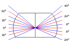
Elements for the original Selectric typewriter bore 88 characters on their surface, 22 characters girdling the typeball in four bands.
The ball was indeed a portion of a sphere, at least for part of its extent.
If we treat the conventional upwards direction on the element as north, the bands of characters are centred at 32 degrees North latitude, 16 degrees North latitude, on the Equator, and at 16 degrees South latitude.
This diagram showing the regions these bands occupy may make things clearer:
To attempt to calculate the basic space available to a character, one begins with the radius of the sphere. What matters, though, is not the ground from which the characters rise, but the location of the actual surface in contact with the paper.
Apparently, this radius is about 11/16", as best as I can measure a Selectric element with dial calipers.
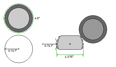
This leads to my current best estimate of the dimensions of a Selectric element.
The circumference of the platen is 4.5 inches. So, rounding the radius upwards to the next thousandth of an inch, we get 0.717" as the radius of the curve by which the faces of the characters on the element are dished so as to come in contact with the paper uniformly. Perhaps a slightly larger radius is used, as the thickness of the ribbon and the paper, even at a minimum, would still be more than a thousandth of an inch.
The distance between the faces of characters on opposite sides of the ball is apparently 1 3/8", or 1.375". Recently, I made some additional measurements of a Selectric element, and for a time I thought I made an error, and this distance was smaller; on re-checking, however, this did not appear to be the case. However, instead, it does seem that I am in error about the tilt angle increment being 16°; instead, it may be 15°. Also, it may be noted that for typewriter elements, the character baseline (the bottom of letters which do not have descenders) is the same for all typestyles, except for Orator, where it is lower, because the very tall capital letters fill all the space available. In the case of Selectric Composer elements, there is again a consistent baseline, but it is higher than the one for typewriter elements, to allow typefaces with longer descenders than used for typewriter typestyles.
Because the characters curve outwards to meet the platen, for the band on the equator, the available width does not need to include the cosine of 8 degrees as a factor.
The width available to the widest characters is 0.19635" if one merely multiplies the diameter by pi and divides by 22. As we shall soon see, however, a number of factors conspire to reduce this by quite a bit.
Multiplying by the cosine of 24 degrees gives the space available for the two adjoining bands of characters as 0.17937", and multiplying by the cosine of 40 degrees gives the space available for the topmost band of characters as 0.15041".
For a conventional typewriter, all the characters are the same width.
A typewriter with proportional spacing, whether it uses a typeball or a daisywheel, normally works by avancing the printhead, or moving the carriage, a distance determined by the width of the character just printed after it has been printed. This means that all the characters have to start in the same place.
So, for the wider bands of characters, the maximum space available for printing is actually half the space given, plus half the space available on the narrowest band.
The space available on the narrowest band, 0.15", is still quite large. If it were actually possible to print characters that wide with a Selectric element, no difficulties would be posed in printing the largest Executive typewriter characters at 5/32", or in increasing the width of the widest Selectric Composer characters from 9 units to 11 units.
In fact, however, a considerable amount of space has to be allowed on the two sides of each character, and a somewhat smaller amount on the top and bottom, because the platen also curves away in that direction, because the paper, and the rubber platen roller on which it sits aren't idealized geometrical objects.
During typing, they will be squeezed, they will give way somewhat to the letter-shaped plastic-backed metal with presses upon them.
On the other hand, characters don't normally fill the nominal character cell that they occupy. A small bit of space stands between the letters of every word. That space can usually be subtracted in calculating the allowance needed, although some characters, such as the underscore, don't leave space between each other, but that space is considerably smaller than the space that has to be allowed on the element.
I would not begin to attempt the work the engineers at IBM doubtless did, taking into account the characteristics of ribbon, paper, and platen to determine the needed allowance.
Instead, I can infer the allowance required from the characters they felt themselves able to place on typewriter elements.
On the topmost band, normal typewriter characters, taking up a cell 0.1" wide for pica typestyles, were placed. However, letters, with their boxy capital forms, weren't placed on that band. Instead, that band was given over to the digits. That may have been primarily because the digits were less used, so as to reduce wear and tear on the mechanism. However, as it happens, the relationship between the element and the platen, and the element's motion in printing, was such that if the element were to undergo no tilt motion when printing, a character in the top band would be printed.
So apparently the space in the top band should be thought of as slightly less than 0.1".
Accounts of the design of the IBM Selectric Composer noted that making the widest characters 1/8" wide, which increased the maximum width by only 1/120", was only possible after the space allowance between characters was reduced. Reducing it was possible because a machine used for generating typeset copy, instead of general office typing, did not need to be able to type carbon copies neatly and well. This reduced the amount of soft material into which the element's letterforms would indent themselves.
                 Raw       Proportional  After      11/12 less  11/9 less
                 width     raw width     Allowance  Allowance   Allowance

32-degree band   0.15041"  0.15041"      0.10219"   0.08966"    0.13561"
16-degree band   0.17937"  0.16489"      0.11667"   0.10293"    0.15331"
 0-degree band   0.19635"  0.17338"      0.12516"   0.11071"    0.16369"
The IBM Electronic Typewriter Model 50, which used 96-character elements, offered proportional spacing with characters from three to seven units in width, with a unit that was 1/60" wide. And many characters had the maximum width of seven units, so many of them were in the two 16-degre bands.
I had been puzzled as to how they could fit on those elements, since they were only 1/15 smaller than the widest characters on the Selectric Composer, which as noted above, posed difficulties, and yet they were on an element that offered a space for characters that was 1/12 smaller. (I was further confused by the fact that the typestyles for the Electronic Typewriter Model 50 were originally offered for the Mag Card Executive, which used 88-character elements. Apparently, though, the story of that machine is more complicated than I initially thought, and the typestyles as used on that machine were slightly adjusted in width for the Electronic Typewriter 50.)
That could just mean that there was a little wiggle room left unused. Later electronic versions of the Selectric Composer could use elements with the Cyrillic script for preparation of documents in Russian. These elements had some 9-unit characters in the 16-degree band.
Thus, the "After Allowance" figures above for the three bands of a Selectric element appear to be somewhat conservative for the restricted case of a machine that will not have to do carbons, even though they already exceed what is desirable for a general-purpose typing element.
One obvious way to make it possible to type wider characters than a normal element allows would be to put 88 characters on a 96 character element, leaving one column of characters empty.
The amount added to the potential width of a character in the column counterclockwise from the empty column would be half the "raw width" of a character in that row. (Of course, all the figures would have to first be multiplied by 11/12.)
That is much more than enough. Thus, while only the M and W need to be made wider on the normal Selectric element, issues raised by matching IBM Executive typestyles lead to a desire for more spaces for wide characters, and so taking advantage of this by having two empty half-width columns instead is attractive.
If the "After Allowance" figures in the third column accurately reflect the space available for characters on an 88-character element, then, assuming the 96-character elements had the same diameter, the fourth column examines what space they would have available. That figure, however, would indicate that 96-character elements with the proportionally-spaced typestyles wouldn't be possible; since they did exist, as noted, my estimate of the required allowance must be excessive.
The fifth column shows how much space would be available if the space available per character on an element were increased by adding a bottom band of characters, similar to the topmost band. With five bands instead of four, reducing the number of columns per side from 11 to 9 would still allow 45 characters in each shift. This seems to allow enough space that there would be no issues in dealing with extra-wide characters, as 11/72" is 0.15278" and 5/32" is 0.15625". As will be noted on the next page, this would require a change to the mechanism by which tilt motions are imparted to the element, but because nothing is added on the top, the lever and spring mechanism to hold the element to the post could remain the same.
Of course, this calculation doesn't attempt to note that distances on the paper are proportional to the tangent of the angle on the element, rather than in a linear relationship.