A forthcoming page of this section contains some speculations as to how the system of IBM Selectric typewriters could be extended to offer further capabilities. This page examines the typebar IBM Executive in more detail, to provide background for understanding that page.
IBM made the Selectric Composer, which, using the basic Selectric typewriter mechanism, offered the ability of producing typeset copy, approaching the quality of conventionally typeset material. It also made proportional spacing available to typists, first with 88 character elements with the relatively uncommon Mag Card Executive, and then later with 96 character elements with the Electronic Typewriter models 50, 65, 85, and 95.
The proportional spacing offered to typists involved typing in only one size, while essentially three distinct sizes were offered with the Composer.
What IBM never offered, however, was a version of the Selectric Composer that could also be used with typewriter elements. On the next page, I look at how that could be done, and then I get greedy, and examine other possible options which could be combined with that capability for even further flexibility.
On this page, I will take a close look at the IBM Executive typewriter, and the various IBM Selectric devices, to provide background for that page.
Except for offering proportional spacing, the IBM Executive was a conventional electric office typewriter with characters on typebars containing only two characters each, a shifted one and an unshifted one.
I examine it here, in relation to what is coming on the following page, because one of the extra features I propose to add to an improved Selectric Composer is to handle the typestyles of the IBM Executive as well.
The most obvious visible difference between an IBM Executive typewriter and other IBM electric typewriters was that the space bar was split into two pieces; a short piece on the left with "3" on it, and a long piece on the right with "2" on it.
The two unit space was intended to be the normal space between words of text.
Since the ten digits were all three units wide, the three unit space was useful in ensuring that columns of figures were aligned, as well as providing an alternate space for producing justified copy.
Because the IBM Executive typewriter was in other respects a conventional typewriter, in which the typestyle was not interchangeable, there was no reason not to allocate space to the individual characters in accordance with what would best suit an individual typestyle. And this was indeed done.
For example, Documentary, a typestyle somewhat resembling Century Expanded, along with Secretarial, which, like the typeface American Typewriter, looked like a proportionally-spaced version of a classic manual typewriter typestyle, Modern, and Bold Face #2, used the following arrangement of units:
2 fijlt                I
3 abcdeghknopqrsuvxyz  JS
4 w                    ABCDEFGHKLNOPQRTUVXYZ
5 m                    WM
Patron, a typestyle which somewhat resembled the typewriter typestyle Prestige Elite, had this similar arrangement of units:
2 ijl                    IJ
3 abcdefghknopqrstuvxyz
4 w                      ABCDEFGHKLNOPQRSTUVXYZ
5 m                      WM
Heritage and Testimonial, typestyles designed to have a somewhat more traditional appearance, used this arrangement of units:
2 fijlt                IJ
3 abcdeghknopqrsuvxyz  BPS
4 w                    ACDEFGHKLNOQRTUVXYZ
5 m                    WM
On the other hand, Mid-Century, a typestyle resembling Futura, with more classical proportions, used this arrangement of units:
2 fijlrst            I
3 abcdeghknopquvxyz  BEFJLPRST
4 wm                 ACDHKUVXYZ
5                    GMNOQW
Also, Arcadia, a typestyle looking like a typeface in the Egyptian slab-serif classification, had this arrangement of units:
2 fijlrt              IJ
3 abcdeghknopqsuvxyz  ABEFKLPRSTVXYZ
4 mw                  CDGHNOQU
5                     MW
And Charter, a typestyle which seems to resemble the Roman of Aldus Manutilus, used this arrangement of units:
2 fijlrstz          IJ
3 abcdeghknopquvxy  BEFLPSZ
4 w                 ACDGHKNOQRTUVXY
5 m                 MW
Another typestyle, Text, used an almost identical unit system, except that z took 3 units instead of 2, R took 3 units instead of 4, and Z took 4 units instead of 3.
Incidentally, the book Anatomy of a Typeface by Alexander Lawson notes that Bruce Rogers adapted his classic typeface Centaur, made in the style of a Jenson, to the Justowriter, for which this typestyle was called Rogers. As some typestyles were shared between the Friden Justowriter and the IBM Executive typewriter (both of which were based on the original Electromatic typewriter from North East Electric, the rights to which were split between the two companies) I had wondered if Charter could be this typestyle, because there are some resemblances, but that is not the case.
Initially, I could not find a specimen of Rogers on the web, but now this site has a brochure for the Justowriter that does include samples of several Justowriter typestyles, including Rogers, on its back cover. Rogers is not the same as any IBM Executive typestyle. Like all the typestyles available for the Justowriter except Text, it used a 1/32" escapement.
One thing I saw in the brochure puzzled me. It was obvious from the sample of Text shown that in that typestyle, the lower-case s was two units wide, while in all the other typestyles, the lower-case s was clearly three units wide. And yet, unlike the other typestyles, it was only available on the Reproducer and not the Recorder. To produce justified copy with the Justowriter, text was typed on the Recorder, which produced a paper tape where every line included information about how much additional space was needed to pad out the line, and then the tape was played back on the Recorder which made use of that information when typing from paper tape.
However, the Justowriter, being based on the Flexowriter, was a flexible device. The paper-tape codes for each character, and, in the case of the Justowriter, the widths of each character, were coded by removable slugs which clipped on rods connecting the typewriter keys to the typebars. So, if one was using a Recorder with Bold Face on its typebars to produce text to be played back on a Reproducer with Text, all that had to be done was to make it type with the spacing of the Text typestyle. That the rough unjustified copy on the Recorder would look funny would not be a consideration.
And there were other differences in character widths between Justowriter typestyles, I now have seen through closer examination of the type specimens in that book, instead of them all being the same for convenience in using the Recorder and Reproducer system.
The unit size of a typestyle on the IBM Executive depended on the individual typestyle.
In general, larger typestyles used a unit of 1/32", medium sized ones used a unit of 1/36", and small ones used a unit of 1/45".
Because characters were on separate typebars - except that the shifted and unshifted characters for a given key were one above the other on the same typebar - there was no problem with giving even the widest characters all the space they needed.
But the IBM Executive - and many similar typewriters - being intended to provide an improvement over the ordinary typewriter, which squeezed every letter into the same space, not to substitute for genuine typewriter, still allowed only four different widths for characters. So, while the most basic distinctions of width were made, more subtle ones could not be reflected, and thus it did not produce copy of the same quality as conventional printing and typesetting.
For comparison of the alternatives, here are samples - from NASA documents, as it happens, because they made use of all these techniques, and, as U. S. Government publications, are in the public domain:
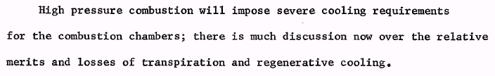
Here is typewritten text (from Space Shuttle Propulsion, NASA Technical Memorandum X-52923):
This was doubtless typed on an IBM Selectric, in the Prestige Elite typestyle, despite the fact that a larger size, Prestige Pica, was also available - and Prestige Elite was also available for IBM's typebar electric typewriters even before the Selectric.
Here is one sample of text typed with an IBM Executive typewriter. This sample is in the Modern typestyle, from Apollo Spacecraft Familiarization:
And another sample of text typed with an IBM Executive typewriter, this time in the Documentary typestyle, from Apollo Systems Description:
For comparison, here is a sample of text typed on a Vari-Typer, from an advertisement:
A sample of printing prepared with the IBM Selectric Composer (from the Saturn V Flight Manual):
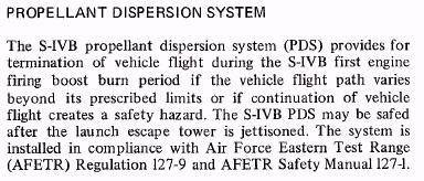
That it was done with a Selectric Composer begins to be suspected merely from the fact that Univers was used for the headings: the fact that, in those headings, the "O" in PROPELLANT is closer than it should be to the following P is the tip-off. The positioning of characters achieved by a Selectric mechanism, while very good, does not equal the tight tolerances of normal typesetting.
As the resolution was not as good as I would have liked, I went to another NASA publication, Space Settlements: A Design Study, NASA Special Publication 413, for this sample:
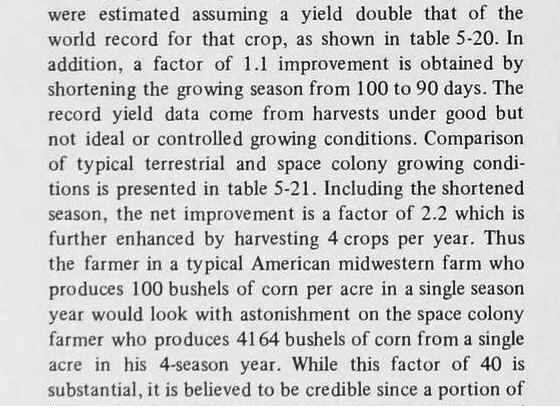
to provide a better opportunity to see the distinguishing characteristics of material typeset by means of the Selectric Composer.
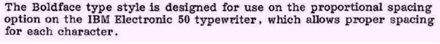
And here is a sample of text typed with one of the proportionally spaced typestyles for the IBM Electronic Typewriter Model 50, which are also very attractive in appearance, having a finely-spaced unit system:
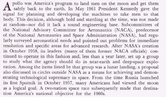
And, from Chariots for Apollo, NASA Special Publication 4205, here is what real printing looks like:
Above, in comparing the unit systems for a few IBM Executive typestyles, only the letters were shown, as they were relevant to the issue of how different basic styles of typeface were served.
It was noted that the units for IBM Executive typewriters were 1/32", 1/36", and 1/45".
The IBM Selectric Composer used units of 1/72", 1/84", and 1/96" to permit the use of different point sizes of type. To allow the use of different unit sizes, tab stops could only be placed at positions spaced 1/6" apart.
As it happens, 72, 84, and 96 are all multiples of twelve, not just six. So unit sizes of 1/78" and 1/90" could be added to the Selectric Composer without disturbing its system of tab stops, and doing so would be desirable to permit coming closer to the ideal width for some sizes of some typefaces.
The 1/32" unit of the Executive typewriter is equal to three 1/96" units of the Composer.
The 1/36" unit of the Executive typewriter is equal to two 1/72" units of the Composer.
The 1/45" unit of the Executive typewriter is equal to two of the 1/90" units I propose to add to the Composer.
So it appears that a Selectric Composer, extended for somewhat more attractive typography, could easily have the ability added to it to use elements which bear typestyles from the Executive typebar typewriters.
However, 5/32", the maximum width of an Executive typewriter character, is wider than anything the Selectric Composer could handle. One of the improvements planned is making the letters M and W wider in Composer typefaces, and so a means of handling wider characters than before will be provided.
But an issue raised by the Executive typewriter is that the letters M and W weren't the only wide characters. Some typestyles also used 5 units for such characters as %, &, or @.
& is a 5-unit character in Arcadia, a typestyle with a 1/32" escapement.
@ and % are 5-unit characters in Mid-Century. This typestyle has a 1/36" escapement, but 5 units at 1/36" equals 10 units at 1/72", so these characters do present an issue, as they are also wider than the widest existing Selectric Composer characters.
@ is also a 5-unit character for Charter and Text, but those typestyles use a 1/45" escapement, and thus this does not present an issue.