In the early days of the typewriter, a wide variety of typewriter designs competed.
There were machines with a large keyboard including both capital letters and small letters, without a shift key, and there were typewriters which had only three rows of keys (three-bank typewriters) which had an extra shift key to go into a "figures shift", in addition to those with one shift and four rows of keys, as we are familiar with even today.
Also, there were a number of typewriters that printed the characters from a single element instead of using one typebar for each key. Two of those typewriters, in particular, the Hammond (which was the basis for the later VariTyper, which added proportional spacing, and which, in that form, remained in use as a specialized device into the 1960s) and the Blickensderfer had a wide selection of type elements available for them.
That diversity largely came to an end in the years following the introduction of the Underwood Five typewriter in 1900. That typewriter both had a light touch, allowing fast typing, and was "visible", allowing the typist to easily see what had just been typed.
The single-element typewriters available at that time did not have a light touch. This limited the speed at which typing could be performed, and made typing a more taxing task, and so it is hardly surprising that offices across the nation chose the Underwood Five, and later its imitators, over typewriters which would be less well accepted by secretaries.
For a typewriter to be visible, of course, was also an advantage, as it made it easier for a typist to quickly deal with the occasional error in typing. But there were other typebar typewriters that differed from the Underwood Five design, and yet still offered those two advantages; for example, the Oliver was a visible typewriter, and it used typebars, but it had a three-bank keyboard.
A typewriter with no shift keys would mean the typist would have to move her hands to type capital letters, mitigating against touch typing. A four-bank typewriter solved this problem in a simple manner, and only required using the shift keys for special symbols like $, @, %, # and &. Because a three-bank typewriter required the use of a shift key to type digits as well, typing numbers was more difficult, particularly as many typewriters with three-bank keyboards did not include "shift lock" and "figs lock" keys, although some did have that functionality but by means of a small lever instead of a key in each case.
So the four-bank typewriter offered the best balance, and just as the QWERTY layout, despite its flaws compared to alternative layouts like the Dvorak, became pervasive because that was what typists were familiar with, the fact that the four-bank typewriter was more popular meant that the three-bank typewriter would be less familiar to most typists available to be hired.
Also, all the older single-element typewriters with which I am familiar had three-bank keyboards, not four-bank keyboards (not counting single-element typewriters with index mechanisms instead of keyboards, of course). The reason for that was obviously to simplify the mechanism for moving the element to the right character during typing by separating out more of the movement to shifting, which didn't have to take place as rapidly.
In 1961, the single-element typewriter finally returned to visibility with the IBM Selectric. This typewriter provided the flexibility of interchangeable elements combined with an ease of typing comparable to that of an ordinary typebar electric typewriter, let alone an ordinary typebar manual typewriter.
Later on, of course, the Selectric typewriter itself gave way to daisywheel typewriters, as daisywheel mechanisms, first used in computer printers by companies such as Diablo and Qume, became less expensive to make.
Many daisywheel printers and typewriters could print in 10 pitch, 12 pitch, 15 pitch, or proportional spacing. That is, they could use "Pica" type, at 10 characters per inch, "Elite" type at 12 characters per inch, or print small type at 15 characters per inch. To be able to print at both 10 pitch and 12 pitch, a daisywheel printer needed to be able to move the printing element in increments of 1/60 of an inch - six of them for 1/10 of an inch, and five of them for 1/12 of an inch.
So adding small printing by moving the printing element by four increments, and thus 1/15 of an inch, or proportional spacing where the number of increments moved depended on the character that was printed, was an obvious step.
Originally, when one bought a Selectric typewriter, one had to decide between one which used 10 pitch typestyles or which used 12 pitch typestyles. Later, the Selectric II came out which was available in a dual-pitch model. However, it switched between two toothed railings, one with 10 teeth per inch, and one with 12 teeth per inch, rather than using a smaller unit as the basis of moving the printing element.
The IBM Electronic Typewriter Model 50, when it came out in 1978, offered the three choices of 10 pitch, 12 pitch, and proportional spacing based on a 1/60" unit to the ordinary office using the IBM Selectric element in its newer 96-character form instead of a daisywheel. In 1982, additional models of the IBM Electronic Typewriter, models 65, 85, and 95 came out which also included the proportional spacing option.
If that were all there was to the story, there would be no reason to consider the IBM Selectric to be distinguished, in comparison to the daisywheel, in the matter of flexibility. But it isn't. During the long reign of the 88-character Selectric element, IBM had put the Selectric mechanism to other uses besides the common office typewriter.
One of these uses was as a computer terminal for use with the computers which it made and for which it was famed. The IBM 2741 terminal and the IBM 1050 printer were based on the Selectric mechanism.
Since IBM could make computers, and it could make a modified typewriter that a computer could control, it had the idea of making a very small and simple computer that could allow a typist to type in a document, and then make corrections before having the final copy printed. At the time when these devices were first introduced, the term "word processor" wasn't yet used for them, and they were expensive enough that only very large offices used them. There was the MT/ST (Magnetic Tape Selectric Typewriter), introduced in 1964, the Magnetic Card Selectric Typewriter introduced in 1969, and the Memory Typewriter from 1974.
In 1972, IBM came out with a modified version of the Magnetic Card Selectric Typewriter, the Mag Card Executive. Back in 1944, IBM produced a version of its popular typebar electric typewriter with proportional spacing, the IBM Executive Typewriter. Several different versions were made with different styles of type. Characters could be from 2 to 5 units wide; the size of a unit might be 1/32" for Documentary, 1/36" for Mid-Century, or 1/45" for Text, so one had the choice of printing with larger or smaller characters. So it was natural for IBM to use that trademark again for the Mag Card Executive, although it printed proportionally-spaced text in only one size. The size of text was comparable to 10 pitch or Pica typing, or to typebar Executive typestyles with a 1/32" unit.
Several typestyles were developed for the Mag Card Executive, and it was these typestyles that were later used on the Electronic Typewriter Model 50 (and the later Model 65 and 85). On the Electronic Typewriter Model 50, proportionally-spaced type involved a 1/60" unit, and characters could be up to 7 units in size. The typestyles for the Mag Card Executive were slightly different from those for the Electronic Typewriter 50, in that the degree by which the uppper-case alphabet took up more space than the lower-case alphabet was greater for the former. Because the Mag Card Executive, unlike the Electronic Typewriter Model 50, could not use conventional Pica and Elite monospaced elements, apparently it took the 1/72" unit size from the Selectric Composer instead of the 1/60" unit for proportional typing that would be expected from its ubiquity with daisywheel devices. Initially, I had not realized this, and I disbelieved one account that stated this until I found other corroborating information later on. Not all the typestyles from the Mag Card Executive were carried forward to the later device, one notable omission was the Symbol Proportional element that it had.
The typestyles available for the Mag Card Executive were: Arcadia 72, Bold Face 72, Bold Face Italic 72, Document 72, Essay, Essay Italic, Modern 72, Thesis, and Title. Note that some of these typestyles had the same name as typestyles for the original IBM Executive, which were, of course not identical, except for the addition of the number 72 as a suffix. Presumably Document was considered to be close enough to Documentary that the suffix was also required.
Of these typestyles, Arcadia, Bold Face, Bold Face Italic, Essay, Essay Italic, Modern, Thesis, and Title were all available on 96 character elements as well, so only Document was not carried over.
I had thought that a Mag Card Executive was owned by the office of the President of the United States. I based this conclusion on the letter from President Ronald Reagan to Dr. Jerry Pournelle which appeared on the back cover of Dr. Pournelle's book "Mutual Assured Survival" (about the Strategic Defense Initiative, of course). However, as that letter is dated October 27, 1983, there is no reason why it couldn't have been produced on an ordinary IBM Electronic Typewriter as found at the time in countless offices.
In 1966, however, what is perhaps the most significant development for the 88-character Selectric element from the point of view relevant to this page took place: IBM addressed printing and typography with the Selectric Composer. It was initially introduced in two versions, the basic Selectric Composer, which was mechanical, and required a second typing for justification, and the MT/SC, Magnetic Tape Selectric Composer. In 1975, the Electronic Composer, which physically resembled the Memory Typewriter, and which also saved documents in internal core memory, became available, and, finally, in 1978, IBM offered the Mag Card Composer.
Just recently, I heard that IBM introduced the Paper Tape Selectric Composer in 1967. I have seen references to it as being a variant of the MT/SC, and it was also noted that along with its introduction, several new typefaces were introduced for the Selectric Composer. I don't know at this time if paper tape served as its primary storage medium, replacing magnetic tape, with the paper tape being in an IBM code, or if it was an MT/SC with the additional capability of communicating with Teletypesetter paper tape.
To allow the same basic design of type to be printed in a range of sizes, the Composer could be switched between three different unit sizes: 1/72", 1/84", and 1/96". The unit sizes were indicated by colors on the elements, 1/72" by red, 1/84" by yellow, and 1/96" by blue.
Having different unit sizes meant that the type element could reach positions which were associated with only one of the unit sizes, but not the other. Therefore, the Composer only allowed tab stops to be set at positions that were multiples of 1/6", or a pica (or, as printers would call it, a pica em), as all three unit sizes were integer fractions (or aliquot parts) of this distance.
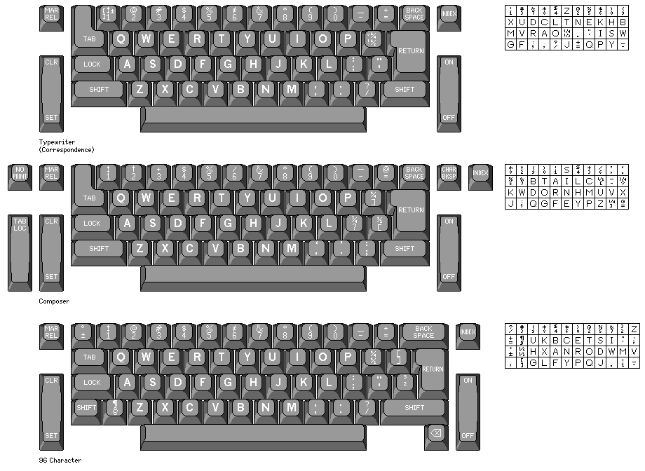
Below is a diagram showing the keyboard layouts and the arrangements of characters on the elements of the original IBM Selectric typewriter, the IBM Selectric Composer, and the later 96-character Selectric III as well as various IBM electronic typewriters:
The IBM Selectric III typewriter was also available in a version with a 92-character keyboard, more natural to typists used to the 88-character keyboard:
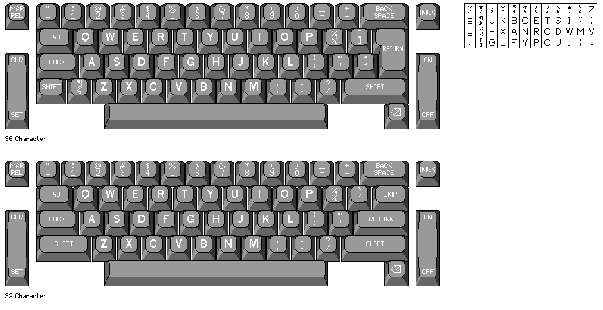
Note that the superscript 2 and 3 replaced the square brackets on this keyboard; this was not true on the 92-character variant of the Displaywriter keyboard, neither of these diagrams is in error on that point.
It was in 1978 that IBM introduced the 96-character element; the Electronic Typewriter Model 50 and Model 60 came out that year, and the Model 75 in 1979; it wasn't until 1980 that the Selectric III typewriter that used it became available, and the Model 65 and 85 (and 95), which were the other models besides the 50 that supported proportional spacing, and which were different in styling, came out in 1982. The 96-character keyboard design, however, was used by IBM with the 3278 display station, which dates from 1975; this appears to have come about so that IBM's System/370, which used EBCDIC to represent characters, could communicate and interoperate better in a world using ASCII, with its full character set, including lower-case, increasingly.
I've seen a video on YouTube of something that looks like an IBM Memory Typewriter 50 with a 96-character keyboard; I do not know when IBM sold this device, or what they called it (I've seen ads advertising ribbons for the Memory Typewriter 60; IBM could have given it that name to prevent confusion, although it could still only remember 50 documents, but I have not seen any confirming information to eliminate the possibility of those pages being in error).
Since this was written, I've seen it observed in a discussion forum on Selectric typewriter repair that a version of the Memory Typewriter that used 96-character elements was indeed made by IBM, but for sale in Europe and not the United States. Which, of course, makes sense: numerous European languages use accented letters, and so could benefit from a slightly larger keyboard, and so IBM could have hastened in that market to offer functionality with 96-character elements that could wait until a completely new product was introduced in the United States, where people would be satisfied with using 88-character elements.
Also, before the daisywheel took over, when other companies, many in Europe, made typewriters similar to the Selectric, such as Facit, Olivetti, and Hermes, they mostly used 96-character elements, and this competitive factor may also have had an influence.
Even more recently, I've learned that IBM made a product apparently called the "96 Selectric".
This looked like a Selectric II, but it used the new 96-character elements. It appears to have been sold only in markets outside North America. Presumably, it was available from 1978 to 1980, and it existed to make a typewriter using 96-character elements available as soon as possible in the European market, where competing machines with 96-character elements were available, and where elements with more character positions would be more useful because of the use of accented letters in many European languages.
88-character elements for the Selectric sometimes included the number 72 after the name of the typestyle. This was to indicate that the typestyle may have been slightly different for the similarly named typestyle for IBM's typebar electric typewriters. The model numbers for the original Selectric typewriters were three-digit numbers starting with the two digits 72, and the original Selectric was sometimes called the Model 72. Selectric II model numbers were in the eight hundreds, 96 Selectric model numbers were in the nine hundreds, and Selectric III model numbers were in the eight thousands.
Of course, 1/60" is a tenth of 1/6", so IBM could have modified the Electronic Composer to allow it to also use typewriter elements, and 88-character versions of the elements for the 96-character Electronic Typewriter 50, 65, and 85. (Originally, at this point, I said "elements for the Mag Card Executive", but as noted above, apparently it really did use a 1/72" unit size.) A machine like this is the "Perfect Typewriter" that is the subject of this section.
Why didn't they?
One reason might simply be that such a machine would have appeared to have been of limited applicability. While the existence of the Mag Card Executive showed that offices appreciated the appearance of proportional spacing, proportional spacing in itself didn't present too great a challenge to office typists, as the typebar Executive showed.
Typesetting is more demanding, even when a machine like the Selectric Composer makes it appear almost as simple as typing.
The fact that the Selectric Composer limited tab stops to one every 1/6" would be very disconcerting to typists using a 10 pitch element. Even a typist using a 12 pitch element would be disconcerted - although in that case, as 72, 84, and 96 were all multiples of 12 and not just of 6, that could be fixed.
Given the existence of the dual-pitch Selectric II, allowing a typewriter to switch between two sets of tab stops, one for 10 pitch typing, and one for everything else, would not have been insurmountable technically. But I can quite understand that at IBM it might have been seen as unacceptably confusing.
What about giving the ability to typesetters to use fixed-width elements in addition to those with normal typefaces?
Here, the issue wouldn't be the ability to cope with complexity.
Instead, the usefulness of the feature would have been considered questionable. Yes, one category of typeset documents - textbooks and manuals for computers - involves incorporation of monospaced typed material with traditionally typeset text. But ideally, this typed material should be taken directly from computer output to avoid errors - and it would normally, therefore, be treated as an illustration, and handled by paste-up, it might be thought. In fact, many computer manuals did have text and examples in precise alignment, though.
The IBM Selectric Composer, while an amazing device at the time, was not completely perfect.
The text it produced was of very good quality, and normally it would take careful scrutiny by someone knowledgeable about typography - and who knew exactly what to look for - to distinguish it from ordinary typesetting. And a machine not much bulkier than a typewriter was a vast improvement over a Linotype machine or a Monotype caster, or the hand setting of movable type.
But it did have limitations.
One of them was that the three unit sizes, 1/72", 1/84", and 1/96", covered a range of type sizes going from 7 points up to 12 points.
In the case of Press Roman, therefore, both 7 point and 8 point Press Roman used the 1/96" escapement, both 9 point and 10 point Press Roman used the 1/84" escapement, and 11 point Press Roman used the 1/72" escapement.
This meant that 10 point Press Roman was only larger than 9 point Press Roman in the vertical direction, and so it was more condensed than the 9 point.
This was noted, and identified as a limitation, if only because it meant that changing the type size might not produce as much benefit as expected for purposes of copyfitting, by James Craig in the first edition of his book Production for the Graphic Designer. (The second edition appears only to have briefly mentioned the Selectric Composer, as opposed to the first, which devoted a couple of pages to it.)
The Electronic Composer used a disk with three sets of rectangular holes in it to control the movement of the typing element across the paper, so with this design it would have been relatively easy not only to add a 1/60" escapement for the use of typewriter elements, but also to add intermediate escapements of 1/78" and 1/90". Since 78 and 90 are also multiples of six, this would not have placed an additional restriction on the possible location of tab stops beyond what was already imposed.
Another limitation of the Selectric Composer was that, in order to allow type sizes as large as 11 points to be set without enlarging the existing Selectric typewriter element, the maximum width of a character was limited to 9 units. Comparing the widths of the various characters in a Selectric Composer font to those of typefaces used by printers, it turns out that the widest letters, M, W, and m, should have been 11 units wide, not 9 units wide, to be in the same proportion to those in a regular typeface as the other letters.
This is a more difficult limitation to correct, and much of the discussion to follow below will concern various possible schemes, some quite elaborate or impractical, to deal with this issue.
A third limitation of the Selectric Composer is that the widths assigned to each character were the same for all typefaces. Those widths were close to those used for the Times Roman typeface, to which the Press Roman typeface for the Selectric composer was similar in appearance.
Those widths were also appropriate for a number of other typefaces. Some typefaces, with a more classically-inspired look, such as Optima, Lydian, Palatino and Goudy Oldstyle have the letters E and F, among others, significantly narrower than in ordinary typefaces like Times Roman and Century Expanded. This, however, would normally only be noticed by typographic purists.
More seriously, in many typefaces, italic text is somewhat narrower than normal Roman text. Even the Linotype machine, however, forces the two to have the same spacing. The disparity between the italic and the Roman is particularly pronounced in older typefaces, such as Caslon and Baskerville. And the Selectric Composer did offer a version of Baskerville, which meant that their version of Baskerville was compromised by having an italic that was wider than that for the italic of Baskerville in either its foundry type versions, such as the one from ATF, or its Monotype version.
In contrast, since the IBM Executive typewriter was a typebar machine, even though it used a coarse 5-unit system for spacing, several different unit arrangements were used, individually suited to different typestyles.
This would be trivial to remedy on an electronic version of the typewriter as well, except that the element would need to indicate which spacing system was used, and a convenient method for the operator to communicate that selection to the machine would be required. Selectric typeballs, whether for typewriters or the Composer, didn't include any direct means to indicate to the typewriter information about their category; there was simply a symbol on the element's plastic cap which indicated how the typist or typesetter would set a lever on the machine.