Another limitation is that all the typefaces had exactly the same spacing for each character. Later electronic versions of the Selectric Composer allowed a two-digit type code to be entered, permitting a different arrangement of spacing to be used with Cyrillic elements and for elements which contained two sizes of fonts like Copperplate Gothic, where a smaller size of capital letters replaced the lower case.
In general, this is not normally a problem for most typefaces in normal use. However, the proportions of the capital letters of some oldstyle typefaces are patterned after classic Roman carved letters, such as those on the famous Trajan column, in which case the capital letters B, E, F, L, and P, among others, are more noticeably narrower than most other capital letters than is the case in more ordinary typefaces.
Also, there are typefaces in which the size of the small letters relative to that of the capital letters is unusually small.
The chart above shows how a unit system derived from that of the Selectric Composer could be augmented with two alternative spacings for these cases. Note that capital J has become narrower in both additional settings; that is because, in the fonts concerned, it descends below the line, and thus is kerned: that is, part of the letter overprints the space alloted to the preceding letter.
It can also be noted that in these diagrams, the typefaces shown are in different point sizes, so that the width of the lower-case alphabet is very nearly the same for each one. Since the relative widths of the lower-case letters do not change as noticeably as the widths of some upper-case letters between typefaces, keeping their size fixed reduces the amount of change needed to match the different typefaces.
Also, in preparing this diagram, I examined three typefaces as examples of an old style typeface in which the classical proportions of the capital letters were used. There was a noticeable difference in the relative sizes of small letters and capital letters between those three faces, and the one in the middle was chosen as the example.
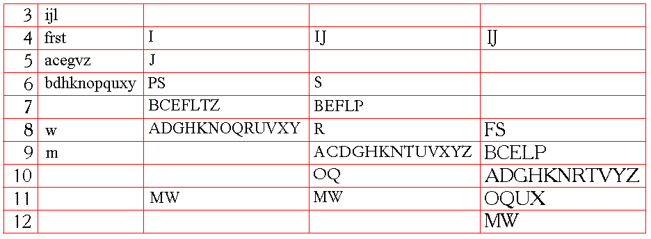
While still restricting the number of alternative spacings, there are a few other possibilities not shown here. The width of the capital J is something of a compromise value; a number of typefaces call for it to be made one unit wider rather than one unit narrower. Also, there are the newspaper legibility faces with a very large x-height; reducing the width of the capital letters 8 or more units in width by one unit may be appropriate for them.
The diagram above illustrates how these additional cases might be handled.
Another thing to consider, which involves relatively subtle changes, is how the widths of the characters may vary somewhat when going to italics and boldface:
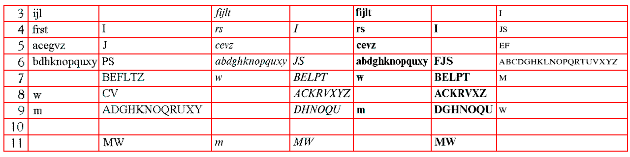
Also depicted is the appropriate spacing for small capitals, which, of course, is not a subtle variation, but an entirely new series.
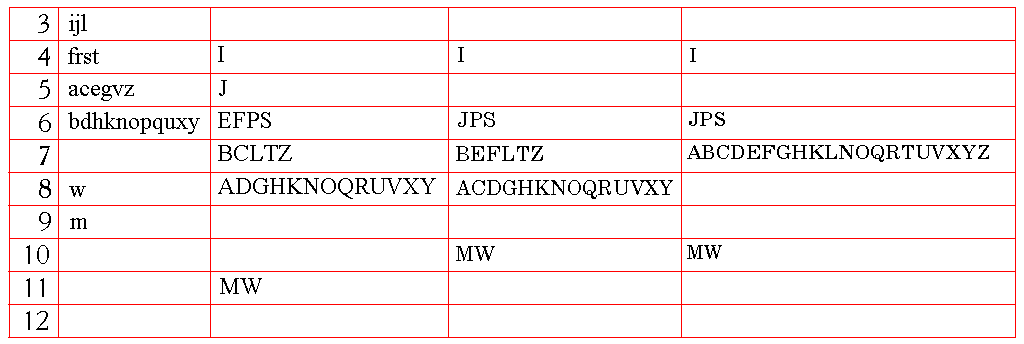
However, there are further variations in some fonts that might be worth accomodating, as illustrated above. Given, though, that the capital letters are not used as frequently as the lower-case letters, which have much less variation in widths from one typeface to another, it is understandable how it was possible to get away with one unit system for all typefaces.
The appropriate proportions for small capitals are a question worthy of some examination. The Selectric Composer had available features that would allow it to vary the spacing of some letters, so that it could use Copperplate Gothic elements which had the capital letters in a smaller size as the lower case. The spacing involved was:
    Upper           Lower         Small
    Case            Case          Capitals

3                   ijl           I
4   I               frst          J
5   J               acefvz        LPSTZ
6   PS              bdhknopquxy   ABCDEFGHKNOQRUVXY
7   BCEFLTZ                       MW
8   ADGHKNOQRUVXY   w
9   MW              m
Here, the ratio of the two sizes appears to be about 3:4.
But Copperplate Gothic might not be a good example to use. To get a trustworthy example for the proportions of small capitals in a normal text face, and for that matter to address the question of italics and boldface, it makes sense to resort to the Monotype matrix-case; one example being that for Times New Roman, series 327:
   Normal                         Italics                Bold

   Upper   Lower       Small      Upper     Lower        Upper   Lower
   Case    Case        Capitals   Case      Case         Case    Case

 5          ijl        I                    ijl                  ijl
 6          ft         J                    ft                   ft
 7 I        rs         S          I         rs           I       rs
 8 J        cez        EF                   cevz                 cevz
 9          agvxy      BLPT       J         abdghnopuy           abdghnopquy
10 S        bdhknopqu  ACOQRVXYZ            kx           J       kx
11 P                   GDHKNU     FS                     FS
12 BEFLTZ              M          BELPT     w            BELPT   w
13 CV       w                     AGKRVXYZ               ACKRXZ
14 AOQRXY                         DNOQU     m            DGNU    m
15 DGHKUN   m          W          H                      HOQ
18 MW                             MW                     MW
Monotype Baskerville, series 169, at least from 6 points to 14 points, has these proportions:
   Normal                            Italics

   Upper   Lower       Small         Upper     Lower
   Case    Case        Capitals      Case      Case

 5          ifjl       I                       ijlt
 6          st         J                       cefrs
 7          r                        I         ovy
 8 IJ       cez        F                       abdghknpquxz
 9          agkovxy    BCELPTZ       S
10 S        bdhnpqu    ADGKNOQRUVXY
11 BFP                 HM            CFJLP
12 ELZ                               ABEGRVYZ  mw
13 ACTY     w                        KOQX
14 DGNRV               W             DHNTU
15 HKOQUX   m
18 MW                                MW
and so it is apparent from this table that the italic is considerably narrower than the Roman.
On this page, I note that, prior to the adoption of a uniform point system for printing, one James Fergusson adopted a scheme which approximated the old named type sizes by dividing a unit of fourteen lines of Nonpareil type, or seven picas, into different parts, just as the Selectric Composer divided the pica em into different numbers of parts.
In order to allow small type sizes to be handled, the actual unit that would have to be divided would be one of 42 points, of which the circumference of the roller would have to be a multiple. Since dividing it into 6 parts yields 7 points, and into 7 parts yields 6 points, those two of the six possible sizes would not require additional gears, so only four additional gears would be left:
(7 points)  Minion    (7 points)  x2 English       x4 Two-line English
(6 points)  Nonpareil (6 points)  x2 Pica          x4 Double Pica
 8 parts    Agate     (5.25)      x2 Small Pica    x4 Two-line Pica
 9 parts    Pearl     (4.66667)   x2 Long Primer   x4 Paragon
10 parts    Diamond   (4.2)       x2 Bourgeois     x4 Great Primer
11 parts    Brilliant (3.81818)   x2 Brevier       x4 Columbian
In order to match this up with the horizontal divisions, so that no rescaling of typefaces would be required between sizes, one could use the 1/72" unit for English, the 1/84" unit for Pica, the 1/96" unit for Small Pica. Since 11 point type, rather than 14 point type, was used with the 1/72" unit, this would mean a unit system that was more finely grained for those sizes of types; for smaller sizes, though, the number of units to the em would need to be divided in half, so instead of 11 units to the em, either 14 or 7 units would be used.
The fact that these scales would only coincide every 42 points would create a limitation in their use. One way this difficulty could be reduced is this: if the normal gear for advancing the platen according to the point system operates in steps of 1/144", then it would not be unreasonable for the four additional gears to divide the basic 42 point space not into 8, 9, 10, and 11 parts respectively, but into 56, 63, 70 and 77 parts. One would still need 11 lines of Brevier to add up to exactly 84 points, but now those 11 lines could start at any position that was a multiple of 6 points. As well, the diameter of the roller would now only have to be a multiple of 6 points instead of a multiple of 42 points, so that a standard typewriter roller could be used without a change in its diameter.
Also, while the system of James Ferguson appealed instinctively to me as something that might have been likely to be used as the basis for type heights before the point system was used, further study of the old sizes of type has led me to the conclusion that, instead, it seems like the pica was simply divided into a greater number of equal parts than the twelve points we use now. If the pica is divided instead into thirty parts, the sizes from Pearl to Pica seem to be approximated closely.