When dealing with a laser printer, or, for that matter, an IBM Selectric Composer, a point is exactly what it tends to be thought of as being nominally: 1/72nd of an inch, or 0.01388888...89 inches.
However, with printer's type, a point is slightly different: 0.013837 inches (or 0.03514598 centimeters). (This point is descended from the 0.0137 inch point of Fournier and the 0.0138 inch point of Nelson C. Hawks.)
The American Typefounders' Association adopted the point standard in 1886.
One alternate definition of the point proposed at that time was that 83 picas (a pica being 12 points) would equal 35 centimeters (one source says this size of point was already in use at MacKellar, Smiths & Jordan, but their 1885 specimen book uses the old named sizes); this leads to a point being equal to about 0.35140562249 mm, or 0.013834867 modern inches of 2.54 centimeters. At the time, however, the U.S. and British inches differed; the inch was defined so that a metre would be 39.37 inches long. In those inches, a point would be about 0.013834839 inches, so this doesn't account for the difference between that and 0.013837".
D. B. Updike's Printing Types: Their History Forms and Use, incorrectly gave that as the official point standard.
Instead, apparently the references that are correct are the ones which state that the proposed point size which was adopted in 1886 was a proposal by Lawrence Johnson that the point would be 249/250 of its nominal value of 1/72 of an inch; this was, at the time, defined in terms of the English inch, not the American inch, but it is said to have been modified when the inch of 2.54 centimeters was adopted.
However, that works out to 0.0138333333... inches, not 0.013837 inches, so it still doesn't explain where the present value of the point came from.
At least if we accept that the actual official size of a printer's point is 0.013837 inches: I have seen this in countless places; in a textbook for printers, many web sites, even with the authority of NIST behind it. This is said to correspond to 72.27 points per inch, which is very close, at .01383700013837000... inches, but other references note that 72.27 is an approximation.
I've seen one search result that credits the change to 0.013837 from whatever was adopted in 1886 to ATF in 1902; that what was almost the only typefounder in the United States in its day could impose a de facto standard is unsurprising; other sources credit the 0.013837" point to Nelson C. Hawks, but as he was the first person to advocate having a point system, long before a committee met to decide an exact standard, it would be easy for people to make the error of attributing the exact modern point to the originator of the point system in general because of not being aware of the intermediate history, so I'm inclined to take 0.0138" as the authoritative value for his point, although another source claims it is likely that the foundry at which he first instituted the point system used one of exactly 1/72".
Since this was written, I have come across a contemporary reference to a point size of 0.013837"; it is given as having been adopted in 1886 by the United States Typefounders' Association in the 1908 specimen book of Stephenson Blake & Company, but American Type Founders is credited as the source of the information.
But this point size is explained as 0.375% smaller than 1/72", originally in terms of the American inch. As it is, 0.99625 divided by 72 is 0.013836805555... which is at least close to 0.013837"; if we take that in American inches, and measure it by the modern 2.54 centimeter inch, we can increase it slightly, to 0.013836833229222... but that doesn't take it all the way to 0.013837".
According to one source, Linotype machines work to a point which is 0.014 inches (or 0.03556 centimeters) in size - I've seen this again in an Intertype manual, but I also vaguely remember seeing another value, closer to the normal foundry point, given for the Linotype point - and according to another, Monotpe machines used a point which was only slightly different, 0.013833 inch, so that one-eighteenth of a point, the basis of the Monotype point system, could be expressed exactly as a decimal fraction of an inch: .0007685", to be exact.
In Continental Europe, a different type of point, the Didot point or Didone is used. Fourteen Didot points are very close to 15 points in height; a more precise figure is about 14.975 points. Another very good approximation to the ratio is said to be that 72 Didot points are almost equal to 77 points in size. Now that I have been given the exact value of 0.376065mm, however, I can with confidence calculate my own next good approximation at 107 points to 100 Didones.
While the Didot point dates from the 18th century, it was not until late in the 19th century that the English-speaking countries adopted their point system; Nelson C. Hawks proposed his system in 1879, and it had spread to England by 1898.
Another value for the ratio between the old French measure and English measure is 1142 to 1071, referenced to a history by Poggendorff by this web site.
Originally, the Didone was 1/72nd of the pre-Revolutionary inch, which in turn was 1/12 of the pied du Roi. As the French foot was originally about 12.7892 inches (various figures, from 12.7889 inches to 12.7893 inches, are given) in length, this works out to about 0.0148023 inches or 0.0375979 centimeters. Based on that length, 43 Didot points should be extremely close to 46 points in size. (And so, a laser printer with a resolution of about 0.08173 mm could come very close to reproducing both type sizes exactly.)
In 1879, Firmin Berthold revised the Didot point system to connect it with the metric system: a Didot point became 1/2660th of a metre, which is about 0.014800781 inches or 0.037593985 centimeters. The ratio of 43 Didones to 46 points remains applicable as a very good approximation in that case as well. (And so a laser printer with a dot pitch of 0.0081734 mm, or a resolution of 3107.6 dpi, would be able to provide an excellent approximation to both systems; some coarser approximations will be discussed below.)
Also, it has now come to my attention that not only was the French foot divided into 12 French inches, but the French inch was divided into 12 lines, and there was an official legal definition of the French foot, in which a metre was defined as three feet and 11.296 lines. Based on that definition, however, the Didot point works out to be 0.037597151038282923... centimetres in length.
Given that standard, from 1799, which defined the metre as 443.296 lines, where 12 lines made a (French) inch, and thus 144 lines make a French foot, that would make the French foot about 32.4839385 centimetres long, or 1.065746 times as long as the English foot, or 12.78895 inches long.
So just multiply 443.296 by six, and one gets the number of Didot points to the metre: 2,659.776. Given that the Anglo-American point is 0.013837 inches, or 0.03514598 centimeters, the Anglo-American point is 0.9348043410048 Didot points exactly, and the Didot point is about 1.0697425719313496762... Anglo-American points.
This leads to a Didot point of about 0.014802028 inches, about 1.069742572 points or 1+1/(14.3384445...) points, so a 15:14 ratio is indeed a reasonable approximation, and the next even better approximation would be that of 46:43 noted above.
If one compares the Didot point to the approximate point of exactly 1/72 inch, then the 1.065746 ratio between the Pied du Roi and the English foot is what applies directly; that ratio is 1+1/(15.21...), making a 16:15 ratio applicable in that case (this is surprising, as I had thought the difference between a printer's point and 1/72 inch was almost inconsiderable), and the next very good approximation would be an 81:76 ratio.
If one started with the 1/72" point and first used the 81:76 ratio to approximate the Didot point, and then a 43:46 ratio to approximate the English printer's point from that, the result would be 0.013837242563... inches, a close approximation indeed to its 0.013837 inch value.
A metric Didot point of exactly 0.0375 centimeters has been proposed, and may in fact be in use, and the French Imprimerie Nationale is said to use a point of 0.04 centimeters. I have since learned from Wikipedia that this standard was adopted around 1810, and, due to imperfections in measuring equipment at that time, while the standard is still in use, their metric point is now 0.039877 centimetres, to ensure compatibility. Also, it has been proposed to measure printing type directly in millimeters.
I have now found out that most Continental printers used a Didot point of 0.376065 mm rather than one based exactly on the old Pied du Roi, while the Berthold typefounders rounded it off a bit more to 0.376 mm.
And I have now further learned that in Holland, a unit known as the Augustijn was used, having a value of 4.5112781 mm, as an equivalent to the Cicero or the Pica, which would mean that their point was approximately 0.375939841667 mm; oh, wait, that just means that they called the Didot Cicero an Augustijn, or, at least, if it was genuinely a distinct unit, the difference was very slight; it is almost identical to the 1879 Berthold value of 0.37593985 mm.
Also, in Belgium, the Mediaan system of type measure involved a point that was 0.01374 inches in size; this is slightly smaller than the Anglo-American point, but the ratio is about 144:143, as opposed to the 15:14 ratio between the Anglo-American point and the larger Didot point; while even a small difference is important for the use of existing equipment, as the visual difference seems likely to be inconsiderable, the system is likely to be little supported in new equipment, the Anglo-American system seeming to be a good enough equivalent.
Although it is of historical importance only, my attention was recently called to a standard for point size similar to, but different from, both the Anglo-American point and the Didot point, that was proposed at an early date. The common ancestor of both those point systems was devised by Pierre Simon Fournier; while the Anglo-American point was based on the English foot, and then adjusted slightly downwards, and the Didot point was based on the pied du roi, Fournier's point was based on a different French length standard, the common foot used in Paris, which was about 29.8 centimetres in length, significantly shorter than both of those other feet. Thus, while an Anglo-American point is about 14/15 of a Didot point, a Fournier point is even smaller at about 11/12 of a Didot point.
I see that in 1668, the length of the French pied-du-roi changed from 32.66 cm to 32.484 cm, further complicating the matter; and another precise value for the pied du roi, 32.48394167 cm, turned up.
Finally, on one web site, I see that 18,410 Paris feet were equal to 18,000 feet. If "feet" were pieds du roi, however, this would not give an 11/12 ratio. If feet were British feet, that would give a closer value, about 29.801195 centimetres. However, I do not know how precise this ratio is, so I can't be sure if this is actually closer to the true value than 29.8 centimetres at this time.
The first laser printers tended to print at a resolution of 300 dpi. This already was high enough for the dots of which text was composed to be invisible. And 300 is a multiple of 60; since typewriters in the English-speaking world tended to type either at 10 characters per inch, or 12 characters per inch, Pica or Elite, dividing the inch into 60 parts was to achieve the largest unit that could produce both character widths. Proportionally-spaced fonts for electronic daisywheel typewriters, therefore, were based on 1/60th of an inch as the unit.
Some laser printers adopted the resolution of 360 dpi, so that in addition to being able to reproduce 1/60th of an inch with an exact number of dots, one could do the same for 1/72nd of an inch. In this way, lines with different point sizes could fit together in the expected way without having, occasionally, to make a line of type one pixel taller or shorter at times.
Incidentally, I had thought that in Europe, typewriters printed characters that were either 2.0 mm or 2.5 mm in width, in lines that were 4.0 mm in height. But I have since learned that this applied only to the typewriters made by one Swiss company, Hermes, and other European companies tended to use closer approximations to the Pica and Elite sizes of the English-speaking world, often rounding them off to either the next higher or the next lower tenth of a millimetre; thus, there was no one standard size for typewritten text that commanded agreement between the typewriter makers of Europe.
Today, of course, laser printers may print at 600 dpi or higher resolutions. It seems to me that it might be beneficial if fonts could be reproduced on a laser printer with an exact unit system, so that the way characters fit together would not change as characters are scaled up for different font sizes.
At 360 dpi, this would mean that fonts could be designed around a system of 5 units to the em, and be reproducible at any integer point size. Such a unit system, however, is too crude for quality typography, although it was used to good effect on some early proportionally-spacing typewriters.
The Monotype type-casting machine used a system of 18 units to the em. This could be achieved with a laser printer resolution of 72 * 18 or 1296 dpi. This would not seem too unreasonable. But it isn't a multiple of 60! Would we have to multiply the resolution by another factor of five?
The fact that a printer's point is 0.013837 inches, not exactly 1/72 of an inch, comes to our rescue. If we raise the resolution to 1320 dpi, which is 22 times 60, then we could reproduce typography by using a point of 0.13636... inches.
But that is a bit small. Also, what about our European friends, who use the Didot point?
Perhaps, instead of using the Monotype standard of an 18-unit system, we could compromise, and use a 14-unit system. Then, for a point of 1/72 inch, we would need a laser printer resolution of 1008 dpi. To achieve a multiple of 60, we could adjust this to 1020 dpi, giving a point size of about 0.0137255 inches. This is still a bigger difference from 1/72 inches than a real printer's point provides, though.
Why a 14-unit system? Then, we could also devise a separate version of each font, designed around a 15-unit system! And *that* version of each font would be the one used when setting things to Didot points; one Didot point would be divided into 15 dots at that resolution, two Didot points into 30, and so on, just as one English/American point would be 14 dots, two points 28 dots, and so on.
But while the two kinds of points would be nearly in the correct ratio, they would both be too small. Thus, to satisfy all the conditions more closely, perhaps the way to go would be to use a resolution of 360 * 3 dpi, or 1080 dpi, and a 15-unit system for fonts based on the 1/72 inch point. The Didot point would just be approximated by using a 16-unit system - and 16 to 15, rather than 15 to 14, is the best approximation when starting from a 1/72" point, as we've seen above.
16 dots at 1080 dpi would be 0.37629629... millimeters, though; this is too large instead of too small (which seems to imply that the difference between a 16/15 ratio and a 15/14 ratio is smaller than the difference between a 1/72 inch point and the actual printer's point of 0.013837 inches: but that is not true, the difference being 0.446% between the two raios, and 0.375% between the actual English point size and its nominal value), and is actually closer to the traditional Didot point of 0.37593985 millimeters than the metric Didot point of 0.375 millimeters is. Thus, it seems as if this should yield an acceptable result.
However, in at least some areas of Europe, typewriters aren't designed to be either Pica (10 characters per inch) or Elite (12 characters per inch), since, after all, they don't use inches over there, they're on the metric system. Instead, their metric typewriters used characters that were 2.5 mm in width or 2 mm in width. This gives a common unit of half a millimetre.
If we want to divide that unit further to allow an approximation to the Didot point, a back-of-the-envelope calculation led me to the conclusion that splitting it into seven parts would work best. This would lead to a resolution of 350 dots in a metric "inch" of 2.5 centimetres.
Thus, the Didot point would be approximated by 5/14 of a millimetre, or about 0.357142857 millimetres. This is not a particularly good approximation, though; it is larger than 1/72", but it's considerably closer to the Anglo-American point than it is to the Didot point. However, I missed an even better approximation available at a coarser resolution: the metric Didot point of 0.375 millimetres, noted above, is 3/8 of a millimetre, and so attainable with 8 or 16 dots per millimetre (approximately 200 or 400 dots to a metric "inch" of 25 mm); 16 dots per millimetre is exactly 406.4 dpi. So this is a reason to prefer 0.375 mm to the closer approximation of 0.376 mm, as it can be made to harmonize with typewriter pitches more easily.
However, if we do allow an increase in the resolution, since resolutions significantly above 300 dpi are now common in laser printers,
Incidentally, if we do not worry about having a multiple of 60 dpi, but instead design a laser printer only for typesetting and not for reproduction of typewritten text, other possibilities become available. Thus, Autologic sold laser printers with a 723 dpi resolution, and with a 1016 dpi resolution. The 723 dpi resolution corresponds to a 720 dpi resolution, reduced in scale by about 0.414%, so that 10 dots would equal a point, not of 1/72", but of 0.01383126...", a close approximation to the standard printer's point of 0.013837". The 1016 dpi resolution corresponds to a 1008 dpi resolution, so that 14 dots equal a point, and 15 dots equal a Didot point, with a scale reduction of 0.787%; in this case, 14 dots equal a point of 0.0137795...". A 1012 dpi resolution, for example, would have given a better approximation of 0.013834..." to the point.
For the Anglo-American system of Pica and Elite typewriter faces, and the point of 1/72", 360 dpi harmonizes these systems well. If it were desired to use the standard printers point of exactly 0.013837", then one would multiply its reciprocal by five, and get 361.35 dpi (more precisely, 361.3500036135... dpi) as the resolution.
In the case of Continental printing, if the metric point of 0.375 mm is used, that works out nicely with respect to the typewriter pitches of 2.0 mm and 2.5 mm; all are multiples of 0.125mm, and so there would be three dots to a point, sixteen dots to 2.0 mm, and twenty dots to 2.5 mm. In fact, this works out too nicely, as that would be a resolution of eight dots to the millimetre, or 203.2 dpi, too coarse for a laser printer. However, doubling that resolution to 406.4 dpi, or sixteen dots to the millimetre, gives a resolution very much in the same ballpark as 360 dpi.
And if one wishes to use an exact Didot point, instead of matching the size of typewriter printing exactly, again the resolution may be slightly adjusted; thus, using the 1879 Berthold value of 0.37593985 mm, the resolution would be adjusted slightly downwards to 405.384 dpi (or, more precisely, 405.383999594616... dpi).
Returning to the case of a laser printer with 1080 dpi resolution, it may be interesting to explore the consequences of allowing the user to select one of several closely similar resolutions for a given print job depending on its goals:
| 14 dots | 15 dots | 16 dots | |
| 1008 dpi | 1/72" exactly | 0.0148008" approximated by 0.01488095" | - |
| 0.0251mm / dot | 0.013837" approximated by 0.0138346" | 0.376065 mm approximated by 0.3765 mm | - |
| 1012 dpi | 0.013837" approximated by 0.013834" | 0.0148008" approximated by 0.014822" | - |
| 1013 dpi | 0.013837" approximated by 0.0138203" | 0.0148008" approximated by 0.0148075" | - |
| 0.025mm / dot | 0.013837" approximated by 0.0137795" | 0.376065 mm approximated by 0.375 mm | - |
| 1080 dpi | - | 1/72" exactly | 0.0148008" approximated by 0.0148148" |
| 0.0235mm / dot | - | 1/72" (0.0138889") approximated by 0.013878" | 0.376065 mm approximated by 0.376 mm |
| 1081 dpi | - | 0.013837" approximated by 0.013876" | 0.0148008" approximated by 0.0148011" |
| 1084 dpi | - | 0.013837" approximated by 0.0138376" | 0.0148008" approximated by 0.01476" |
| 1152 dpi | - | - | 1/72" exactly |
| 0.022mm / dot | - | - | 0.013837" approximated by 0.013858" |
| 1156 dpi | - | - | 0.013837" approximated by 0.0138408" |
This set of resolutions offers a choice between two close approximations to the Didot point. The 15:14 ratio is used when appropriate, in relation to the true printer's point of 0.013837", and the 16:15 ratio is used where it is the closest one, with respect to the nominal point of 1/72", in a 1080 dpi resolution, instead of with the true printer's point, as was attempted in the 1008 dpi resolution with poor results.
1156 dpi is also offered, to allow distances of 1/2 and 1/4 point to be expressed effectively, for a closer match to the capabilities of traditional printing.
1008 dpi, while it allows a nominal point of 1/72", is not a multiple of 60 dpi, required for imitating a typewriter, and it offers a poor approximation of the Didot point, so by comparison to the other possibilities in the table, it can now be seen not to be a particularly useful resolution. On the other hand, while 1084 dpi also does not approximate the Didot point well, it does have the benefit that it offers the closest approximation to the true printer's point of 0.013837" of the resolutions in the table. For the closest approximation to the Didot point, a resolution of 1081 dpi can be used; this produces a better result than improving the approximation to the Didot point by going from 1012 dpi to 1013 dpi.
As it may be that laser printers, even if advertised with resolutions in dots per inch, are actually designed with metric dot pitches, metric values in the applicable ranges are also shown.
Just as the Didot point could be rounded to 0.375 millimeters, the English point could also be approximated in the metric system by 0.35 millimeters. In that case, a laser printer with a nominal resolution of 360 dpi would instead have five dots to the point by having a dot pitch of 0.07 millimeters. This would allow Pica and Elite typewriter faces to have pitches of 10 and 12 characters to a metric "inch" of 2.52 centimeters, instead of the actual inch of 2.54 centimeters.
In this connection, it might be appropriate to mention some facts cited on this page: foundry types, in order to avoid it being impossible or at least excessively difficult to justify them, were generally designed by at least one foundry to have widths which were multiples of 1/4 point, whatever their point size, thus a grid of 288 dpi would handle their spacing; and a unit system of 11 units was demonstrated, by the IBM Selectric Composer (it used a 9-unit system, but it condensed the widest letters, M and W), to be fully adequate for typeset-quality work.
11 times 72 is, of course, 792; change that to 795 dpi for a close approximation to the foundry point of about 0.013836478 inches.
Given this discussion, it seems opportune to mention here the old names for type sizes:
                                   Points     Bruce     Johnson        Fergusson          Caslon    Fry

Two-line Double Pica (Canon)       48         48.492     80    48       1 3/4   48         48
Four-line Small Pica (Trafalgar)   44         43.2       72    43.2     2       42         41.64     20.75
Two-line Paragon                   40         38.488     64    38.4     2 1/4   37 1/3     38.83
Two-line Great Primer              36         34.289     56    33.6     2 1/2   33 3/5     33.88     25.5
Two-line Columbian                 32         30.548     52    31.2     2 3/4   30 6/11    31.14
Two-line English                   28         27.215     44    26.4     3       28         28.33     32

Double Pica                        24         24.246     40    24       3 1/2   24         24        35.75
Two-line Small Pica                22         21.6       36    21.6     4       21         20.82     41.5
Paragon                            20         19.244     32    19.2     4 1/2   18 2/3     19.42     44.5
Great Primer                       18         17.145     28    16.8     5       16 4/5     16.94     51
Columbian                          16         15.274     26    15.6     5 1/2   15 3/11    15.57     56.25
English                            14         13.607     22    13.2     6       14         14.16     64

Pica (Cicero)                      12         12.123     20    12       7       12         12        71.5   12
Small Pica                         11         10.8       18    10.8     8       10 1/2     10.41     83     10.337
Long Primer                        10          9.622     16     9.6     9        9 1/3      9.71     89      9.64
Bourgeois                           9          8.572     14     8.4    10        8 2/5      8.47    102      8.412
Brevier (Petit)                     8          7.637     13     7.8    11        7 7/11     7.78    112.5    7.627
Minion (Colonel)                    7          6.804     12     7.2    12        7          7.08    128      6.703
Emerald (Mignonette)                6 1/2

Nonpareil                           6          6.061     10     6      14        6          6       143
Agate (Ruby)                        5 1/2      5.4        9     5.4    16        5 1/4      5.20
Pearl                               5          4.811      8     4.8    18        4 2/3      4.85    178
Diamond                             4 1/2      4.286      7     4.2    20        4 1/5      4.24    204
Brilliant (Gem)                     4          3.818      6     3.6    22        3 9/11
Ruby                                3 1/2      3.402                   24        3 1/2

Excelsior                           3          3.031      5     3      28        3
The first two columns give the old typeface names as used in English-speaking countries followed by the size, in points, of type usually thought of as corresponding to those sizes today.
However, before the point system was adopted, the different sizes of type were not actually all multiples of a single small unit. Thus, as noted on this site, before the point system came into general adoption, one George Bruce proposed a system in which successive sizes of type would be in the ratio of the sixth root of two. (One web site gives 1882 as the year in which this was done, but that would have been decades after his death. It could have been a typographical error for 1822, which would have been plausible.) What this would lead to is shown in the third column. The point sizes are given in terms of the nominal point of exactly 1/72".
A point system devised by J. R. Johnson, called the "Monometrical" system, based on the pica being 20 points instead of 12 is next shown, the fourth column showing the point sizes in that system, and the fifth column showing the equivalent size in conventional points for purposes of comparison.
I had wondered if the previous tendency had been to divide the column inch into a fixed number of parts. This does not appear to have been the case, as the sizes of the various bodies varied from one typefounder to another; however, it is recorded that one James Fergusson did propose such a system in 1824 in Scotland. In his system, twelve lines of Nonpareil type corresponded to exactly one inch, and the other sizes of type were defined in terms of the number of lines of those type sizes which would take up the same space as 14 lines of Nonpareil. What this results in is shown in the sixth column in terms of the number of lines in 14 lines of Nonpareil, and in the seventh column in terms of the size in points of exactly 1/72 of an inch.
In the eighth column, one example of actual sizes, based on what the Caslon typefounders used in 1841, is given, and in the ninth, another, in the form of reciprocals, is given for the foundry of Fry and Sons; this one is taken from The Printer's Grammar.
Since it makes sense that a ratio of three lines of one size of type to two lines of another size would be useful, from first principles I might have supposed that the old sizes of type followed a system like this, which I've then adjusted to fit the actual sizes seen:
               Ratios            Units Points  Caslon

Pica           9  10             1350  12      12
Small Pica     8      10      3  1200  10.67   10.41
Long Primer        8   9   5     1080   9.6     9.71
Bourgeois              8          960   8.53    8.47
Brevier                    4      864   7.68    7.78
Minion                        2   800   7.11    7.08
Nonpareil          5              675   6       6
which does seem to present an interesting approximation to the old system of type sizes, and it may finally reveal the underlying principle that it had.
                        Points Luckombe

Great Primer            18    5               16.666

English                 14    4 10            13.333

Pica (Cicero)           12       9 8          12
Small Pica              11         7 15       10.5
Long Primer             10           14 8   5  9.8
Bourgeois                9              7 9    8.575
Brevier (Petit)          8                8 4  7.622/7.84
In the table above, ratios between the different named type sizes given in The History and Art of Printing by Philip Luckombe are given. These ratios were intended to be approximate, as a set of ratios given for Long Primer, Bourgeois, and Brevier are inconsistent. These ratios are also given in a work titled The Printer's Grammar.
Note that the "Monometrical" system of J. R. Johnson, for example, with 120 points to the inch, gives a better fit to those old sizes than the current point system. In fact, it appears from that example that the equivalents in our current point system of the traditional point sizes ought to be:
Name              Caslon     Close Equivalent   Difference   Fry       Close Equivalent     Difference   Current
Pica              12         12                              12        12                                12
                                                1 1/2                                       1 2/3
Small Pica        10.41      10 1/2                          10.337    10 1/3                            11
                                                  3/4                                         2/3
Long Primer        9.71       9 3/4                           9.64      9 2/3                            10
                                                1 1/4                                       1 1/3
Bourgeois          8.47       8 1/2                           8.412     8 1/3                             9
                                                  3/4                                         2/3
Brevier            7.78       7 3/4                           7.627     7 2/3                             8
                                                  3/4                                       1
Minion             7.08       7                               6.703     6 2/3                             7
                                                1                                             2/3
Nonpareil          6          6                               6         6                                 6
As noted, though, the old body sizes differed from one typefounder to another, and so our current point system was no doubt worthy of being accepted as fully adequate.
At one point, though, I thought I had finally found a system, similar in principle to the Monometrical system, that did unlock the idealized ratios for the older type sizes:
Name          Units    Difference   Points   Caslon   Fry

Pica          44                    12       12       12
                      6
Small Pica    38                    10.363   10.41    10.337
                      2 1/2
Long Primer   35 1/2                 9.682    9.71     9.64
                      4 1/2
Bourgeois     31                     8.455    8.47     8.412
                      3
Brevier       28                     7.636    7.78     7.627
                      3
Minion        25                     6.818    7.08     6.703
                      3
Nonpareil     22                     6        6        6
                      3
Agate         19                     5.182    5.20
So the system is that the series begins at Agate and the next series begins at Small Pica. Three units are added for each new size, except for the last systematic step, where 4 1/2 units, one and a half times as many, are added; and then an odd amount, 2 1/2 units, is the left-over amount which is the difference between Long Primer as the last element of one series and Small Pica as the first element of the next series.
Comparing it with the table just above though, there the step between Long Primer and Small Pica is the mostly the same as that between the other type sizes, instead of the odd one out. So instead of having two odd steps, one 1 1/2 the size of the main step, and one a leftover, perhaps the series should start one position earlier - although there will still be a second odd step of half the size:
Name          Units    Difference   Points   Caslon   Fry

Pica          30                    12       12       12
                      4
Small Pica    26                    10.4     10.41    10.337
                      2
Long Primer   24                     9.6      9.71     9.64
                      3
Bourgeois     21                     8.4      8.47     8.412
                      2
Brevier       19                     7.6      7.78     7.627
                      2
Minion        17                     6.8      7.08     6.703
                      2
Nonpareil     15                     6        6        6
                      2
Agate         13                     5.2      5.20
                      1
Pearl         12                     4.8      4.85
Finally, this seems like a good fit which is relatively simple and straightforwards, dividing the Pica into 30 parts, and making the difference between successive type sizes in this range usually 2 parts, with a limited number of exceptions.
In China, a system of numbered type sizes was used when Western mechanized printing was introduced. The system originated with the work of William Gamble and Richard Cole for the Presbyterian Mission Press in Shanghai in the middle of the nineteenth century, before the adoption of the modern point system; in addition to being known by number, the sizes were also known, in English, by the old names for the type sizes:
Size name                   Size     Hypothesized   Early Japanese           Later Japanese
                            number   Points  Units  mm      Units  Points    mm      Points

Two-line Double Small Pica  Initial  42      24    (15.22)  16     42.947    14.759  42
Double Pica                 #1       28      16      8.56    9     24.158     9.664  27.5
Double Small Pica           #2       21      12      7.61    8     21.474     7.379  21
Two-Line Brevier            #3       16.5    10      5.60    6     16.105     5.622  16
Three-Line Diamond          #4       14       8      4.85    5     13.421     4.832  13.75
Small Pica                  #5       10.5     6      3.72    4     10.737     3.652  10.5
Brevier                     #6        8.25    5     (2.80)   3      8.053     2.811   8
Ruby                        #7        5.25    3      1.87    2      5.368     1.826   5.25
                            #8        5                                       1.4055  4
I give my guess, from the information I have, of the appropriate approximate equivalent sizes in points for each of the numbered sizes, which would presumably have to be multiplied by some scaling factor (which I suspect to be less than unity) corresponding to the discrepancy between the standard sizes of Chinese type and our point system.
The final column shows the various sizes of types as multiples of what appear to me to be their basic unit, a unit of 1 3/4 points; this is reminiscent of the Monometrical system, mentioned above, which used a unit which we would now express as 3/5 of a point.
Unlike the Japanese, the Chinese did also use an additional series of type sizes in this system, the small versions of each size, with the same number of units, but with the unit now only 1 1/2 points.
With a point of 1/72 of an inch, there would be 41 1/7 of these units to the inch, and so if those units were somewhat smaller, the unit could be 1/42nd of an inch if one with a simple relation to the inch were chosen.
On the other hand, it is possible that the units were only systematized later by the Chinese, in which case the Chinese foot, or ch'ih, which may be 30.8 cm or 12.41 inches (31.5214 cm) in length, which is divided into 10 t'sun and 100 fen, would be the basis.
Since beginning this section of the page, I have found a reference for what I had initially thought were the exact original sizes (dating from 1868) of Chinese type in millimetres, which have been added to the table. It turns out that this is actually the original Japanese system based on the Chinese one; in addition to it, a later Japanese system (not the current one of this type) is shown, which had metric sizes such that the point sizes given for that system appear to be exact point sizes (for the official printer's point of 0.013837 inches).
The earlier Japanese system did have simple ratios as well, apparently, although that wasn't as easily apparent from the dimensions given only in millimetres. It seems to be based on a fundamental unit of 0.94339 mm, or 2.68422 points (although size #4 becomes about 1/7 of a unit too small, taking these simpler ratios), and I have given a column giving the presumed actual sizes, in points, of these type sizes based on the ratios being exact and averaging the unit size from the metric sizes given.
This fundamental unit would be 3/10 of a fen, given a ch'ih of 31.4463 cm, which is a plausible length for that unit, which was consistent with that series of type sizes being Chinese type sizes which were based on Chinese units of measure. Given, however, that it is a Japanese system, we need to look to Japanese units of measure.
The jo was defined as 100/33 of a metre in 1891, subsequent to this series of type sizes. It does not seem reasonable to think that it could have been defined as about 3.03 metres if it had previously been 3.14 metres, even if the variations in the length of the ch'ih show that such variation is not entirely implausible. The subdivisions of the jo, like those of the ch'ih, are decimal ones.
New data, however, from this web site, now enables me to clear things up:
Size name                       Size     Hypothesized   Small    Proposed Actual
                           mm   number   Points  Units  Points   Regular  Small

Two-line Double Small Pica      Initial  42.667  64     40       41.78    39.17
Double Pica                8.55 #1       28      42     26.25    27.42    25.71
Double Small Pica          7.6  #2       21.333  32     20       20.89    19.59
Two-Line Brevier           5.6  #3       16      24     15       15.67    14.69
Three-Line Diamond         4.6  #4       14      21     13.125   13.71    12.85
Small Pica                 3.7  #5       10.667  16     10       10.45     9.79
Brevier                         #6        8      12      7.5      7.83     7.34
Ruby                            #7        5.333   8      5        5.22     4.90
The sizes of the original types, not systematized into a relationship, are in the second column, the first one with mm as its heading.
The sizes from different Chinese publishers or typefounders varied. Shown at the end of the table are sizes which fit into the range of that variation, and which would be systematic in the manner hypothesized.
To fit into the range of variation of the actual measurements of Chinese type sizes, the unit is changed to be one that is nominally 2/3 of a point for the regular type sizes, and nominally 5/8 of a point for the small type sizes, with the points then shrunk to about 98% of their normal size.
Incidentally, 98% of 1/24 of a point (of 0.013837 inch, not 1/72") is a unit that would be available with a laser printer resolution of 1770 dpi.
However, that data turns out to be for Japanese typefounders as well, not Chinese typefounders.
Between the two tables, however, it becomes apparent that a possible relation between the sizes which depends consistently on the ratio 2:3 can be proposed, rather than involving ratios including the primes 5, as in the first table, or 7, as in this second one.
Size name                                Size     Hypothesized    Alternate       Possible
                           mm   points   number   Points  Units   Points  Units   Points  Units

Two-line Double Small Pica               Initial  42.667  48      42.667  32      42.667  16
Double Pica                8.55 24.327   #1       28.444  32      24      18      24       9
Double Small Pica          7.6  21.624   #2       21.333  24      21.333  16      21.333   8
Two-Line Brevier           5.6  15.934   #3       16      18      16      12      16       6
Three-Line Diamond         4.6  13.088   #4       14.222  16      12       9      13.333   5
Small Pica                 3.7  10.528   #5       10.667  12      10.667   8      10.667   4
Brevier                                  #6        8       9       8       6       8       3
Ruby                                     #7        5.333   6       5.333   4       5.333   2
Thus, here the unit is nominally 8/9 of a point in the first case, and in the second case, where the sizes of #1 and #4 are changed to obtain sizes closer to the initial actual sizes, thus shifting the 4:6:9 series, the unit is nominally 4/3 of a point.
It may be, though, that #1 was not twice the size of #4, but instead #4 stood in a 4:5:6 relationship between #5, #4, and #3, while #2 and #1 stood in a 2:3 relationship. This, shown in the final set of columns, fits the sizes of the original types on which the system was based, and produces very simple integer ratios. That #1 was 9 units instead of 10 units high is perhaps not all that strange; the higher prime 5 was only used once, where needed to maintain adherence to a relatively coarse fundamental unit of 8/3 of a point. That explains why there was no type size approximating 12 points in the Chinese system, even though the #1 type was close to 24 points in size.
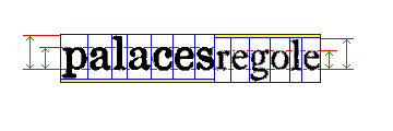
This image:
illustrates another issue connected with type sizes.
In the illustration, we see the word "palaces" in a typeface from 1930, intended for use in a newspaper, and the word "regole" in a typeface from 1691, used for printing fine books.
Both words include one lowercase letter that ascends above the line (in some typefaces, they are noticeably taller than capital letters), and one lowercase letter that descends below the line. The height of lowercase letters that have neither ascenders nor descenders is called the x-height; it determines the visual size of printed letters, but it isn't tied to the point size of the type, which is determined by the size of the type body (shown in the diagram by the blue boxes around the letters).
Because the descenders in the newspaper face are short and stubby, while those from the old book face are long, in order to make the baselines of the two words line up, leads have to be used, below the newspaper face and above the old book face.
This will work if the height of the leads required happens to be a size which the printer happens to have on hand. Thus, the height needs to be an exact multiple of 1/2 point, and, ideally, it should be a multiple of 1 point for the greatest convenience.
In order to allow this, type foundries, during the 19th Century, adopted systems by which the distance of the baseline of letters above the bottom of the type slug was standardized. Thus, the letters printed by type bodies of a certain point size were slightly smaller than they would otherwise have been in order to fit into the standard.
For type of any one point size, the baseline usually could be in one of three positions; a very low position, for titling fonts (in which only capital letters were present, and so there were no descenders to worry about); a standard position which was still fairly low, as, at the time, economical use of paper was a great concern, and so most typefaces had short and stubby descenders like those still used for newspaper typefaces; and a high position for script faces and authentic versions of older typefaces. Thus, the Inland Type Foundry referred to these three positions as the Standard Title Line, the Standard Line, and the Standard Script Line; Barnhart Brothers and Spindler referred to them as the Cap Line, the Uniform Line, and the Text Line; American Type Founders at one point referred to them as the American Title Line, the American Common Line, and the American Script Line; and then later used the term Art Line in place of Script Line.
Combining contradictory information from multiple sources, it appears that the American Common Line allowed the amount of space at the bottom of the letter for the descender shown below, and that the other standards similarly allowed what is shown:
Type Size:                    5   6   7   8   9  10  11  12  14  16  18  20  24  30  36  42  48  54  60  72


ATF      American Common      1   1   2   2   2   2   3   3   3   3   4   4   5   7   9   9  10  11  12  14
Barnhart Uniform              1   1   2   2   2   2   3   3   3   3   4   4   5   6   7   8  10  11  12  14
Inland   Standard             1   1   2   2   2   2   3   3   3   3   4   4   5   7   8   8   8   8   8  14

ATF      American Script/Art  2   2   3   3   3   4   4   4   5   5   7   7  10  11  13  14  15  16  17  24
Barnhart Text                 2   2   2   2   3   3   4   4   5   5   6   7   8  10  12  14  16  18  20  24
Inland   Standard Script      2   2   2   3   3   3   3   4   5   5   5   6   8  11  13  14  14  14  14  16

ATF      American Title       1   1   1   1   1   1   1   1   1   1   1   1   1   1   1   1   1   1   7   7
Barnhart Cap                  1   1   1   1   1   1   1   1   1   1   2   2   2   3   3   3   3   4   4   4
Inland   Standard Title       1   1   1   1   1   1   1   1   1   2   2   2   2   2   2   2   2   2   2   8
The numbers given for the Script Line for ATF are merely conjectured at this point, but the other rows of the table have been derived from one or another source.
It may be that there was a constant offset of a fraction of a point from the descender sizes listed here, as well, and this could have differed for each manufacturer.
The space allowed for the descender was usually a minimum 1/5 of the height of the type body, rounded upwards to the next nearest point; while two exceptions were made, 1/6 in the case of 6 point type, and 3/16 in the case of 16 point type, 48-point and 60-point type did not copy those sizes.
In the case of the script line, it appears that the goal was for the descender to occupy about 1/3 of the height of the type body.
All these distances differed from one another by even multiples of a point, and also from the distances applying to all other point sizes, making it practical to mix types of different sizes and styles on the same line of text as required, and yet keep a perfectly aligned baseline.
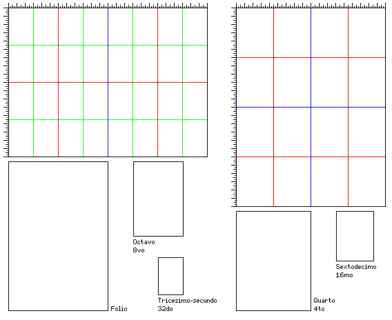
As for old books, it may also be of interest to note the terms for page sizes:
                          Traditional            American Demy          Metric
Sheet size:               18"     x 24"          17"     x 22"          A0:  841mm     x 1189mm

Quarto              4to    9"     x 12"           8 1/2" x 11"          A2:  420.5mm   x  594.5mm
Sextodecimo        16mo    4 1/2" x 6"            4 1/4" x  5 1/2"      A4:  210.25mm  x  297.25mm

Folio                     12"     x 18"          11"     x 17"          A1:  594.5mm   x  841mm
Octavo              8vo    6"     x  9"           5 1/2" x  8 1/2"      A3:  297.25mm  x  420.5mm
Tricesimo-secundo  32do    3"     x  4 1/2"       2 3/4" x  4 1/4"      A5:  158.625mm x  210.25mm

Duodecimo          12mo    6"     x  6"

Vicesimo-quarto    24to    4"     x  4 1/2"
The derivation of these sizes being illustrated below:
Many different paper sizes exist, a different series of sizes being used in the United States and in Britain. Some of the most common paper sizes are:
              British                American                 Imperial

Imperial      29 1/2" x 21 1/2"      32" x 22"                 30" x 22"
Royal         23 1/2" x 19"          24" x 19"                 25" x 20"
Demy          19 1/2" x 15 1/4"      22" x 17"                 22 1/2" x 17 1/2"
Foolscap      16 1/2" x 13 1/4"      17" x 14"                 17" x 13 1/2"
Crown         15" x 20"
American Foolscap was 14" x 17", thus giving rise to the traditional legal size page of 8 1/2" x 14", just as American Demy gave the standard 8 1/2" x 11" sheet of typewriter paper, which is approximated by the metric A4 size.
The diagram below illustrates the mathematical principle that may have led to particular choices of paper size being preferred:
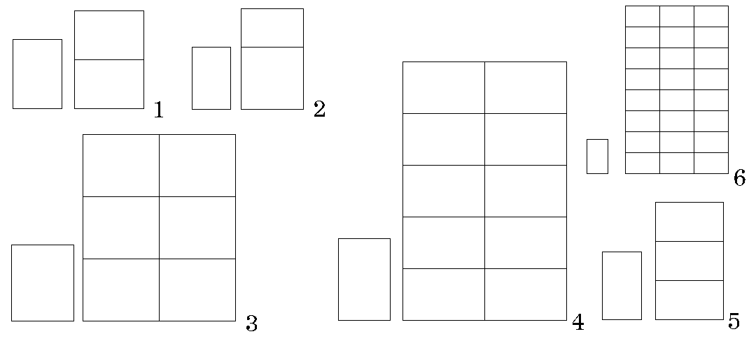
If one's goal is to be able to print books of a particular shape, that is, with a rectangular page that has a given ratio of width to height, but in several different sizes, then if that ratio happens to be closely in the neighborhood of 1 to the square root of 2, one is in luck.
As section 1 of the diagram above shows, if you start from a large sheet of paper in that aspect ratio, in addition to using square numbers to cut it into more sheets of paper of the same shape, one can also cut it into twice the number of smaller sheets of paper of the same shape, but sideways.
I see from Wikipedia that we even know whose idea this was; it was apparently first suggested by one Georg Christoph Lichtenberg in 1786.
However, on further investigation, I learned that his letter to Johann Beckmann dated October 25, 1786 noted that the very sheet of ordinary writing paper on which he wrote the letter was already in that ratio, so clearly printers were already aware of the benefits of such a paper size in practice well before that date - so the question of who deserves the credit is still an open one.
So in addition to cutting it into 4, 9, 16, 25, and so on smaller sheets of paper, since 2 is not a square number, one has 8, 18, 32 and so on as additional choices.
Section 2 of the diagram illustrates the Golden Ratio. That lets one cut a rectangle in that size into a smaller rectangle of that size... plus a square. However famed the Golden Ratio might be for its aesthetic properties, that's no help to the printer.
But the square root of 2 isn't the only basis for the shape of a sheet of paper that does yield more choices to the printer.
The square root of 3 will work as well, as section 5 of the diagram shows; here, one can have three times the number of smaller rectangles of the same shape when one goes sideways.
And the square root of one and a half works, as shown in section 3, and the square root of two and a half works as well, as shown in section 4. Neither three, six, nor ten is a square number, so each one of them can provide additional choices.
And finally, section 6 of the diagram shows that the square root of 2 2/3 can be used to obtain a very close approach to the golden ratio, and so a sheet of paper in these proportions can be cut into 24 pieces, in addition to 4, 9, 16, or 25 pieces of the same shape. And 24 pieces, even if very close in size to 25 pieces, might be easier to produce from dimensions well suited to making 9 or 16 pieces.
Since 24 is six times 4, one might suspect that there is a relationship between section 6 of the diagram and section 3 of the diagram. And indeed there is. The rectangles in section 3 have the proportions of one to the square root of 1 1/2; cut such a rectangle in half down the middle, and the proportions of the two pieces are then of one to the square root of 2 2/3, the type of rectangle featured in section 6, as this diagram shows:
Now, let us try to systematize some of this information. The various ratios that can be used to allow pages of different sizes to be made in the same proportions that we've seen are:
The square root of 1 1/2           1.22474
The square root of 2               1.41421
The square root of 2 1/2           1.58114
The square root of 2 2/3           1.63299
The square root of 3               1.73205
Now, let's compare that to some of the paper sizes we've seen:
Foolscap       17" x 14"           1.21429
Royal          24" x 19"           1.26316
Demy           22" x 17"           1.29412
Imperial       32" x 22"           1.45455
So these sizes seem to belong to the cases shown in sections 3 and 1 of the diagram.
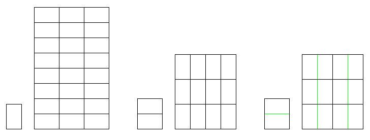
For any paper size, quarto, nono and sextodecimo will produce pages of different sizes, but in exactly the same proportions, since these sizes divide the sheet into two, three, or four parts each way.
For the Imperial paper size, its proportions being near the square root of 2, folio, octavo, octodecimo, and tricesimo-secundo will produce pages of a similar proportion; thus, Imperial Folio will be 22" x 16", with the sides in the ratio 1.375, and that ratio will apply to all the other sizes in this family.
For Foolscap, as well as Royal and Demy, pages with a different proportion will be produced, but as this proportion will approach the Golden Ratio in size, it will still be a desirable proportion.
Foolscap Folio   14" x 8 1/2"     1.64706
Royal Folio      19" x 12"        1.58333
Demy Folio       17" x 11"        1.54545
And because this proportion is close to the square root of 2 2/3, or its parent proportion is close to the square root of 1 1/2, a similar proportion should also be obtained by dividing the sheet in the long duodecimo fashion, where the short dimension of the original sheet is divided into four parts, while the long dimension is divided into three parts, instead of the other way around:
Foolscap Long Duodecimo     5 2/3" x 3 1/2"     1.61905
Royal Long Duodecimo        8"     x 4 3/4"     1.68421
Demy Long Duodecimo         7 1/3" x 4 1/4"     1.72549
Note that Foolscap Long Duodecimo comes particularly close to the Golden Ratio.
On the other hand, Demy Long Duodecimo seems to be too tall and narrow to be of interest. Demy Duodecimo, on the other hand, would be 5 2/3" x 5 1/2" in size, for a ratio of 1.0303, too close to a square to normally be of interest.