Devoting all this space to unit systems and character widths, I might as well go "whole hog", and present this little cross-reference of some historical font metrics:
| Characters | Font, Device | |||||||||||||||||||
| 12-point Oldstyle type, Foundry (1/4 point) | Times Roman, Monotype | Teletypesetter | Graphotype (improved) | IBM Selectric Composer (1/72" for 11 point) | IBM Electronic Typewriter Model 50 (1/60") | Adler Daisywheel Typewriter PS | Diablo 630 (1/60") | Baskerville, ATF Typesetter Model B (7 unit) | Self-Spacing Type | Quick-Set Roman | Typotabular Gothic No. 4 (1/72") | Graphotype (original) | Documentary, IBM Executive (1/32"); Friden Justowriter | Charter, IBM Executive (1/45") | Mid-Century, IBM Executive (1/36") | Varityper | Varityper, Coder 2 | No. 17 with Condensed Title No. 5, Linotype (1/36") | Raphael, Underwood | |
| i j l | 15 | 5 |
(remove j) 6 |
5 | 3 | 3 |
(add I) 3 |
(add I) 3 |
2 | 2 | A |
(I: 3 units) 2 |
2 | 2 | 2 | 2 | 2 | 2 | 1 | 1 |
| f | 6 |
(add j) 7 |
6 | 4 | 4 |
(remove I) 4 |
(remove I) 4 |
|||||||||||||
| t | 17 1/2 | 3 |
(remove J) 3 |
|||||||||||||||||
| I | 7 | 8 | 7 | 3 |
(add Z) 2 |
2 | ||||||||||||||
| r |
(add 0, 1, 2, 3, 4, 5, 6, 7, 8, 9) (remove J) 9 |
(add o) (remove g, v, x, y) 5 |
(add o) B |
3 | ||||||||||||||||
| s |
(J: 3 units) 4 |
3 |
(add R, X, Y) 3 |
|||||||||||||||||
| z J | 21 | 8 |
(g, v, x, y: 9 units) 8 |
5 | 5 | 5 | 3 | |||||||||||||
| c e |
(add o) 10 |
3 | ||||||||||||||||||
| a g v |
(add o) (remove g, x) (0, 1, 2, 3, 4, 5, 6, 7, 8, 9: 24 units) 25 |
9 |
(add J) (remove 0, 1, 2, 3, 4, 5, 6, 7, 8, 9) 11 |
(add L) 4 |
(add Z) 4 |
(remove o) C |
(add J) 4 |
|||||||||||||
| x y 0 1 2 3 4 5 6 7 8 9 | 6 | h k n o u |
(add g, x) (remove o) 27 |
10 |
(b, d, o, p, q: 9 units) 10 |
(add g, v, x, y)
(remove o) 6 |
||||||||||||||
| b d p q | ||||||||||||||||||||
| S | 11 | 6 | 3 | |||||||||||||||||
| P | 33 | 11 | (remove P) 12 |
(add V, Y) 6 |
6 |
(remove L, O, Q) 5 |
(remove w, X, Z) 5 |
5 | 4 | 4 |
(remove Z) 3 |
|||||||||
| Z | 12 | 7 | ||||||||||||||||||
| E F L |
(add C, T) (remove E, F) 13 |
(remove E, T) 12 |
||||||||||||||||||
| B |
(add F, P) (remove w, C, R, T, X, Y) 14 |
7 | ||||||||||||||||||
| T |
(remove w) (add A,U) 35 |
4 | ||||||||||||||||||
| C | 13 |
(remove V, Y) 7 |
7 | D | 4 |
(remove R, X, Y) 4 |
||||||||||||||
| w V |
(remove w, G, R, X) (add D,E,T) 13 |
8 | ||||||||||||||||||
| A G O Q R X Y |
(add w, K) (remove A, U) 38 |
14 | ||||||||||||||||||
| D N U | 15 |
(add w, E, G, R, X, Y) 15 |
(add w, G, R, X) (remove D, H) 14 |
(add O, Q) 6 |
||||||||||||||||
| H K |
(remove K) 40 |
(add w, X) 6 |
6 | |||||||||||||||||
| m | 18 | 9 | 8 | 8 | 5 | 5 | ||||||||||||||
| M | 18 |
(add H) 15 |
7 | 7 | 5 | |||||||||||||||
| W | 50 | 16 | ||||||||||||||||||
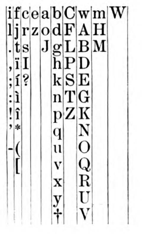
I've found information on the Diablo 1640 and 1650 printers and printing terminals which gives a different spacing than that shown above for the Diablo 630 printer. Surprisingly, the spacing is different for typestyles on metal and plastic printwheels.
For metal printwheels, the spacing is:
3 ijl I
4 frst
5 abcdeghknopquvxyz JS 0-9
6 BEFLPTVZ
7 w ACDGHKNOQRUXY
8 m MW
which is not too different from that shown for the Diablo 630 above, although it does differ in some details.
For plastic printwheels, the typestyles are slightly smaller:
2 j
3 il I
4 frst J
5 abcdeghknopquvxyz BEFLPSTZ 0-9
6 ACDGHKNOQRUVXY
7 mw MW
but the fact that lower-case j is smaller than any other letter means that the chart above would have to be altered significantly to include this arrangement.
For the oldstyle foundry type shown in the first column of the table, the digits are oldstyle or non-ranging digits, and this may be a reason that they are somewhat narrower.
Note that the lowercase letter g is narrower than the digits on the Selectric Composer, and the lowercase letters g and y are both narrower than the lowercase letters h, k, n, o, and u in Monotype Times Roman, while on the Mag Card Executive, lowercase g and y are wider than the digits and the lowercase letters h, k, n, o, and u, and, thus, there is a note to that effect in its column, as these letters cannot merely be displaced to an adjacent row in the diagram.
Often, the differences in unit systems are due to differences in the style of the typefaces they were designed around. Thus, no letters had to be displaced in the unit system of the Selectric Composer compared to that of Monotype Times Roman. Although both of them used 7-unit systems, different letters were displaced for the ATF Typesetter and Self-Spacing Type; this could be because the first typeface, or at least one of the earliest typefaces, designed for the ATF Typesetter was a version of Baskerville, and thus its unit system could have been designed around that face, while Self-Spacing Type, a special kind of foundry type originally created by Linn Boyd Benton, the father of Morris Fuller Benton, which was designed to a unit system as an aid to the setting of tabular matter, may have been designed around the proportions for Scotch Roman. And the Teletypesetter was intended primarily to set copy on Linotype machines for newspapers, and thus its unit system was designed around typefaces such as Corona or Ionic No. 5, which have a very large x-height.
In addition to having a unit system, Self-Spacing Type had one other thing in common with the IBM Selectric Composer. The IBM Selectric Composer used only three sizes of unit, 1/72", 1/84", and 1/96". It allowed margins to be set, and tab stops to be placed, at locations spaced one-sixth of an inch apart. (Note that the unit sizes actually had 1/12" as a common multiple.) Self-Spacing Type was also based on aliquot parts of the pica em, approximately one-sixth of an inch; it could have 6, 7, 8, 9, 10, 11, 12, or 13 units to the pica em, so if we take that as exactly one-sixth of an inch, its unit sizes would be 1/36", 1/42", 1/48", 1/54", 1/60", 1/66", 1/72", and 1/78".
Although the Selectric Composer had only three unit sizes, more than three point sizes were offered of several of its more popular typefaces; this led to the problem (as noted, for example, in Production for the Graphic Designer) that changing the point size of text might only change the size of the text in the vertical direction, producing less impact than expected for copyfitting purposes. This also meant that some sizes of a typeface would be slightly more or less condensed than others.
The Varityper had four different unit sizes, designated A, B, C, and D. The A scale had the largest unit size, the D scale the smallest.
Initially, I had some difficulty puzzling out the size of a unit in each of these scales, but I believe that I now have determined this correctly:
A  23/900"
B  21/900" or 7/300"
C  19/900"
D  17/900"
all these sizes being expressed in inches.
At a late date, a second version of the English-language coder was offered for the newer models of Varityper in which the coder could be removed and changed. This allowed some type fonts, such as their version of Univers, to provide a narrower width, 3 units instead of 4, for a few capital letters. While the regular coder was very similar to the spacing for the Documentary typestyle on the IBM Executive typewriter, Coder 2 was more like the spacing used for Charter or Mid-Century.
When a control was pulled out on the Varityper to turn off proportional spacing, each character was assigned three units of space.
The units for Self-Spacing Type were, like those of the Selectric Composer, also subdivisions of the Pica em. While Selectric Composer units were 12, 14, and 16 to the Pica em, Self-Spacing Type units were 7, 8, 9, 10, 11, and 12 to the Pica em.
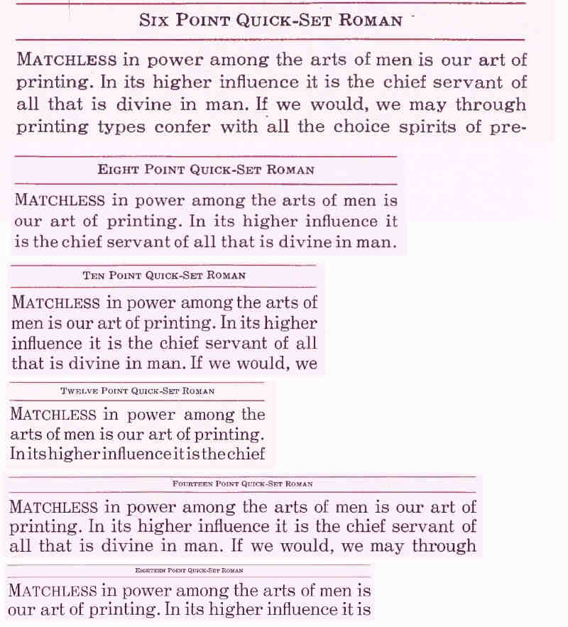
Later, another form of type based on this principle, Quick-Set Roman, was made and sold by American Type Founders. Instead of using units which were different fractions of the Pica em, the fundamental unit was 1/2 point, or 1/144", although the effort was made to minimize the use of half points. Characters were made in only four different widths, and which character was assigned to which width did not vary with the size of the type, but the ratios between the various widths were allowed to change. The four widths for 6, 8, 10, and 12-point type, as given in the 1923 ATF catalog, and the widths for 14 and 18-point type, of which specimens are also given, are noted in the table below:
| Point Size: | 6 | 8 | 10 | 12 | 14 | 18 |
| A | 2 | 3 | 3½ | 4 | 5 | 6 |
| B | 3½ | 4 | 5 | 6 | 7 | 9 |
| C | 4 | 5 | 6 | 7 | 9 | 12 |
| D | 5½ | 6½ | 8 | 9 | 12 | 16 |
Despite the greater limitation in the variation of the widths of the characters, this later form of type seems to me to have been at least as attractive in appearance than Self-Spacing Type, its predecessor.
While the table above shows no difference in the allocation of the letters to the four possible widths for all the sizes, the small capital version of J was allocated to class B for six-point type, but to class A for the larger sizes.
Here are the specimens of Quick-Set Roman from the 1923 ATF specimen book all scaled to the same size, so that the effects of the variations in letter size on the quality of the resulting text can be seen:
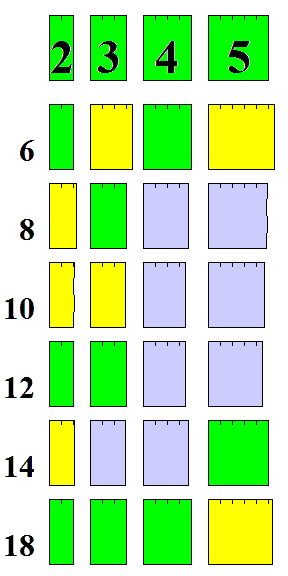
and this chart of the relative sizes of the four widths for each point size shows that they're not far away from the four sizes available in the kind of five-unit system used on the IBM Executive Typewriter or the Flexowriter (for the particular scale used in each row, green indicates a match, yellow a larger size, and light blue a smaller, to make it easier to compare the sizes of the various widths for each point size; but it shouldn't be forgotten that all the sizes are relative), indicating that the plan of allocating the four available widths to the various letters used in Quick-Set Roman should be applicable there as well, allowing a general improvement in the apparent quality of printing at the cost of denying the widest letters their full proper width.
However, it seems that despite having a greater limitation on character widths than the Selectric Composer, both of these forms of unitized type appear to be just about as good as normal printing type, so that at least on casual inspection, there is nothing wrong with them to be noticed. This is unlike the five-unit system of the IBM Executive, which results in typed text that, while more appealing than conventional monospaced typing, is still clearly inferior to genuine printed text under almost all circumstances.
How could that be possible? I believe that the fineness of the unit system was improved by choosing to make a different compromise: the widest letters, such as W and M, were the same width as other capital letters, instead of being significantly wider, so for most of the characters, a larger selection of widths was available, enabling finer distinctions to be expressed.
Here is a specimen of Self-Spacing Type:
and here is one of text typed on an IBM Selectric Composer, which I think is truly indistinguishable from normal printing (at least insofar as the fineness of its unit system is concerned, it is still possible to tell it apart based on other factors):
and, finally, a sample of text typed on an IBM Executive typewriter, which I think can be seen to fall noticeably short, despite being not unattractive:
In addition to also making monospaced Mailing List Type, there was yet another unitized font for rapid setting available from ATF; this was their line of Typotabular Gothics. Most of these faces resembled Copperplate Gothic, but there was also a condensed gothic as well. These were all-caps fonts, with I (and sometimes J and 1) being one unit wide, and all other characters two units wide. There was only one exception to this, Typotabular Gothic No. 4, which did have lowercase, and four different sizes of characters; this one is shown in the table above.
Later on, ATF made use once again of the fact that a seven-unit system, unlike the five-unit system of the IBM Executive typewriter and the Friden Justowriter, was sufficient to produce results that looked like "real printing", at least to the naïve eye.
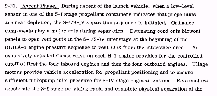
The original version of the ATF Typesetter, an early phototypesetting machine, as it was first introduced in 1958, used a five-unit system, at least at first.
As can be seen from the picture, it looked like a Friden Flexowriter, but with the typebars and carrage removed, and a phototypesetting assembly, using a disk containing the typeface in use, added on.
To produce justified type, this printing unit, performing the same function as a Justowriter reproducer, had to run from paper tape prepared on another unit which was basically a Justowriter recorder.
The ATF Typesetter had an interesting history. Originally, it set type using 5-unit typefaces, just as the Justowriter on which it was based did. This would seem to make it hard to justify the additional expense of this phototypesetter, as against a Justowriter with a carbon ribbon. However, ATF had considerable expertise in typeface design, and it could also have skewed the unit system towards higher unit counts, giving finer distinctions for the less wide characters: for example, by basing it on the system of their Quick-Set Roman, and this could have led to even their 5-unit typefaces having better apparent quality than nearly all IBM Executive and Justowriter faces. At the moment, however, this is purely speculation on my part.
As ATF was able, without making extensive modifications to its design, to allow it to use 7-unit typefaces, it quickly moved to do so.
A 7-unit version of Baskerville was designed for it by Samuel Winfield Thompson (usually known as Tommy Thompson), who also designed several foundry typefaces for them. I believe I have seen a document set in that face, dating from 1961, and indeed, while it may be slightly inferior to conventional typesetting, the difference was far more subtle than that between ordinary 5-unit faces, such as those of the IBM Executive typewriter, and regular type. This is true despite the fact that the widest letters were not limited in width the way they were to improve the appearance of Self-Spacing Type.
This may seem to raise a question. Given that a 7-unit system, without an imposed width constraint on the widest characters, seems to be adequate to produce output that is hard to distinguish from conventional typesetting, why is it that the IBM Selectric Composer did somewhat restrict the width of the widest characters?
While it is true that the quality of type produced by the ATF Typesetter in its 7-unit version was slightly inferior to that of the Selectric Composer, so that while it wasn't obviously inferior to real typesetting, a subtle difference that one can't quite put one's finger on is still visible, and there is also the question of the "jump" from 2 to 3 units as the width of the narrowest characters, so that a subdivision of the em into an arbitrary number of units won't necessarily produce an improvement in quality for every single unit added... but that is not really what is at work here, as print quality is not the only issue involved.
The Selectric Composer was built to use elements that were physically equivalent to the elements used on the IBM Selectric typewriter, so that much of its mechanism could be used in its construction. That meant that the size of the widest possible characters was limited by the size of the element; and for that typesetting machine to be versatile enough to be useful, it had to be able to produce type in sizes up to 12 points, or, for some typefaces, at least up to 11 points.
Here is a sample of work which I am certain was typeset on the ATF Typesetter; this is not in ATF Baskerville, but in Century Schoolbook, another 7-unit typeface for the machine:
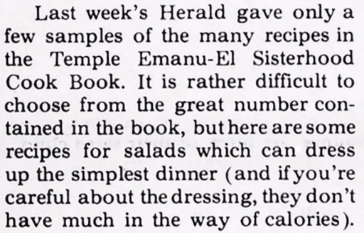
In my opinion, the quality of this type is very nearly indistinguishable from normal typesetting.
The particular issue of the publication from which this was taken (the February 8, 1963 issue of the Rhode Island Herald) included an article about how they had recently begun typesetting it with the ATF Typesetter. So, from that I know this was done on that machine. It was dated 1963, and, in addition, there was a photograph of the printing unit, which showed it did not have the front attachment characteristic of the model B-8, therefore I know this is not produced with an 18-increment typeface. From detailed examination of the image, I determined that the letter "m" was fully three times as wide as "i", so it had six units; therefore, this must have been done on a 7-unit machine and not a 5-unit machine. It has been difficult for me to find an ATF Typesetter print sample in which I could have this level of confidence.
ATF did not stop its efforts to improve the quality of type produced by the ATF Typesetter, but it took a few additional years to achieve a more radical improvement. In 1963, ATF announced the new ATF Typesetter Model B-8, which was available by 1964; this was the first one to offer their 18-increment system. That required significant modifications to the design, described in U.S. Patent 3,333,668; the printing unit could be distinguished by the addition of a metal box in front of the keyboard with a row of buttons.
This picture shows what the newer version looked like:
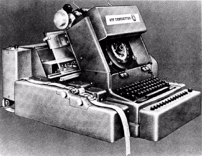
An ATF Typesetter disk had the upper- and lower- case versions of two styles of type, such as Roman and italics or Roman and boldface, on it. Initially, the keyboard had 42 keys for printing characters, that was later increased to 44.
I had believed that, being built around the mechanical Friden Justowriter, the ATF Typesetter shared one limitation with the IBM Selectric Composer: the unit system, allocating widths to each character in a typeface, was the same for every typeface. However, I have now learned that the ATF Typesetter Model B, which apparently is the one with a 7-unit system, did incorporate (as a new feature, and a version for use by newspapers existed without that feature) a width control system, so indeed different typefaces could have different widths for each letter. However, the same brochure that I saw which mentions this also, in its illustrations, showed that the bold and italic forms of a given typeface still had the same width, even in typefaces such as Baskerville where this was not appropriate.
The width control system required a metal framework from which the widths were read to be replaced for each given scheme of widths, so no doubt they were relatively expensive.
However, in addition to having a full 18-unit system in its later versions, it avoided another limitation of the Selectric Composer: instead of just having three escapements, the size of a unit was determined by two gears that the user could replace, and so the set width was very flexible, and could exactly match what was appropriate for a given point size of a typeface.
At least one version of the ATF Typesetter could be used to set body copy in sizes from 5 1/2 points to 14 points, with the ratio between the size of the characters on the disk and those placed on the film being fixed, so that a different disk was required for each size of type.
And here is an illustration, from an advertisement by Schelter and Gieske, of a typeface they offered which I at first took to be an illustration something which they offered which was similar to Self-Spacing Type, but more detailed examination of the image revealed that as the spacing shown was comparable in fineness to that of the 18-unit Monotype system, it was more likely that this system applied to all their typefaces in general, and the advertisement was just highlighting their systematic organization.
And, as I've noted, I think that the unit system of the IBM Selectric Composer is fine enough that the matter which it produces is not, for that reason, distinguishable from conventional typesetting, even if the distinction can often be made easily enough on the basis of other factors - a Selectric typeball does not tend to maintain the precise alignment that the matrix-case in a Monotype caster does.
Yet, for some, even the 18-unit system of the Monotype is not adequate. The Lumitype and the Photon provided a 36-unit system, and this was at the request of the noted type designer Adrian Frutiger, who genuinely found the Monotype system inadequate to express some of the subtleties of the proper shape of letterforms, so this was not a feature simply thrown in because it was easy to do and a possible talking point in advertising. Another phototypesetter broke up the 18 units of the Monotype em into three parts each instead of two, for a 54-unit system.
One obvious benefit of a very fine unit system is that if one is copying a pre-existing typeface, particularly from foundry type, one could obtain adequate results by just copying the characters as they are, and then using the nearest width available, instead of having to use the pantograph to widen or condense some characters slightly to properly fit the nearest available width.
One place where a finer unit system is desirable even when a typeface is being drawn to fit within it is for the narrowest letters. Thus, on the Selectric Composer, the narrowest letters, i and l, are each 3 units wide; c and e are both 5 units wide. On the Monotype, these two groups of letters are respectively 5 and 8 units wide. Since the narrower letters occupy only a small number of units, the possible choices of widths for them mean that the ratio of their widths can only be specified coarsely.
The references to two forms of the Graphotype in the table above are to a typesetting machine invented in 1893 by George A. Goodson; the name "Graphotype" was later applied by Addressograph-Multigraph to an embossing machine which is not in any way related to it.
A table in the famed reference work Typographical Printing-Surfaces, by L. A. Legros and J. C. Grant, giving the widths of the characters in two fonts of foundry type, one a modern typeface and one an oldstyle typeface, appears to indicate that a unit system was in use for foundry type as well:
Units     Points    Inches    Modern           Oldstyle
 16 2/3    12 1/2   0.17296                    W
 16        12       0.16604   W+=@             +=
 13 1/3    10       0.13837                    HMm@
 12 2/3     9 1/2   0.13145   KMm              DGKNOQRXw&
 12         9       0.12453   HGNUX$
 11 2/3     8 3/4   0.12107                    ACTUVY
 11 1/3     8 1/2   0.11761   ADEOQRVY
 11         8 1/4   0.11416                    BEFLPZ$
 10 2/3     8       0.11070   BCFLTw%&
 10         7 1/2   0.10378   PZ
  9         6 3/4   0.09340                    Sbdghknopqux
  8 2/3     6 1/2   0.08994   SJbdghknpqu
  8 1/3     6 1/4   0.08648                    aovy
  8         6       0.08302   vxy1234567890*   1234567890*%
  7 1/3     5 1/2   0.07610   ao
  7         5 1/4   0.07264   ce               Jcez
  6 1/3     4 3/4   0.06573   Irs?
  5 5/6     4 3/8   0.06054                    Irst-/?
  5 1/3     4       0.05535   fjt
  5         3 3/4   0.05189                    fijl[]()
  4 2/3     3 1/2   0.04843   il-/[]()
  4         3       0.04151   .,:;'!           .,:;'!
The fundamental unit is 1/6 of the unit used, but note that only once is the unit split into sixths, and there does seem to be a preference for whole units as opposed to thirds of units. As 13 1/3 units, or 40/3 units, equals 10 points, 1/3 unit appears to be 1/4 of a point, and 1/6 unit appears to be 1/8 of a point. There is reason to believe that the practice was not to scale the unit size with the size of the type, but rather to have the widths of all type slugs as multiples of 1/4 point or 1/8 point, since several ATF catalogues note that spaces which are nominally 3-to-em, 4-to-em, or 5-to-em in fact have their sizes altered so as to be multiples of 1/4 point, as shown below:
Point size:    6      7      8      9     10     11     12     14
            -----------------------------------------------------
3 to em        2      2 1/2  3      3      3 1/2  3 1/2  4      5
4 to em        1 1/2  1 3/4  2      2 1/4  2 1/2  2 3/4  3      4
5 to em        1 1/4  1 1/2  1 1/2  1 3/4  2      2 1/4  2 1/2  3
It might be asked why foundry type would make use of a unit system.
Some typefaces for use on Linotype machines are designed to a unit system, so that they are compatible with both the Monotype machine and with electronic systems by which copy is prepared on a typewriter keyboard, punched on paper tape, and then transmitted in order to automatically operate Linotype machines at remote locations.
But it is clear that Linotype typefaces do not need to adhere to a unit system, because springs are used to provide spaces between words that lead to justification.
In the case of foundry type, though, one uses metal slugs to insert space between words, and space between text and the end of a line. So every letter and every space has a specific physical width.
If the widths were not all multiples of a common unit, then there would be no guarantee that it would even be possible to make every line the same length.
By using 1/4 of a point as the common unit, ATF made it possible to mix typefaces with different point sizes on a line and still make all the lines end evenly.
Of course, one could design a typeface where every letter is an integral number of units in width except for, say, "w"; make that letter, say, 6.123 units in width, and also make special anti-w spaces that are 1.877 units in width - and always use one anti-w space in a line for every w in the line. So commensurability is not absolutely required for justification or locking type in the form, but it is still the simplest way to achieve that.
It turns out that this consideration appears to have been apparent to even the earliest printers. Thus, the doctoral dissertaion of Frank E. Blokland, a Dutch type designer, showed evidence that the type used by Johannes Gutenberg was designed according to a unit system, and that this was also true of other early typefaces, such as the Roman type of Sweynheym and Pannartz, or the Roman type of Nicolas Jenson.