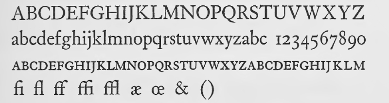
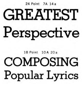
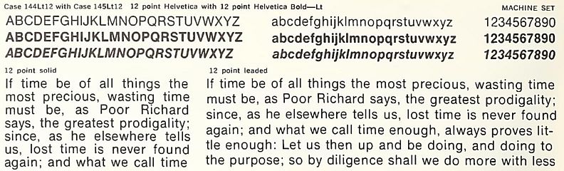
On these pages, I discuss the point system used by printers, and related topics, at length, and I also talk about the IBM Selectric Composer along with other direct impression composition devices at length.
Thus, it seems appropriate to add to this page a brief discussion of the typefaces used in printing and how they were developed. Of course there are books which treat this subject more thoroughly and from greater competence on the part of their authors, but a brief overview might at least pique the interest of some.
Printing with movable type was originally invented in China. As the Chinese writing system makes use of a large number of characters, printing in this fashion was less convenient for them, and thus yielded less in the way of immediate benefits over older methods of printing. The method was borrowed by the Koreans, who did have an alphabetic script, Hangul, and they printed books in this way before Gutenberg as well.
But it was when printing with movable type was rediscovered in the West, and specifically after it was employed by Johann Gutenberg, that this invention was started on the road to changing the face of the world.
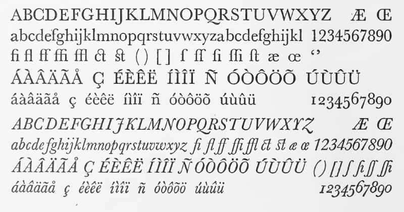
By the time the printing press began to be used in the West, the Latin alphabet had already developed into its present form with both upper-case and lower-case letters. This took place under the initiative of Charlemagne. The Carolingian majuscule was modeled after Roman monumental inscriptions; the Carolingian minuscule on the manuscript writing form called Uncial.
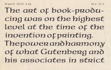
The display typeface American Uncial, shown below, has its lower case based on the Uncial script, but it also includes the addition of an anachronistic set of capital letters.
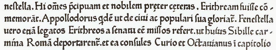
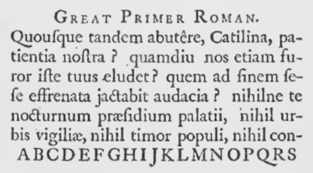
Two editions of the Bible, one commonly called the 42-line Bible, the other the 36-line Bible, are associated with Gutenberg. For a time, only the 36-line Bible was known. Currently, it is believed that only the 42-line Bible was actually printed by Gutenberg, and the 36-line Bible was printed by a later printer who acquired some of the type Gutenberg used.
The 42-line Bible used to be called the Mazarin Bible, and the 36-line Bible had several names, depending on who it was thought had printed it.
Here is what the type of the 42-line Bible looked like:
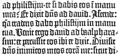
Today, fonts for comic book lettering will often include multiple forms for each letter, so that the text they produce will look like it was hand lettered. Gutenberg did this with the typeface used for the 42-line Bible, so that it would not be obvious it was not produced by a scribe.
An ATF type style, Wedding Text, belongs to this general group:
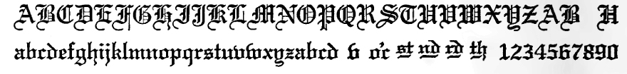
today, this kind of typeface is only used for decorative purposes, and with ever-increasing rarity.
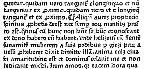
Another book printed by Gutenberg, the Catholicon, was printed in a rounded style of Gothic type which appears much more readable to modern eyes:
Deriving both from humanist script and Roman carved lettering, Roman typefaces emerged as an alternative to blackletter, also known as Gothic. (The term Gothic can be confusing, as it is also the name of a style of sans-serif type.)
The Roman type of Sweynheym and Pannartz, one of the earliest examples of Roman type, was calligraphic in nature, unlike most later Roman types:
Acclaimed as one of the greatest examples of Roman inscriptional lettering, the inscription on Trajan's column inspired the capital letters in many typefaces:
John and Wendellin de Spira were the first printers in Venice, having been granted a five-year monopoly on printing in Venice in 1469. A sample of their printing is shown below; their typeface is clearly a worthy predecessor of that of Jenson, which we will examine next. However, Nicolas Jenson began printing in Venice the very next year, in 1470; what had happened was that the five-year monopoly was in the name of John de Spira, and as he died from the black plague, the Venetian senate did not renew the monopoly, and assign it to his brother Wendelin, because at that point, it had become clear that the market for printing in Venice was large enough to support competition.

One of the earliest printers to use Roman type, although later than Sweynheym and Pannartz, received lasting acclaim for his Roman type: Nicolas Jenson. Here is a sample of his type:
Many present-day typefaces were inspired by the printing of Nicolas Jenson. These typefaces, however, although beautiful and readable, are generally used for artistic printing rather than everyday printing.
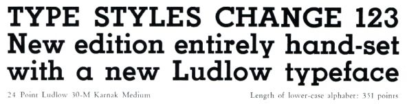
First, let us look at Eusebius, from Ludlow. The Ludlow typesetter allows one to assemble matrices manually, as printers manually assembled type, and then mold a solid line of type with them. It is usually used to supply such things as titles in large type for a print job otherwise typeset on a Linotype machine.
This is one of the Jensons that is the most faithful to Nicolas Jenson's original typeface. It was drawn by Ernst Detterer and first made available in 1923.
One of the first attempts to revive the style of type used by Jenson, along with some of his contemporaries, was the Golden type of William Morris. In addition to being the author of The Well at the World's End, he was a Utopian reformer, one of the founders of the Arts and Crafts movement.
Here is a sample of the Golden type:
Several commercial typefaces, for advertising and for titles in books and magazines, were inspired by the Golden type of Morris; the most popular was Jenson Old Style:
here represented from a specimen of Lining Jenson Old Style No. 2 in the 1912 specimen book from ATF.
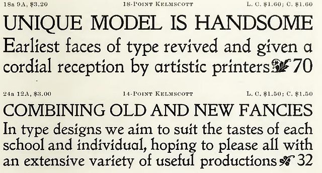
Here is Kelmscott, from the Inland Type Foundry:
Here is Ancient Roman, from the Keystone Type Foundry:
Linotype's version was simply called Jenson:
They also had a version of Cloister as well, for another take on the Jenson design.
And here is Mazarin, which was designed by Berne Nadall, who also designed Fifteenth Century, better known as Caslon Antique:
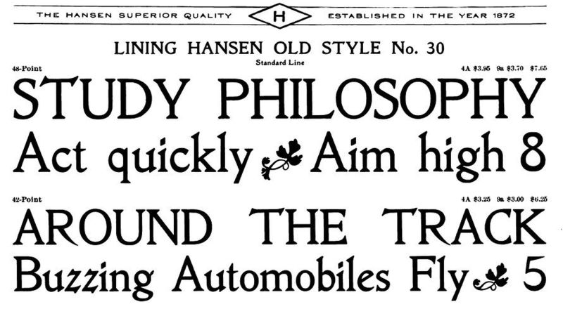
And then there was the H. C. Hansen Type Foundry.
It gave us Lining Hansen Oldstyle No. 30:
Lining Poster Hansen Oldstyle No. 30:
Lining Hansen Oldstyle No. 40:
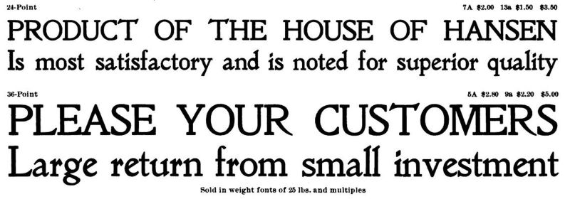
and Lining Hansen Poster Oldtyle No. 40:
One type in the Jenson style that was much admired had a poignant story associated with it. The Doves type was designed by T. J. Cobden-Sanderson and cut by the punchcutter Edward Prince. It was the private press typeface of the Doves Press.
It was used for a five-volume edition of the Bible; the first volume was published in 1903, the second in 1904, and the series was completed in 1905.
After the Doves Press closed up, Cobden-Sanderson retained the type, punches, and matrices of the Doves type, but they were to revert to his partner, Emery Walker, upon his death. However, he was horrified at the thought this fine type might eventually be turned to lesser purposes, and secretly, bit by bit, threw the materials into the Thames.
This was discovered after his death; by that time, Edward Prince could not cut punches to equal those he had cut before, and Emery Walker could find no other punchcutter to do the face justice.
Very recently, some of the types for Doves had been recovered from the banks of the Thames, and this has led to a recent attempt at a digital revival of the type by the British company Typespec.
Cloister Old Style was designed by Morris Fuller Benton. He was the son of Linn Boyd Benton, the inventor of the type-cutting pantograph, and thus the second in the American Type Founders dynasty. This typeface was a reasonably faithful adaptation of the Jenson, and yet modernized just enough to be suitable for commercial work as well as artistic work.
It has a companion italic, which is anachronistic, and that italic is not even a narrow italic in the chancery style which would belong to the next group of typefaces we will encounter. However, I cannot fault this, as it makes the typeface usable in more situations.
However, unlike most other Jensons, despite being "dated" to 1460 or so by virtue of being Jensons, some of the subtle changes in modernizing this typeface have, unfortunately, caused this type to be dated - to around 1915, when it was designed.
Another type in the Jenson style is Centaur, by Bruce Rogers. Many hold this type to be the finest of all these typefaces, while others give first place to the lost Doves typeface.
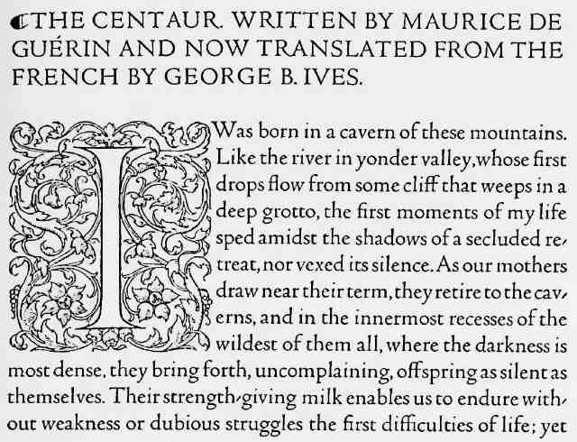
In addition to its first use, in an edition of the book for which it was named, Centaur was used by Bruce Rogers to produce two notable editions of the Bible; the Oxford Lectern Bible (1935) in an edition of 200 copies, and the Bruce Rogers World Bible (1949) in an edition of 975 copies.
Another typeface in the Jenson style was Kennerley Old Style by Frederic W. Goudy. Here is a sample of text set in that typeface:

And here is a specimen of Goudy Bookletter 1911, by Barry Schwartz, which resembles it:

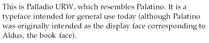
One very popular modern typeface which I believe can be properly characterized as a Jenson is Palatino, by Hermann Zapf. This typeface was originally intended as a display typeface, with the typeface known as Aldus being its book version.
Hermann Zapf had intended that typeface to be called Palatino Book, and he also found the name Aldus annoying for the additional specific reason that Palatino was not designed as an Aldine.
While it was modeled on humanist manuscript hands, much as Jenson itself was, it was also designed for legibility, so as to be a practical typeface for widespread modern use, not simply a historical revival for producing books of great beauty but perhaps less practical usefulness than something set in a contemporary face.
While Aldus has been used widely in book publishing, Palatino itself has been so popular as to also have been used for books instead of the face intended as its book weight.
Here is a small specimen of URW Palladio, which closely resembles Palatino:
Modern typeface designers still find inspiration in the printing of Nicholas Jenson. One modern Jenson is ITC Berkeley Old Style, drawn by Tony Stan, and based on another typeface by Frederic Goudy designed for the University of California. Another is Hightower, by Tobias Frere-Jones. Yet another one is Nicolas Jenson SG designed by Jim Speice; this one takes its inspiration from Ludlow's Eusebius.
Linotype, in an effort to compete with Jenson Old Style, came up with a typeface based on the work of a different type designer of the period, Plato de Benedictis:
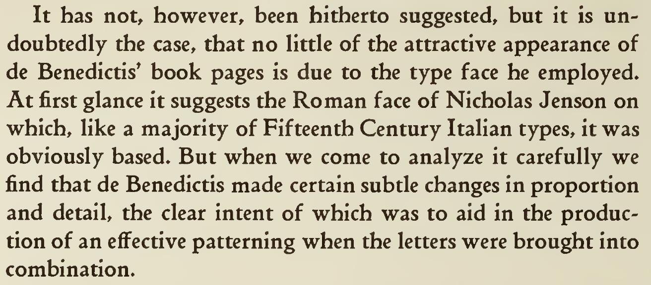
The uncial outward curve of the lowercase "h", and the bar over the top of the capital "A" definitely give it a more explicitly archaic appearance.
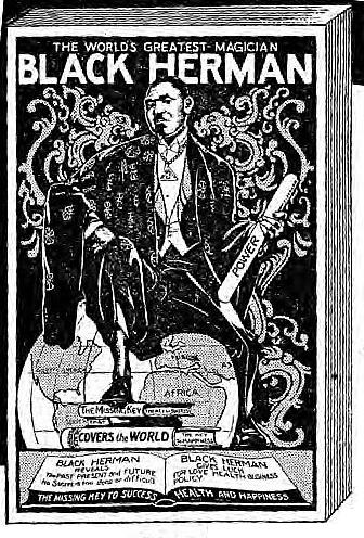
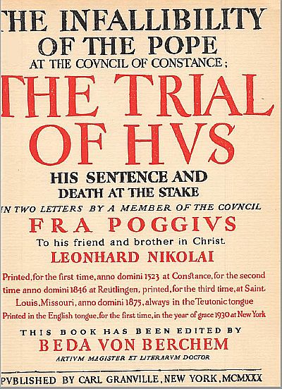
This is the typeface in which Black Herman's Secrets of Magic-Mystery & Legerdemain was set!
This unassuming volume, as shown at left.
It turns out that this volume was not something fraudulently ascribed to his name after his death: it was sold at his performances. He passed away at the untimely young age of 44 from a heart attack.
I did a search, to see if I could find another example of a book set in the typeface Benedictine Book. The title page of the first one I did find is shown at right.
It is because this attempt at approximating a fine example of typography (although the private presses seriously attempting to do that didn't have their publications set on Linotype machines) explicitly stated the typeface in which it was printed, as well as the paper on which it was printed,
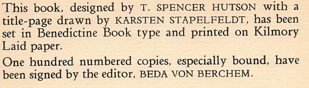
that I was able to locate it.
I had wondered which of these books is worse; an attempt to prey on the gullible, or an apologia for murder. Is the typeface under a curse, or what? But I see that I was mistaken about the latter book; rather than a justification of the execution of Jan Hus, it was rather an account praising him and condemning his execution; it was, though, also a forgery, pretending to be a series of letters written by a Catholic.
And, on continuing my search, I've found it was also used for the works of John Raymond Shute, such as The Seer, His Parables and Tales, The Chapel of the Seer, and Soft Tolls the Bell, and, more recently, Lawrence B. Holdridge's Symphony in B Minor: The Passion of Peter Illitch Tchaikovsky.
And here is an image of the original type on which this typeface was based:
Here is a somewhat higher-quality image of this type:
While the curved lowercase "h" in a Roman type may look strange to modern eyes, note that this was also present in the type of de Spira; and that there was a valid historical reason for this form of the letter, since originally when Charlemagne had caused our modern dual-case script to be invented, while the upper case was derived from Roman monumental capitals, the lower case was derived from uncial, in which this curve was a feature.
Another contemporary of Jenson who produced type worthy of note, who I only recently learned of when I took another look at Daniel Berkely Updike's Printing Types: Their History, Forms, and Use: a Study in Survivals was Pacifico Massimo, an example of whose type is shown below:
After Nicholas Jenson, while several other early printers were also of note, the next major milestone in printing was achieved by Aldus Manutilus.
The Aldus Press was famed for printing books in italics, so that they could be more compact, and thus less expensive. It was only later that italic type came to be used for text to be emphasized; before that, emphasis was indicated by letterspacing the words to be emphasized. This continued to be done for books printed in a Fraktur typeface, as companion italics were not considered appropriate for them.
Italics are certainly much more noticeable than letterspacing. However, the fact that they are commonly used for emphasis in most books can be confusing to readers of one particular Book. In Hebrew, as in some other languages, such as Russian, for example, the word "is" can be omitted in a sentence; thus, in most traditional Bible translations, when it is necessary to add "is" or "was" in order for the English translation to make sense, it is printed in italics; but this does not mean that these words, which the original could omit, are to be taken as of particular importance.
Aldus Manutilus' roman type was, for a time, not regarded as nearly as significant as Jenson's, but later typographers have recognized its importance.
The roman types other than Venetians, used for day to day printing instead of specialized artistic printing, that we use today all derive from his roman type.
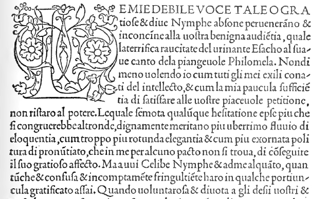
Almost every book on the history of printing in its typographical aspect features an illustration of a page from his first edition of Hypnerotomachia Poliphilii; thus, I was rather amused when another author, inspired by the success of Dan Brown's novel The Da Vinci Code, wrote a thriller in a somewhat similar vein, with, as he explained in a television interview, this incredibly obscure book that almost no one had ever heard of - that book being Hypnerotomachia Poliphilii - as the cornerstone of its plot.
He was correct, though, that until very recently, the only translation of this book, written in a mixture of Latin and medieval Italian, into English was incomplete. Unfortunately, at least for the soundness of his argument, though, there was a complete translation of the book into another language, that incredibly recondite and obscure tongue known as "French", made shortly after the book's original release... and, as that book is also featured in many books on the history of printing as an example of the original Garamond typeface, the existence of that translation is also not a terribly obscure and little-known fact.
Thus, whether or not those who translated the book into English in the modern day made use of this crib, meanings in that book which may only have been accessible to its contemporaries in its original language were not necessarily lost.
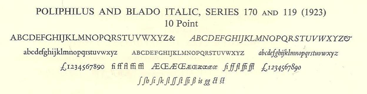
Monotype designed a typeface, Poliphilus, baed on the type of this book. Instead of having an italic of its own, the italic typeface Blado was recommended as its companion italic.
Here is a specimen of Poliphilus together with Blado:
However, their later typeface Bembo, also based on the type of Aldus Manutilus, was much more successful.
That was based on the type of De Ætna by Pietro Bembo. It was not a completely different typeface; the same lower-case type was used as in the Hypnerotomachia Poliphilii, but it had used a different upper case. De Ætna was published in 1495, while the Hypnerotomachia Poliphilii was published afterwards, in 1499.
Here is a sample of that work:
The main difference between the typeface used here, and the Roman of Nicolas Jenson, is that the capitals were redesigned so that instead of being based on the capitals in Humanist manuscripts, they more closely resembled the incised capital letters on ancient Roman monuments.
The book De Ætna is not only famous for the style of its type; it is also in this book that the semicolon was first used!
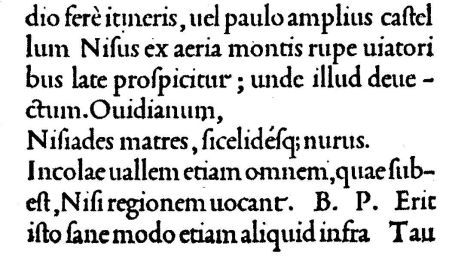
And here is some text in Monotype's Bembo typeface:
Incidentally, when Bembo, Series 270, first came out, Monotype called it Aldine Bembo, later shortening the name.
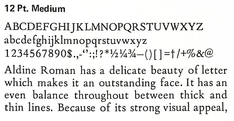
And here is a specimen of Aldine Roman, for the IBM Selectric Composer, also inspired by the typeface of Aldus Manutilus used in De Ætna:
While many typefaces inspired by Nicholas Jenson's type are well-known and celebrated, Aldine romans are considerably less common. However, I have learned that there are some out there. One of the most well-known of them were created by Robert Slimbach for Adobe: Minion. Another notable Aldine roman is Dante, created by Giovanni Mardersteig (but cut by Charles Malin) for Officina Bodoni. Also by Mardersteig, and also an Aldine roman, is Griffo, named for Francesco Griffo, the punchcutter who crafted the original Aldine types. A recent addition to this category is Agmena, created by Jovica Veljović for Linotype.
Still other typefaces in this group include Ivan Louette's Hilfea, and 1501 Manutius by Klaus-Peter Schäffel.
One source that came up in my searches mentioned Aldus, by Hermann Zapf. However, that typeface was not actually designed as a version of Francesco Griffo's roman for Aldus Manutius, it was simply a modified version of Palatino, and in fact, Hermann Zapf himself preferred it to have been simply named "Palatino Book".
As well, I had mistakenly thought that Arno was also a typeface inspired by that of Aldus Manutilus which Robert Slimbach created for Adobe. It turns out this was not quite right; it was instead primarily inspired by the more popular model of Nicholas Jenson's type, but it was softened by admitting the influence of Aldus Manutilus' type as well.
Here is an image of part of Songe de Poliphile published by Kerver in Paris in 1546, the example of the Garamond type I mentioned:
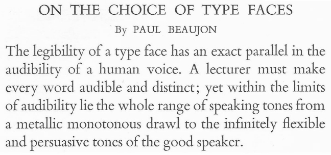
The typeface we know by the name Garamond was actually based on type which was similar in style to that which Claude Garamond originated, but which was cut by Jean Jannon later. This was discovered by Beatrice Warde, who published her findings in 1927 under her pseudonym Paul Beaujon.
This is true of the ATF Garamond typeface from 1917, shown here,
and also of Monotype's Garamond from 1923.
The name Garamond being taken, when Linotype developed a typeface based on Garamond's own original design, they called it Granjon, which prompted Beatrice Warde to write:
"It would seem that Garamont's name having so long been used on a design he never cut is now by stern justice left off the face which is undoubtedly his."
And here is a specimen of Linotype Granjon:
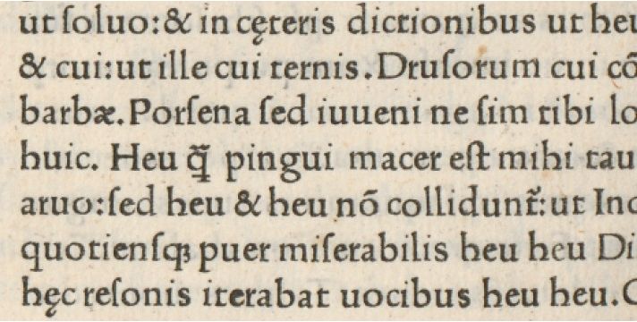
Here is an example of a typeface I could not yet identify, which appeared to me deserve to be categorized as a Jenson:
It's from a 1930 illustrated edition of the popular 1815 poem Lalla Rookh. Although in general aspect it looks like a typeface in the Jenson style, the detailed characteristics of specific letters resemble a Garamond, and it has short descenders. However, on closer examination, I have found one distinctive characteristic of a specific letter that may permit identification: the capital letter P is not closed.
I then found a clearer sample of a similar type from the same printer, however, and this one does clearly seem to be a Garamond and not a Jenson:
But is this extract from Poems of Giovanni Pascoli actually in the same face? If so, perhaps the type in the first book had been made to appear bolder due to how it was photographed for digitization.
Identifont led me through the specific characteristics of several other letters in the edition of Lalla Rookh, most notably the capital K and the capital Z, and finally suggested Stempel Garamond.
From the type of Jenson onwards, the Roman typefaces we have already examined belong to the "Old Style" classification. Here, we will look at some later old style types.
The Roman type of Nicolas Kis has been considered notable enough that it was revived as both Janson and Ehrhardt; these names resulted from an initial difficulty in identifying him as the punchcutter; it was mistakenly believed that the types produced by the Ehrhardt foundry were made from matrices cut by Anton Janson, a Dutch punchcutter.
Here is a sample of this typeface as it existed originally,
in a 1759 specimen from the Ehrhardt type foundry.
And here is a somewhat different typeface, which appeared in a Hungarian-language edition of the New Testament printed by Nicolas Kis:
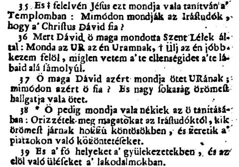
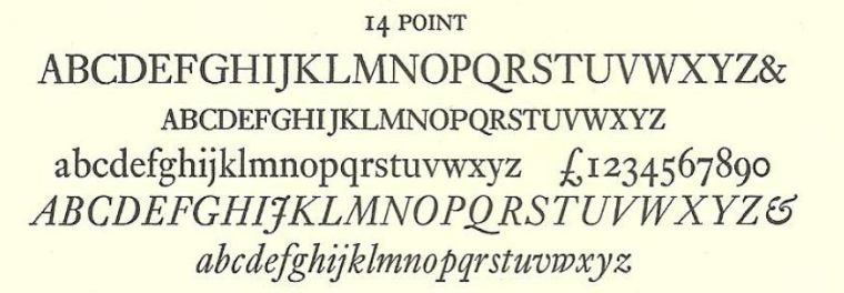
Here is Linotype's Janson:
Here is Monotype's Ehrhardt:
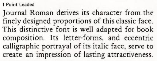
Here is a specimen of Journal Roman, a typeface for the IBM Selectric Composer, which, like Janson, is based on the work of Nicolas Kis:
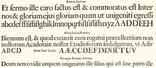
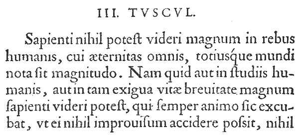
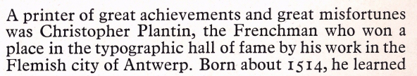
An even more popular style of Roman type was that devised by Christophe Plantin. Here is a sample, from his specimen book, of his Roman type:
And here is the Monotype Plantin typeface, which was brought out in 1913:
Here is some text in that typeface, from a magazine published in 1930:
At first when I saw it, it looked so much like Times Roman - but the date made that impossible. And, as is visible from the sample above, the capital J extends below the line, and the numerals are oldstyle, which also shows that no, it is not Times Roman.
Here is another specimen, this time from Ludlow:
This typeface was very popular itself, and it later was the basis for another typeface originated by Monotype that became extremely popular.
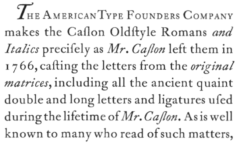
Christophe Plantin worked in Antwerp. Dutch types in general, because they were in wide use in England at the time, were the inspiration for William Caslon in devising his famous Roman type:
This style of type, imitated by nearly every typefounder of that era, was the principal typeface used by printers in the English-speaking world for over a hundred years.
From 1741, here is an example of high quality printing using the Caslon typeface by the famed English printer William Bygrave:
Above is another example of his work from an even better source.
And here is a recent version of the Caslon typeface:
Quite unlike the original, because it is intended as a workhorse typeface and not an artistic one, it has quite short descenders.
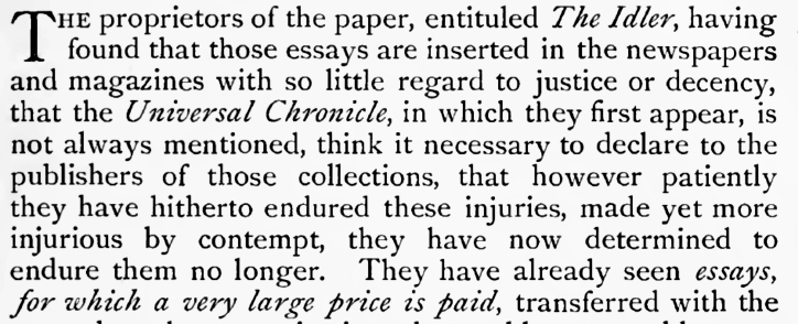
However, not all modern versions of Caslon were modified in that manner:
In 1913, Monotype created the typeface Imprint, originally for a magazine about printing titled "The Imprint", but which was later generally available. This typeface was a modernized version of Caslon, and a sample is shown below:
Also, the old style cut by Alexander Phemister for the Miller and Richard foundry in the 1850s, when old style types were being revived, although treated as a generic old style type at the time,
is not without its charm; it provided much of the inspiration for the later Century Oldstyle design. Alexander Phemister also designed the typeface Bookman.
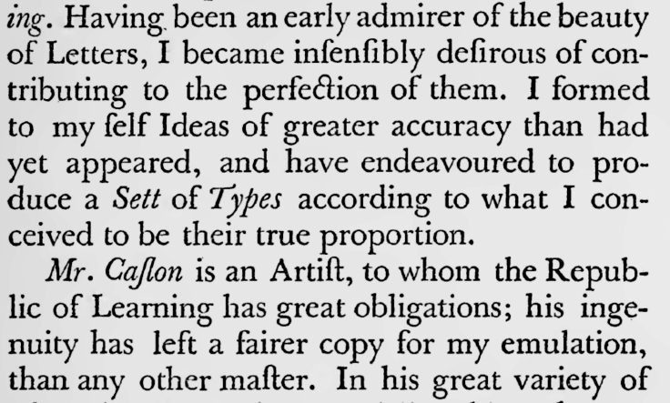
John Baskerville was a printer in Birmingham whose printing was of very high quality, so much so that other printers disliked him for putting pressure on them to improve their craft.
His types are generally considered to have been the first transitional typefaces, while those of Caslon are classified as old style, although they are in many respects very similar to those of Caslon.
This text, printed by Baskerville,
is immediately recognizable as essentially identical to modern Baskerville type:
here represented by Monotype Baskerville.
Another text in Baskerville, but printed by another printer, J. Davis, presumably representing an effort on his part to produce the highest quality of printing possible, is shown from the second volume of an unfinished edition of the Bible by Alexander Geddes:
I turned this up while looking for Baskerville's own printing of the Bible.
John Baskerville printed two editions of the Bible, the first, in 1763, had marginal references, but no notes; the second, in 1769, had notes, but no marginal references.
I had read that in addition to being considered one of the monuments of good typography, his 1763 edition of the Bible, in the King James Version, modernized the spelling of the text of the Bible from that used in 1611 to that which is generally used in nearly all modern editions of the King James Version. However, I have since learned that this is not accurate. The Baskerville edition of the Bible from 1763 contained the text of the Cambridge revision of the text of the King James Version, by Francis Sawyer Parris, as it appeared in 1760. The version of the text of the King James Version that is generally used today is instead the Oxford revision, edited by Benjamin Blayney, from 1769. The original printing of this was by T. Wright and W. Gill, printers to the university, as was a later 1772 printing. A sample of this printing is shown below:
I had thought it was set in Baskerville rather than Caslon, though, but on reflection I am no longer confident of that.
The 1762 quarto of the Parris text, printed by Joseph Bentham, more definitely seems to be in Caslon,
but very carefully done, with high quality, as of course befits the printing of a Book held sacred.
Here is another example of a version of the Baskerville typeface, containing a famous quotation with which you may be familiar from a popular movie:
It expresses the philosophy of life of one well-known historical figure; but not a philosophy which I would wish to see emulated.
Also belonging to the Transitional classification is a typeface designed by Stanley Morison, using Monotype's earlier Plantin as an inspiration, and cut by Victor Lardent, the Times New Roman, a face which currently bids fair to rival Caslon's enduring popularity:
This illustration shows the version of the typeface offered with the Fotosetter, and it appears to be the version that Linotype had recut.
Here is a sample of Monotype's own original Times Roman. The most obvious feature, the plain italic lower-case "z", that differentiates it from Linotype's recutting is visible in this sample:
You have probably seen this typeface before, and you may even be able to write text in it on your own computer.
Times Roman became generally available for use in late 1933, after being exclusive to The Times (of London), which first used it in its edition of October 3, 1932, for a year. During 1933, Monotype introduced alternate long descenders for Times Roman; and in 1938, they designed a wider version of the typeface.
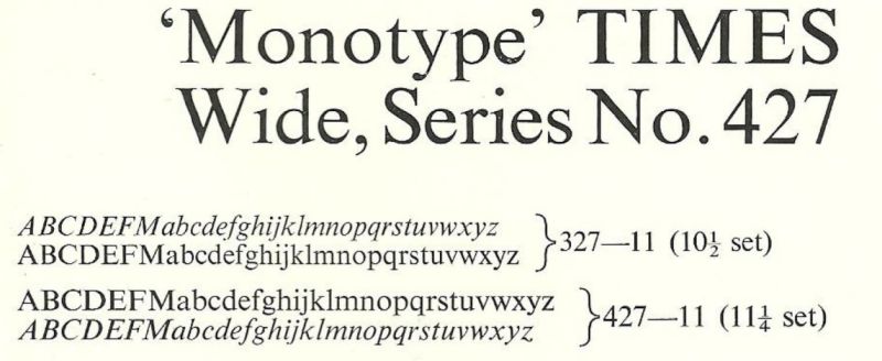
From seeing an illustration of the wider version of Times Roman, shown above, I've learned that the swash italic lower-case z, considered a distinguishing feature between Monotype's cut of Times Roman and Linotype's, was actually introduced by Monotype for Times Wide.
Because of the extraordinary popularity of Times Roman, makers of every sort of typesetting device either licensed it, if they could, or produced a typeface of their own closely resembling it if that was the only option open.
The latter would generally be the case for typesetting devices having a unit system of limited flexibility, for which Times Roman would have to be significantly modified, so as not to be quite the same typeface, or to have quite the same level of quality.
And, thus, here is Press Roman, for the IBM Selectric Composer, where the letters M, m, and W could not retain their full width:
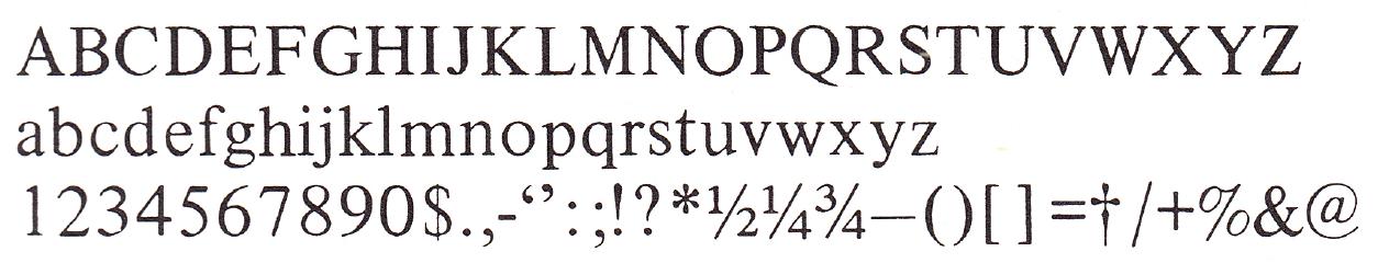
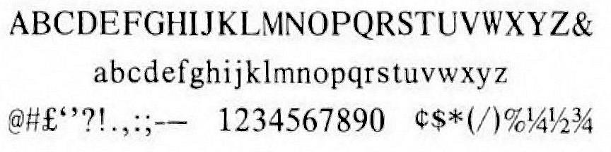
And here is Exeter, adapted to the four-unit system of the Varityper, which, of course, required significant compromise:
Actually, I do have a clearer image, this time of the 10 point size of Exeter instead of the 11 point size:
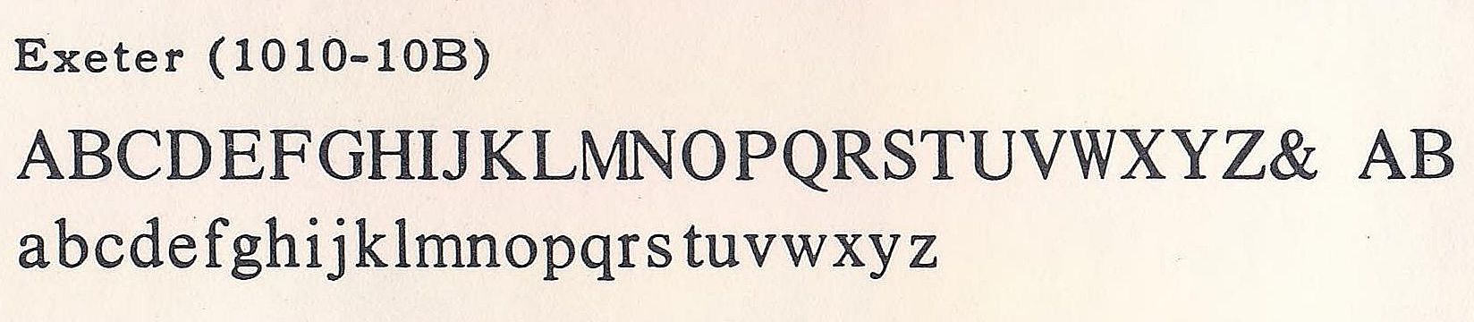
Here, we can see that the verticals of the lowercase "m" are thinner than those of the "n", which suggests that it was mechanically squeezed from the lowercase "m" of the actual Times Roman rather than being newly drawn.
Century Expanded might be classified as a Clarendon, but it lacks the heavy weight characteristic of that group of typefaces and it strongly resembles a Scotch Roman despite having bracketed serifs, and as it is also sometimes lumped in with the transitional faces, I will place it here.
It is a very popular typeface, appearing in many books and magazines.
Instead of just presenting an appearance of that typeface in a type specimen, however, I can give another example, also set solid without leading, wherein some historic words by Dr. John von Neumann appeared:
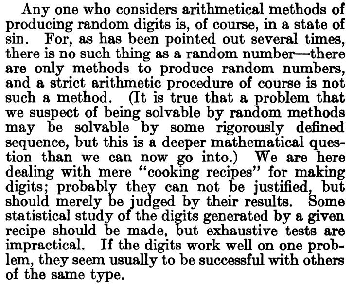
from his paper Various Techniques Used in Connection with Random Digits in Monte Carlo Method, National Bureau of Standards Applied Mathematics Series 12.
Giambattista Bodoni took some of the novel attributes of Baskerville's type to their ultimate conclusion, leading to a style of type with unbracketed serifs and strong stroke contrast.
This is a beautiful typeface, although more suited to display than to body text.
It led to the development of the various Scotch Roman typefaces. Some of those were quite good, but there were, as well, some thin and light ones that were unattractive, and formed the stimulus for a movement to revive the old style types such as those of Jenson and Caslon.
Classed as a Scotch Roman, but quite different from ordinary ones, is Caledonia, from 1947, by W. A. Dwiggins:
This typeface was very popular for many years. Caledonia, along with Times Roman, joined the ranks of Century Expanded, Baskerville, and Garamond as being one of the most commonly used typefaces for printing the text of books and magazines. It was the typeface used for Ace paperbacks, for example. And, for many years, before being supplanted by Times Roman (which has since also been replaced), it was the typeface used for Scientific American, from the January 1949 issue until the February 1976 issue.
Types with bracketed slab serifs are classified as Clarendons, from the name of the display typeface from which their popularity began.
Here is a typical example of the typeface known as Clarendon:
These are the monoline slab-serif typefaces.
Stymie, by ATF:
and as cut by Monotype under license:
Rockwell, by Monotype itself:
![]()
Memphis, by Linotype:
Karnak, by Ludlow:
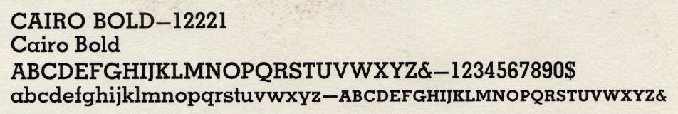
Cairo, by Intertype:
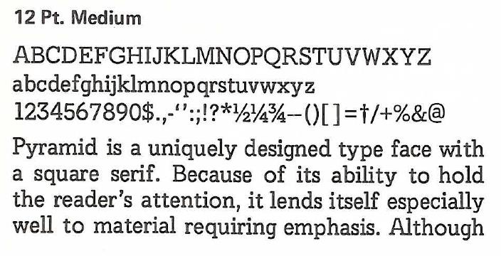
and, finally, Pyramid, by IBM for their Selectric Composer:
Many of the earliest sans-serif typefaces look quite ugly to modern eyes. However, this situation was eventually improved, and the sans-serif typefaces regarded as attractive today fall into several groups.
Here is an example of an early sans-serif typeface, although it is late enough that it seems only to be subtly flawed, rather than entirely unattractive:
Proceeding to those sans-serif typefaces which are fully acceptable by modern standards, here are the "gothics", such as News Gothic and Franklin Gothic, first developed in the United States:
Franklin Gothic:
News Gothic:

There are the geometric sans-serifs, like Futura, designed by Fritz Renner in 1927, and Kabel, designed by Rudolf Koch:
Futura:
Baltotype Sans-Serif Light, which somewhat resembles Kabel:
Futura was an extremely popular typeface, and so a number of similar typefaces were designed which resembled it.
While Vogue, from Intertype, was intended as a response to Futura, it is quite distinct:
Other typefaces inspired by Futura resembled it more closely.
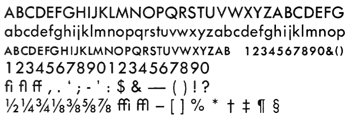
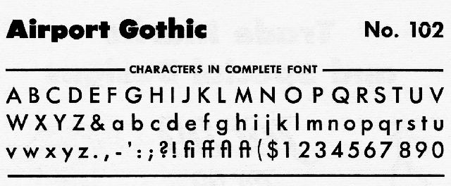
Thus, here is Airport Gothic, from Baltotype:
and Spartan, from Linotype:
and Tempo, from Ludlow:
By the time IBM came out with the Selectric Composer, the popularity of Futura had waned, and thus it did not create a typeface resembling Futura for the Selectric Composer. However, the typestyle Mid-Century, designed for IBM's Executive proportional-spacing typebar typewriters was inspired by Futura:
This typestyle can be seen in use extensively in manuals for computers offered by both the Digital Equipment Corporation and Scientific Data Systems (later Xerox Data Systems).
And then there are the typefaces descended from Akzidenz Grotesk, sold under the name Standard in the United States. Here is a short one-line specimen of Akzidenz-Grotesk, together with its semibold, bold, and wide versions:
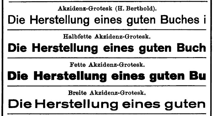
There is an English word accidence which refers to the study of the inflections of words; I am inclined to presume that this name was intended to imply that here was a Grotesque typeface designed with attention paid to the fine details.
The most direct descendant of Akzidenz Grotesk was Helvetica, which is familiar from much official signage in various places.
Here is a sample of text in Helvetica:

And here is a longer sample, this time of Helvetica being used for body copy instead of just a heading:

And here is another specimen of the typeface:
Helvetica has been so popular that some typographers are concerned that it may be overused. Some have pointed to Akzidenz Grotesk as a typeface with more character. Others, however, have recognized that Helvetica improved on Akzidenz Grotesk in some respects which are very useful for contemporary typography, and have tried working from Akzidenz Grotesk as a basis to produce a typeface which is both usable in a wide range of modern contexts, and which, even if for no other reason than the virtue of not being overused, would be evidence of superior taste on the part of the typographer. Usually, though, a genuine superiority over Helvetica is claimed, for example in having greater vigor or authenticity by remaining closer to the roots of the typeface category in Akzidenz Grotesk.
I will briefly mention some of the attempts along this line:
Gerstner-Programm, now available in a digital revival from Forgotten Shapes; it was originally developed for the Diatype phototypesetting machine.
Diatype, from Dinamo, may be similar.
Theinhardt, from Optimo.
Lab Grotesque, from Letters from Sweden.
Univers is better suited, though, to extended text setting. Here, though, I am not doing it justice, as it is only represented by the version designed for the IBM Selectric Composer:
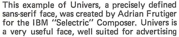
There is also a condensed form of Univers, illustrated here:
I am, however, suspicious that this sample may also be of type created on a Selectric Composer.
Actually, the story is more complicated than that, as Univers was originally designed with a system of weights and proportions based on a principle different from that used for other typefaces.
Also popular, especially in its extrabold extended form, is Venus:

Also a sans-serif type, but not being monoline, of quite a different kind, is Hermann Zapf's most famous creation, Optima, from Stempel in 1958.
Here is an example of text set in Optima, from a 1965 advertisement from Control Data:

Unfortunately, Optima's real claim to fame, its most unique characteristic, translates poorly to the discrete pixel world of computer screens and laser printers, although it was easily enough visible in the days of ink on paper applied by metal type.
Thus, here is an image at a large scale to make the use of flared stems in place of serifs visible. This enlarged image, however, is of URW Classico, which resembles Optima.