Understanding color begins with understanding light and the response of the eye to light.
The diagram at left shows the various wavelenghts of light and their colors, with the longer wavelengths placed on the left. Above the spectrum are shown the response curves for the three types of cone in the human eye.
Because the eye only has three types of light receptors, the information it gives us about the composition of light we see is limited. A mixture of light of two wavelengths will look the same as a mixture of light of one wavelength between them with white light, provided those two wavelengths are not too far apart. Mixing red and blue light produces purple, which doesn't resemble light of any of the wavelengths in between in hue.
It was Isaac Newton who, by conducting some simple experiments with prisms, showed that a prism divides light into its components, each with their own color, which then can't be further divided by going through a prism again, instead of in some way tinting the light or adding a color to it.
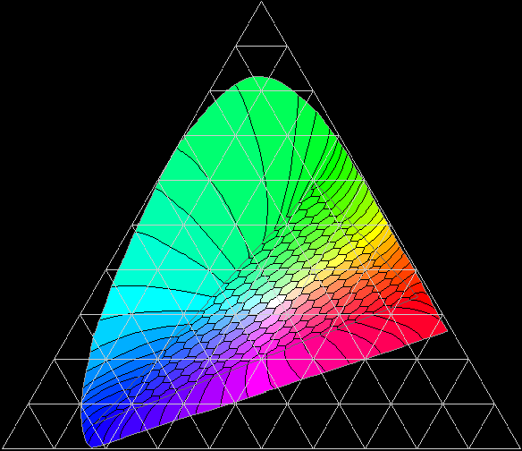
Using a tristimulus theory of vision, derived from experiments in which people matched colors formed in different ways, the CIE chromaticity diagram was developed. This is a version of it distorted to place it in an equilateral triangle:
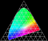
This shows how the colors of the spectrum can be thought of as forming an arch which surrounds the point at which white light is located, and at the bottom of the arch, the neutral point of white is enclosed on the other side with a straight line connecting the most extreme blue (violet) and the most extreme red (magenta).
Thus, while purple isn't a color that corresponds to pure light of a single wavelength, purples are hues which have fully saturated colors associated from them which are distinct from the hues of any spectral color. So the artist's color circle, which reserves a space for purple, is not being unscientific by doing so, as some people will occasionally assume by mistake.
Newton, who established the importance of the spectral colors, noted in Proposition VI, Problem II of his Opticks the following:
That if the point Z fall in or near the line OD, the main ingredients being the red and violet, the Colour compounded shall not be any of the prismatick Colors, but a purple, inclining to red or violet, accordingly as the point Z lieth on the side of the line DO towards E or towards C, and in general the compounded violet is more bright and more fiery than the uncompounded.
which shows that he understood that purple was a genuine hue. Even so, apparently as the result of the prevalence of this attitude, some versions of the artist's red-yellow-blue color wheel refer to the colors between blue and red as blue-violet, violet, and red-violet, and many of the pigments used by artists in the range between red and blue have "violet" in their names, not just those which resemble the short-wavelength light just past blue, the color of which is normally what is meant by violet as the name of a color, but when they go beyond that through purple, mauve, fuchsia and even magenta.
Whether it was artists or pigment chemists who were abashed by the reputation of Newton, and the common misunderstanding of his discovery, to be afraid to speak of purple, I do not know.
This diagram illustrates additive and subtractive color mixing.
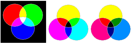
The first diagram shows how the three additive primaries, blue, green, and red can be mixed (additively) in equal proportions to produce cyan, yellow, and magenta, and the second diagram shows how the three subtractive primaries, cyan, yellow, and magenta, can be mixed (subtractively) in equal proportions to produce green, red, and blue.
The principle behind additive and subtractive color mixing is that if the visible spectrum is divided into three large chunks, containing the wavelengths of light that appear red, green, and blue respectively, since the eye senses colors with three types of receptors, producing colors by using these three kinds of colored light as the basic ingredients will allow all but the most vivid of colors to be accurately reproduced.
And, of course, this is an entirely reasonable premise, which has proven to be successful in practice; for example, it is how a color television set can work.
Note the third diagram in the illustration. It also shows the use of the three subtractive primaries, cyan, yellow, and magenta, to produce green, red, and blue. In this case, however, the amount of green in the cyan, and the amount of blue in the magenta, have been reduced to more closely approximate the appearance of typical printers' inks. This hasn't affected the hue of the red and blue areas in the simplified illustration, it has only made them darker.
Additive and subtractive color mixing represent the basis of a way of making colors that is valid for such things as color displays and four-color printing. It does rest on fundamental properties of light and the human perception of light. However, the validity of this way of systematizing color for certain methods of color reproduction doesn't make it universally applicable to such an extent that people are entitled to say that artists are wrong when they refer to red, yellow, and blue as the primary colors. For artists, given the pigments used in the making of paint, whether oil paint, watercolor, or acrylic paint (with a few exceptions, such as Prussian blue until recently, the same pigments are used across all the major paint mediums) their choice of primary colors is eminently reasonable.
For another thing, many paint pigments are opaque rather than transparent, and thus the way that colors combine when mixing paints does not correspond strictly to either additive or subtractive mixing.
Thus, the color wheel might look like this to an artist (although the six pigments chosen in the example are not necessarily the ones most commonly used).
Some color displays use a fourth color for an expanded color gamut. In the case of additive color mixing, dividing the spectrum up into smaller pieces obviously allows the production of more vivid colors in a simple way.
Many color inkjet printers now use more than just magenta, yellow, cyan, and black inks. But the additional inks might be light magenta, light yellow, and light cyan to make a six-color system. Even gray inks are added. And then, red, green, and blue inks may also be added.
This suggests that the spectrum is still only being divided into three parts.
Red, green, and blue inks, since they each absorb two, rather than one, parts of the spectrum allow less ink to be put on the paper; this is important, because considerations of allowing the ink to dry limit how much ink can be used.
Grey inks, and light magenta, light yellow, and light cyan inks make it easier to vary the amount of each color, since inkjet printers work by sending droplets of ink of a constant size to the paper.
Some Color Wheels
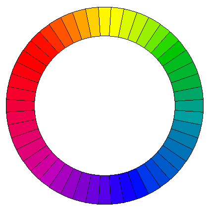
The commonest form of color wheel shows the three subtractive primaries, Red, Yellow, and Blue, with equal spacing.
The Munsell system of colors, which I think is one of the best color systems, uses a circle with ten hues: the five colors Red, Yellow, Green, Blue, and Purple are equally spaced.
And I remember a news item where Red, Yellow, Green, and Blue were identified as the "psychological primaries".
And of course color television and your computer monitor uses Red, Green and Blue as additive primaries, and color printing, unlike color painting, terms the subtractive primaries Magenta, Yellow, and Cyan.
What I like about the Munsell system is that it clearly exhibits the nature of the color itself. Yellow is lighter than blue, so it is shown on the same level as a lighter shade of gray than blue is.
But "best" is a very subjective thing. And it has to do with fitness for a particular purpose. The double-cone of Ostwald provides, for each hue, a triangle showing mixtures of white, black, and a fully-saturated hue - which is very practical for a painter seeking to mix paints to reach a particular shade.
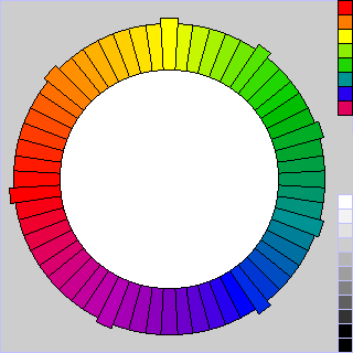
Here's my little addition to the general confusion. The color circle below is based on my notion of how to subjectively space the colors generally acknowledged as primaries:
Red is closest to Yellow. Blue is further away from Red, since those two colors stand at opposite ends of the spectrum. And Blue is farthest from Yellow, since Green is percieved as almost a primary: and the distance between Blue and Green equals the distance between Green and Yellow, and both are less than the distance between Red and Yellow.
A nice color circle meeting those conditions with 60 divisions can be produced by using the sequence of numbers 4-5-6.
Red to Orange and Orange to Yellow are each 8 hues apart.
Blue to Purple and Purple to Red are each 10 hues apart.
Yellow to Green and Green to Blue are each 12 hues apart.
And here's the color circle I arrived at on that basis:
Incidentally, I have now found out that there was an existing color system that was quite similar to this, although not identical.
I simply spaced out the colors according to my impression of the apparent psychological distance between the colors, while also adjusting the distances so that the color wheel could still be divided into various equal parts easily. Thus, the placement of colors in my system was admittedly arbitrary for purposes of convenience to some extent, and so I could make no claim that colors opposite each other on the diagram were truly complementary, or that colors at a certain angle would always harmonize well.
Thus, although there is a resemblance, my color system is not identical to, nor does it have as ambitious goals as, that of the California artist Hilaire Hiler.
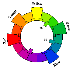
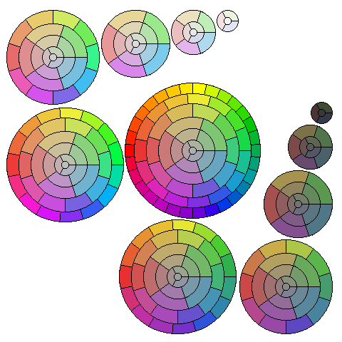
The diagram below illustrates a number of possible color wheels:
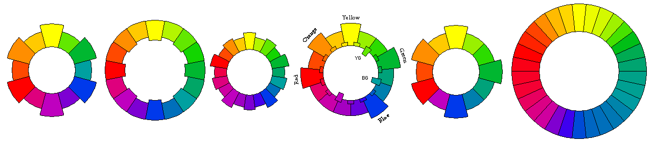
On the left, the first color wheel is the one based on the three traditional artists' primaries of red, yellow, and blue.
The second color wheel is one based on the four psychological primaries of red, yellow, green, and blue.
The third color wheel adds purple as a fifth primary color, as was done for the Munsell system.
Note that the next color that suggests itself as a new primary color to add would be orange; adding that as a sixth primary returns one to the original three-color circle at the left.
Thus, starting with red, yellow, and blue, and observing that green suggests itself first as needing to be added, and then purple, and then orange, the idea behind my scheme, shown in the fourth circle seems to be confirmed, that with the three original primaries of red, yellow, and blue, yellow and blue are farther away from each other than blue and red, which, in turn are farther away from each other than red and yellow.
But while red and yellow appear related, and the subjective difference between blue and red is large, since both blue and red are darker colors, and different shades of purple only receive limited use, as a color classification scheme, the system in the fifth circle, by allocating the smallest space to the colors between blue and red may be more practical. As well, it more closely corresponds to some experimental data on complementary colors by treating yellow and blue as complementary, as well as green and red-orange.
Finally, the circle on the right is my attempt to approximate the color wheel of 30 elements due to Hilaire Hiler.
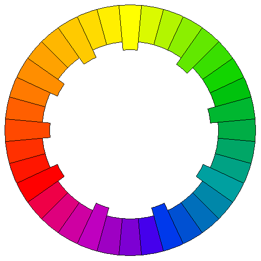
The problem I had with changing the 4-5-6 basis for the color wheel to make the distance between red and blue smaller than that from yellow to red was that then the distance from yellow to red would be harder to divide into halves and quarters.
Which is why I took the extreme step of going to a 1-2-3 basis. However, further thought led me to a 2-3-4 basis, which, as it leads to a wheel of nine colors, requires doubling in any case. Thus, here is a color wheel of 36 colors:
Of course, there are many other color wheels. This diagram, from elsewhere on my site, shows how the different hues are represented by different phase angles of the color subcarrier for color television:
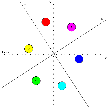
Instead of the artist's primaries of red, blue, and yellow, printing, color photography, and color television usually make use of a system which treats red, blue, and green as the additive primaries, and magenta, yellow, and cyan as the subtractive primaries.
The diagram below illustrates some of the different possibilities this might lead to; on the left is a color wheel based on the subtractive primaries magenta, yellow, and cyan, and on the right is one based on the additive primaries red, blue, and green, with intermediate steps of averaging between them in the middle:
This 48-step color circle is based on one example of a 24-color subtractive color circle that appeared in print:
it runs very quickly through the oranges, yellows, and yellow-greens, but slowly through the blues, purples, and reds.
Some other color systems appear quite unequal subjectively.
Thus, the above is an attempt of mine to approximate the color circle used in the Ostwald color system, which devotes a lot of space to the colors between blue and green.
The idea that more space ought to be devoted to the colors around blue appears to have originated with Adolf Hölzel. Among his pupils were Johannes Itten, and Carry van Biema, who perished in the Holocaust. In her work Farben und Formen als Lebendige Kräfte, Colors and Forms as Living Forces, she exhibited a color wheel which she credited to Schopenhauer; Itten, in a later book, included a similar one which he credited to Goethe.
The color wheel of Carry van Biema looks like this:
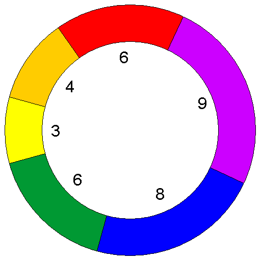
and it just shows six colors, red, yellow, blue, and the three intermediates between them, orange, green, and violet, but each of them is allocated a different amount of space, given as units out of a total of 36 for the complete color circle.
The purpose of this is to more correctly indicate which colors are harmonious and complementary; however, the rationale given is to give less space to the brighter colors, so each area on the circle reflects the same total amount of light, which, to me, does not seem to make sense as a basis from which to deduce the distance between different colors.
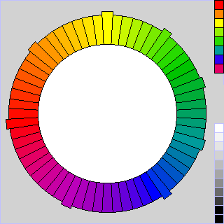
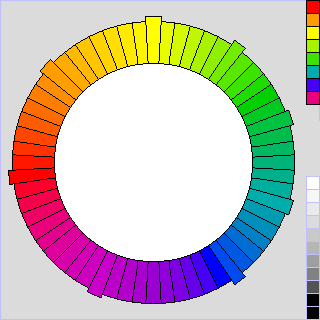
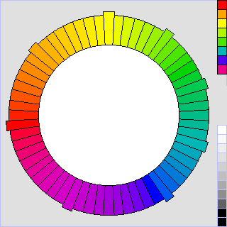
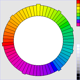
I've modified my own color scheme considerably since starting these pages; here is the revised color circle, with 240 hues in the color circle:
it acknowledges that the green phosphor in a CRT should be considered as representing quite a yellowish green, for example, compared to my initial attempt (however, this correction is now also present in the diagrams above).
Now, before continuing, I should address one objection that some people have to color circles like the one above.
Is Purple A Color?
Pure light with a wavelength of 650 nm is red; pure light with a wavelength of 575 nm is yellow; pure light with a wavelength of 475 nm is blue.
There is no wavelength of light which, by itself, looks purple. Yet purple is on the fundamental circle of saturated hues used by artists. Are they wrong: is purple only a "mixed" color, like brown or beige?
To answer this question, we need to know something about how human color vision works. The retina has two kinds of receptors, rods and cones. The rods are primarily sensitive to blue and green light, and are used for night vision. For normal vision, the cones serve, and there are three kinds of cones. Each kind is sensitive to a range of colors, but each one has a different peak of sensitivity.
We determine the color of objects we look at, or light we see, by means of the ratio between the stimuli experienced by the three kinds of cones. That isn't the whole story, because the brain performs sophisticated processing to correct for variations in the overall color of a scene due to changes in ambient light, for example, from noon to sunset, or from outdoors to indoors, under either incandescent or fluorescent light, so that we can consistently recognize objects by their own colors. But it is the starting point for color vision.
If one uses a triangular chart like this:
to plot the relative intensities of the stimuli to the three types of receptors for the different frequencies of light, one will get a curve going around the point representing the proportions of stimuli caused by white light. This is not commonly done for the actual sensitivities of the three pigments in the cones of the eye, but I finally found an example of that here, but long before those sensitivities were known, studies of the human visual system involving the matching of colors formed in different ways allowed it to be described in terms of three postulated receptor types. The first of the two major studies leading to the first of the modern colorimetric standards was conducted by W. David Wright and involved 10 subjects whose color vision was measured, and the results were published in a 1928 paper; an additional study, with 7 subjects, conducted by John Guild, had its results published in a 1931 paper. If the results of those studies were accurate, conversion between the postulated receptors and the actual receptors would be a simple linear transformation.
If one considers that hue refers to the direction from white in which a color lies, one will note that since:
- the reddest red and the bluest blue are not the same color, and
- a line between them passes by white on the opposite side from that on which green and yellow are found;
then, new hues that cannot be produced by any combination of a pure spectral light with white light can be produced by combining red light and blue light.
The CIE chromaticity diagram, although it is based on tristimulus values obtained by experiments involving subjects comparing colors, and not directly on the spectral sensitivities of the three pigments found in the cones of the retina (which are now known) illustrates this principle, as it consists of an arching curve around white, with a straight line between red and blue accounting for the hues normally thought of as purplish.
Thus, if one wishes to be able to describe colors, on the basis of three co-ordinates; one being brightness (luminance), one being how colorful or gray a color is (saturation), and a third being which saturated color a color tends towards (hue), one cannot describe all colors unless one's circle of hues is complete, and if it only includes spectral colors and is missing purple, then one has cut a wedge-shaped chunk out of the CIE chromaticity diagram - which is considered to be scientific.
So purple really is one of the fully saturated colors. Don't let anyone tell you otherwise.
I am not, here, in any way denying the scientific fact that purple light must be a mixture of light of different wavelengths; I am merely stating that when red and blue light are mixed, the result can be something novel in its attribute of hue, while mixing light of one wavelength with white light only produces less saturated colors having the same hue as the monochromatic light used to start from.
Incidentally, I am pleased to note that the misconception that purple is not a genuine hue, although it is not a color of the spectrum, was not held or fostered by Isaac Newton, for, in his Opticks, he wrote (in Proposition VI, Problem II):
That if the point Z fall in or near the line OD, the main ingredients being the red and violet, the Colour compounded shall not be any of the prismatick Colors, but a purple, inclining to red or violet, accordingly as the point Z lieth on the side of the line DO towards E or towards C, and in general the compounded violet is more bright and more fiery than the uncompounded.
But it could be because of the prejudice against purple by those who had not heeded this that artists named their purple pigments "violet" rather than "purple" to escape scorn - or, for that matter, it may have been chemists who thought to avoid seeming unscientific in this way.
Purple has even been an important color in history. I remember one day hearing a news report that Princess Diana had committed a serious faux pas by attending a function at which Her Majesty the Queen would also be present, by wearing a purple dress thereto. My initial reaction to the report was one of bemusement, but then I remembered how, at one time, the only purple dye available was Tyrian purple, made from a rare mollusk, and the use of clothing dyed with this substance was reserved for the Roman emperors.
It was not until 1856 that the dye mauve was synthesized, and the new freedom in the use of color this provided led to the 1890s being known as the "mauve decade". People have always been fascinated by pretty bright colors, and in addition, they eagerly seize on the new freedoms offered by technological advances, not only using it, but all too often overusing and abusing it; those who remember bad synthesizer music, or laser-printed documents with ten typefaces on a page, will understand: thus, we should not be too surprised that the discovery of the aniline dyes could turn a whole decade purple.
There is, however, a famous quote concerning the color produced by mauveine by the artist James Whistler: "Mauve is just pink trying to be purple".
Color nomenclature is, in some aspects, in a confused state. Thus, a color circle in The Colorist by Joseph Arthur Henry Hatt from 1908 shows deeper colors proceeding from red through scarlet and crimson towards magenta, but at present scarlet is usually taken as referring to a red color with a small hint of orange.
Since purple is a secondary color in the artist's red, yellow, and blue system, it serves as a generic term for a wide range of colors. But it is also used as a specific term for the color also known as royal purple, a deep bluish purple.
Violet is generally used to refer to the color at the extreme blue end of the spectrum. While the color systems of Munsell and Ostwald refer to the colors between blue and red as blue-purple, purple, and red-purple, however, in the artist's red, yellow, and blue system, these colors are often referred to as blue-violet, violet, and red-violet. One example of this is in the influential book The Elements of Color by Johannes Itten, at least in the edition translated into English by Ernst van Hagen, edited and with an introduction by Faber Birren, published by Van Nostrand Reinhold.
However, neither Birren nor van Hagen are the culprits. A color circle in Newton's Opticks shows the seven colors of the spectrum, Red, Orange, Yellow, Green, Blue, Indigo, and Violet in a circle, with Violet extending to and touching Red.
And today in general, oil paints and artist's pigments in this area of the hue circle, such as ultramarine violet, dioxazine violet, manganese violet, cobalt violet, thioindigo violet, mars violet, and quinacridone violet extend across the entire purple segment, from blue at one end to magenta at the other. Some older pigments in this area did include purple in their names, but now that word was entirely absent from one chart of watercolor pigments. On the other hand, looking at the oil paints offered to artists by one supplier, dioxazine purple and alizarin purple are among those offered.
More About the CIE chromaticity diagram
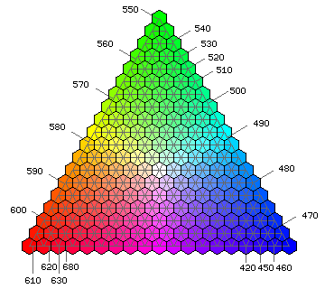
A larger version of the CIE chromaticity diagram, showing how I created the representation of it seen above:
The diagram above is a crude rendering on my part of the normal 1931 CIE chromaticity chart, but instead of being plotted conventionally in Cartesian coordinates of x and y, x, y, and z have been treated as three items that must sum to 1, and are shown in an equilateral triangle. Note that an elongated triangle in the center of the diagram represents what is called a Maxwell triangle, showing colors derived from mixtures of light from the three phosphors of a typical monitor; outside of this triangular area, the gamut of a monitor, the colors on the periphery are extended to the perimiter on the diagram following curved lines of perceived hue shift with saturation change.
As this diagram was developed by the Commission International de l'Éclairage to characterize lighting, the position of a source of light on this diagram depends solely on its relative spectral composition, and not on its brightness. This means that distance from white at the center represents spectral purity, not saturation or chroma. A consequence of this is that the color of an object which only reflected light with wavelengths from 475 to 476 nanometers, which would look nearly black in normal light, would be assigned a position near the edge of the CIE chromaticity chart, corresponding to the vivid color it could have if subjected to an extremely bright source of incident light. This also means that it is possible to plot curves of the maximum achievable spectral purity for the color of objects seen by reflected light based on the proportion of incident light that they reflect; these curves are called the MacAdam limits.
Relating the mixtures of red, green, and blue phosphors on a CRT to the colors of pure spectral light is difficult, but based on information I have found, this chart may have some approximate validity:
Color Systems
In addition to a color circle of fully saturated hues, there are also, of course, less saturated colors.
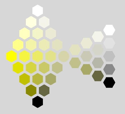
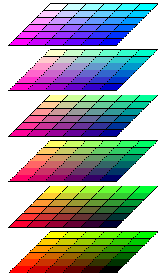
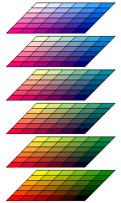
The following diagram includes a full gamut of such colors, with only 30 hues in use. To make it easier to calculate the RGB values for the palette I needed, and to make it easier to draw the diagram in which the colors were placed, I did not attempt to make vertical planes of constant brightness, but instead simply moved from the circle of fully saturated hues towards white and black, somewhat as is done in the Ostwald color system (but I use squares instead of hexagons, having 1, 3, 5, 7... colors instead of 1, 2, 3, 4... in successive shells - the system of Arthur Pope also did this, but it was more like Munsell's than Ostwald's):
For a gamma of 0.85, this illustration shows a color chart made up of colors in that arrangement: the diagrams, in three rows, show every second hue, starting with red, for 24 different values of brightness, excluding black and white, and 9 different values of saturation, excluding no saturation. The diagrams have ten columns, however, because the gray scale is included with each diagram.
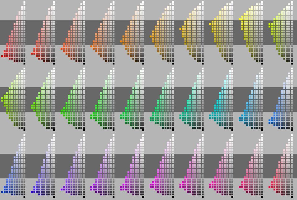
This diagram is in the PNG file format, which is not supported in some older browsers. It has been necessary to use that format for this file, as JPEG did not give acceptable results without an excessive file size, and it has more than 256 colors.
Note also that this color scheme is not the Munsell system, despite a superficial resemblance. In addition to the different arrangement of the hues, no attempt is made to correct for apparent hue shift for less saturated colors.
Artists' Pigments
A painter's color wheel would be based on the paints with pigments for highly saturated colors. However, pigments for less saturated colors are less expensive, more permanent, and less likely to be toxic. For those reasons, and also to make mixing paints easier by starting from a point closer to the desired color, a system that minimizes the use of the paints with more vivid colors might be useful.
This diagram illustrates what I am thinking about.
Here, the system is based on two color circles. An outer color circle might be built by using paints with saturated pigments as the primaries that are mixed to build up the whole circle.
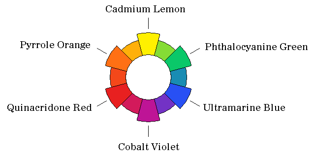
Examples of more vivid pigments used in artists' paints are hansa yellow, phthalocyanine green, ultramarine blue, quinacridone magenta, pyrrole red and pyrrole orange.
And then an inner circle is built up using less vivid pigments.
Thus, the primaries such a circle might be built from could be nickel titanate, burnt sienna, Venetian red, manganese violet, Prussian blue, and chromium oxide.
Mixing triangles would proceed from one position on the inner circle to the column between white and black, forming a double cone similar to that of the Ostwald system.
But as well, for each hue value, there would be two other mixing triangles. Each of those would involve a hue on the outer circle, the corresponding item on the inner circle at the same hue, and either white or black as the third point of the triangle.
The colors can be thought of as belonging to a double cone, with the white and black points of the triangles illustrated above joined:
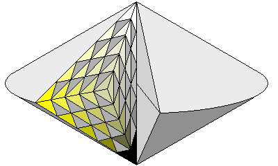
because the triangles would be stretched and sheared in that case, as illustrated above, instead they are left unconnected, so that the color solid becomes a double cone with a torus around it instead of the simple double cone illustrated here.
Of course, this now means that a given color, instead of being formed by mixing white, black, and two brightly colored pigments, might be formed from either white or black, and two brightly colored pigments and two less vivid pigments. This could increase the possibility of using pigments that react with each other chemically.
Gamma Correction Reference Diagrams
This page, if viewed in 256 color mode, will simply look less attractive, due to dithering. As background colors are not dithered, the page with the more extensive gamut will simply show incorrect colors if viewed in that mode.
Because on many computer systems, RGB values are not linear specifications of brightness, it is necessary to take into account gamma correction to present colors accurately. The charts on this page, except for the chart of "internet-safe" colors, which need not be adjusted, as browsers display those colors without correction, have been corrected by being raised to the exponent 0.85.
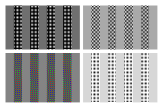
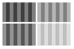
The following table should allow you to determine the gamma correction required for your computer display. The gray squares attempt to achieve the same shade of gray directly, and by alternating white and black pixels (or full-intensity red, green, and blue pixels in one case): where the vertical bars in each square are the closest match in apparent brightness, the correct gamma for your monitor is found.
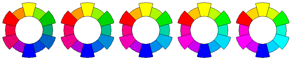
The first item in each row is the chart for checking gamma. The second item is my color circle, presented correctly for systems requiring the gamma correction indicated by that row. The third item is the gamma value (actually the reciprocal of the gamma of your monitor):
 |
 |
1.00 |
 |
 |
0.90 |
 |
 |
0.85 |
 |
 |
0.80 |
 |
 |
0.70 |
 |
 |
0.60 |
 |
 |
0.50 |
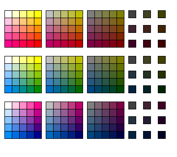
Process Color
Of course, there are other ways to organize a gamut of colors that includes possible colors of all kinds to at least approximate any color. The "internet-safe" colors that work in 256 color mode on common browsers are an example of what is known as process color, and are shown here:
This can be thought of either as a chart of additive colors, or as a chart of subtractive colors. Starting from black, one goes up to add blue, to the left to add red, and away from the observer to add green. Starting from white, one goes down to subtract out blue light using yellow ink, one goes right to subtract out red light using cyan ink, and one goes towards the observer to subtract out green light using magenta ink.
However, in fact, the chart depicts colors produced by addition from monitor phosphors, and not subtraction. Also, in practice, while yellow ink indeed looks yellow, cyan is more like a light blue, and magenta more like red than like purple, than the colors in this diagram.
A similar process color chart with colors more closely approximating what might be available through printing is shown below:
By default, Microsoft Windows uses a different palette of process colors for bitmap images in 256 color mode. Instead of using only 216 colors, all 256 colors are used: the brighter components red and green vary through eight steps rather than six, while only four levels are allocated to blue. This produces a range of colors having the following appearance:
The colors chosen tend to favor the darker colors: for blue, the levels are 0, 64, 128, and 255, with 192 omitted, and for red and green, the levels are 0, 32, 64, 96, 128, 160, 192, and 255, with 224 omitted.
Favoring the lighter colors somewhat instead, and allocating four levels to blue, five levels to red, and twelve levels to green, using:
       0  28  57  85 102 119 136 153 170 187 204 221 238 255
       -----------------------------------------------------
Blue:  0                 119             187             255
Red:   0             102         153         204         255
Green: 0      57  85 102 119 136 153 170 187 204 221     255
one obtains the following chart:
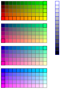
In addition to the 240 colors formed systematically, the missing gray shades with 28, 57, 85, 102, 119, 136, 153, 170, 187, 204, 221, and 238 for all colors are added. This leaves only four colors unused.
In the main section of the diagram, the squares whose borders are black instead of gray are those which would be placed on the circle of maximally-saturated colors available within this gamut.
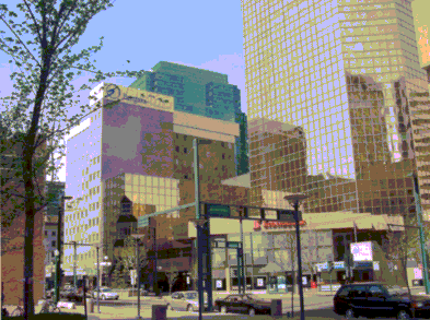
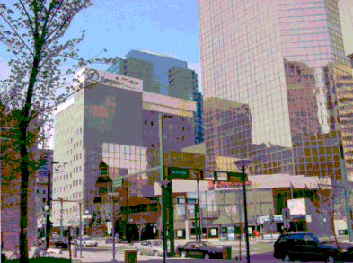
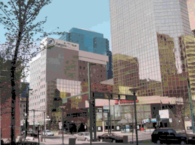
The three images below:
show the results when a color photograph is rendered according to this color gamut, first by mixing colors in adjacent points to approximate actual colors in the scene not present in that gamut, and then by strictly replacing the color at each point by its nearest available neighbor.
The nearest-neighbor image is clearly not perfect; however, for comparison, here is a nearest-neighbor image using the 240 "internet-safe" colors,
and one using the 256 color palette from Microsoft:
Of course, the choice of nearest neighbors by the paint program used may also affect the results, and my scheme has a particular advantage resulting from adding a gray scale to the gamut. If the gray scale were omitted, a nearest-neighbor image using my scheme would look like this:
which is not nearly as much of a visible improvement over the results produced by the other two palettes as the earlier image, although it does seem to me to still be some slight improvement.
For comparison, here is a nearest-color image using the color gamut above that used a stack of color circles based on a 30-hue version of my color circle:
Just as the circular chart that began this section represents the color world as seen by a painter, who has a palette of oil paints representing several saturated colors and also white and black paint, the process color charts represent the color world experienced by someone working with a color monitor, or with printing.
To make a particular color, a painter should use the two saturated colors nearest in hue to the desired color, plus as much white or black paint as is needed to make a good match.
When printing a color photograph by conventional color separation techniques, not involving the use of computer-generated halftones, it is necessary to use cyan, magenta, and yellow to produce the various colors. A light black-and-white image of the same photograph is also overprinted.
But ideally, if one is trying to produce a desired color directly, one should mix at most two of cyan, magenta, and yellow inks with as much black ink as required. For almost the same reason that a painter should not try to create a desired color using widely separated hues. In the painter's case, too much trial and error is needed that way; in the printer's case, the limitations of the inks used are more important.
Color Atlas by Harald Küppers featured a set of color squares for this kind of system; it was an inexpensive small book with a silver cover. Below is a diagram of what a process color chart looks like in that kind of system.
The first row shows colors built from yellow and magenta; the succeeding squares going to the right have more and more black added; first 25%, then 50%, and finally 75%. Since having 75% black added to the colors makes them difficult to distinguish, instead of a complete square with 25 different colors, only nine separated squares, each containing one color, are shown at the end of each row.
The second row shows yellow and cyan, and the third row magenta and cyan.
[Home] [Other]